38
\$\begingroup\$

As part of how Canon (and other lens makers) give technical information about their lenses, they supply an MTF (Modulation Transfer Function) chart. How do I read and interpret what the chart is telling me?

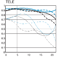
Here is a sample MTF Chart for the 16-35 f2.8 L II (one of my favorite lenses for walkabout photography). What do the various lines mean? What are the axes?

MTF Chart
(original source: Canon.com

\$\endgroup\$
1
  • \$\begingroup\$ What none of the existing answers mention that is critically important is that MTF charts supplied by manufacturers are not measurements of actual lenses. Rather, they are the theoretical limits of a perfectly executed example of the lens design. The physics of visible light itself, and how different wavelengths are refracted differently by the same lens elements is what leads to less than perfect MTF charts, not the imperfections of a manufacturing process. Actual lenses will not perform as well as the theoretical MTF charts released by manufacturers. \$\endgroup\$
    – Michael C
    Commented Sep 26, 2017 at 1:33

4 Answers 4

25
\$\begingroup\$

There is a really good tutorial that explains all the details at luminous-landscape.com.

If you don't want to read the whole article, this section covers the basics:

Here are some rules of thumb for reading a chart...

— the higher up the chart the 10 LP/mm line is (the thick lines), the higher the contrast reproduction capability of the lens will be.

— the higher up the chart the 30 LP/mm line is (the thin lines), the higher the resolving power and thus subjective sharpness of the lens will be.

— keep in mind that the black lines show the lens wide open while the blue lines show the lens stopped down to f/8, so the closer these sets of lines are to each other the better the performance of the lens when used wide open. The very best lenses will have the black and the blue lines close together.

— generally speaking a lens whose thick lines (10 LP/mm) are above .8 on the chart should be regarded as having excellent image quality. Above .6 is regarded as "satisfactory". Below .6 is, well, below.

\$\endgroup\$
0
10
\$\begingroup\$

Zeiss has a pretty good paper on how to read MTF charts. It is rather detailed and extensive, but if you are interested in fully understanding how an MTF represents a lenses quality (and how accurate the MTF may be), it is an excellent read.

How to Read MTF Curves


A very interesting little facet of the article denotes three important properties of MTF, which lead to an intriguing conclusion about the maximum contrast range of a camera lens. I found this to be interesting not only in the context of understanding lens MTF, but also as an important factor in the camera film/sensor dynamic range argument.

We can then recognize three important properties of MTF here which we should remember when reading MTF curves:

  1. Small differences in higher MTF values are particularly significant at high object contrast levels.
  2. On the other hand, weak tonal value variations of less than one aperture stop do not require high MTF values. Differences above 70-80% are then hardly relevant.
  3. With very low MTF values, it practically does not matter how high the object contrast is; the image contrast is always low.

Incidentally, this is why the datasheets of films always also gave the resolving power for the low contrast of 1:1.6. The resolution figures for the contrast of 1:1000 can only be measured using contact exposure. For the finest structures (i.e. very high spatial frequencies), no lens in the world is capable of producing a contrast of ten aperture stops. Estimating the amount of information of film images based on this higher resolution value is thus too optimistic.


Another excellent resource for how to read MTF charts can be found in the last parts of Canon's book "Lens Works". The part "Optical Terminology and MTF Characteristics" provides an EXCELLENT overview of lens types and capabilities, and provides a wonderful, visual review of MTF charts for many Canon lenses.

\$\endgroup\$
1
  • \$\begingroup\$ Canon's link appears stale. \$\endgroup\$
    – mongo
    Commented Feb 19, 2020 at 15:13
3
\$\begingroup\$

What do the various lines mean? What are the axes?

The source we all quote on how to read an MTF chart is Michael Reichmann's article at Luminous Landscape. Most of the following information is cribbed from that article.

However, keep in mind that these particular conventions only apply to Canon MTF charts. Other lens makers may have different ways to denote these things, and may or may not show all the same information. And, as Reichmann says in that article:

... be aware that an MTF chart doesn’t tell us everything that there is to know about a lens. Important variables such as vignetting, linear distortions of various sorts, and resistance to flare are among the things not measured.

On a Modulation Transfer Function, the horizontal axis denotes the distance from the center of the lens, so the zero point on the left is the performance of the lens at center, and the far distance on the right denotes corner performance. Note also, this way you can see the difference in corner performance between use on a crop and on a full frame sensor.

The vertical axis denotes the amount of contrast, on a scale from 0 to 1 (I.e., you can think of it as the scale of 0% to 100). So, air, for example, would give you a straight horizontal line at 1. The flatter and nearer the top of the chart the line is, the better the overall performance.

The black lines indicate performance wide open. The blue lines indicate performance stopped down to f/8 (I think Nikon doesn't bother to show this on their MTFs).

The thick lines are measurements taken at 10 lines per millimeter (low resolution). The higher up the chart these are, the better the contrast of the lens.

The thin ones at 30 lines per millimeter (high resolution). The higher up the chart these are, the better the perceived sharpness of the lens.

Solid lines are meridonial (i.e., the test chart lines are slanted 45° from upper left to lower right). And the dashed lines are sagittal (the lines are slanted from upper right to lower left). They evaluate astigmatism and field curvature, and the closer these two lines are to each other, the smoother the bokeh will tend to be.

See also:

\$\endgroup\$
1
\$\begingroup\$

What none of the existing answers mention that is critically important is that MTF charts supplied by manufacturers are not measurements of actual lenses. Rather, they are the theoretical limits of a perfectly executed example of the lens design.

The physics of visible light itself, and how different wavelengths are refracted differently by the same lens elements is what leads to less than perfect MTF charts, not the imperfections of a manufacturing process.

Actual lenses will not perform as well as the theoretical MTF charts released by manufacturers.

\$\endgroup\$
3
  • \$\begingroup\$ What is your source on this? I have had lens manufacturer and marketers claim they do their own MTF testing. Last did any of this, it was far easier to perform MTF measurements, then to model a lens to create a MTF chart. \$\endgroup\$
    – mongo
    Commented Feb 19, 2020 at 15:15
  • \$\begingroup\$ @mongo Roger Cicala, the founder of lensrentals.com, is one among many that have oft stated this. If you read Roger's blog very much at all, you also know that there is significant variation form one copy of the same lens model to another, and even from one rotation of the same lens to another. Roger often measures the same lens in 45° axis increments. \$\endgroup\$
    – Michael C
    Commented Feb 19, 2020 at 15:38
  • \$\begingroup\$ MTF – The English Translation and Have You Seen My Acutance? and There is No Perfect Lens and Measuring Lens Variance and \$\endgroup\$
    – Michael C
    Commented Feb 19, 2020 at 16:00

Your Answer

By clicking “Post Your Answer”, you agree to our terms of service and acknowledge you have read our privacy policy.

Not the answer you're looking for? Browse other questions tagged or ask your own question.