27
\$\begingroup\$

I've noticed that some photos of landscapes make me feel the depth and immersion, don't know how to describe it, just the true feeling that the photo isn't really flat.

Other photos rather look flat, even though we can tell that one object is behind another, and the shadows persist, but it just doesn't look that "effective" for me.

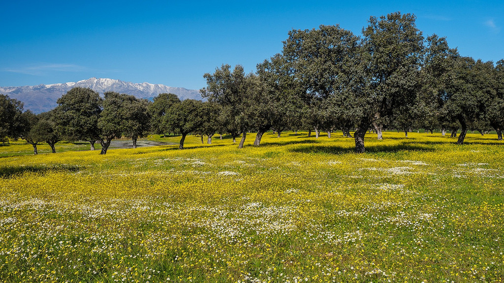
So I would be happy to know if there is anything special about the photos, maybe some special technique or anything else that I haven't yet explored. I brought few random examples from the web trying to demonstrate what I mean.

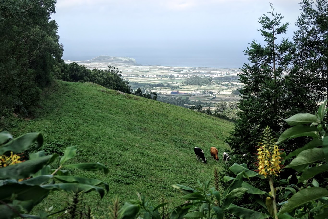
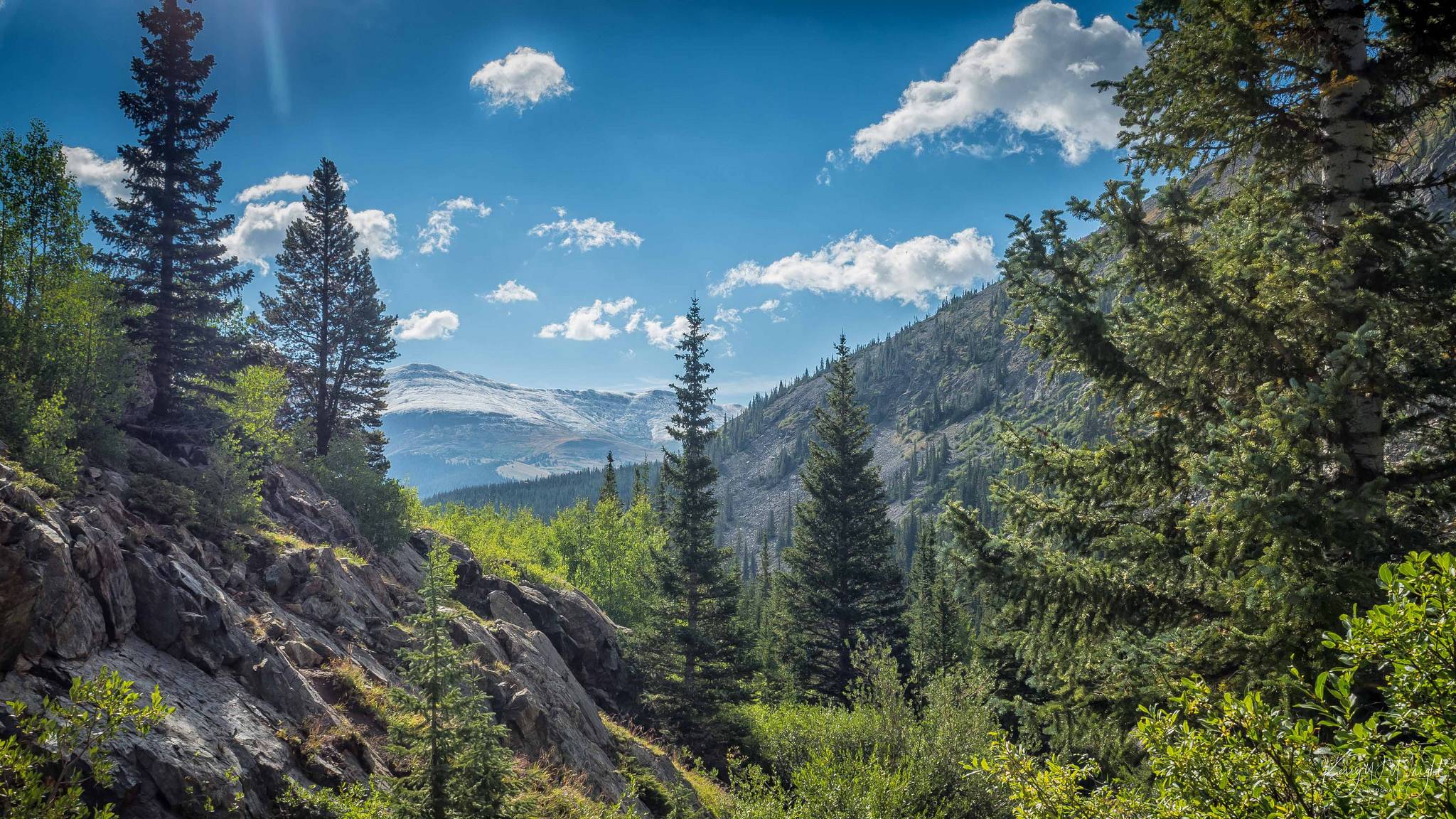
Examples of photos where I can feel the depth:

enter image description here enter image description here enter image description here

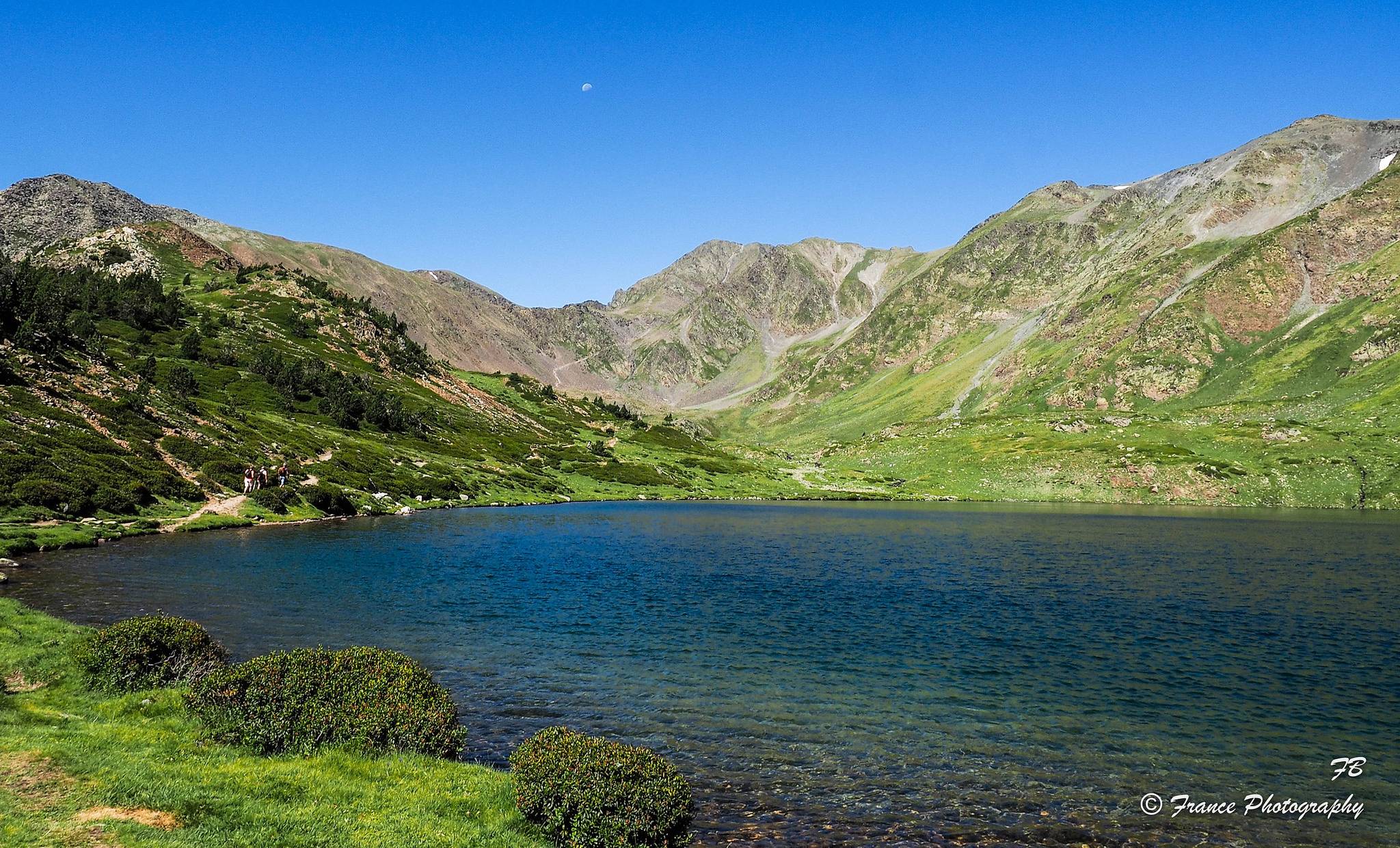
And here are examples that were taken with the same lens as pic #1 and #3, but don't have the same feeling for me:

enter image description here enter image description here enter image description here

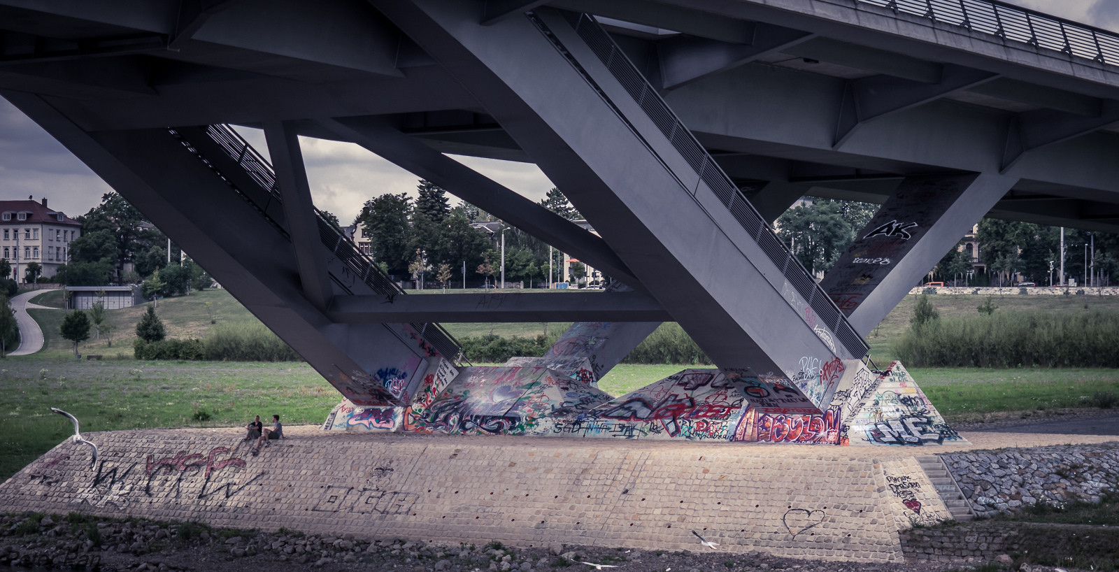
The fifth photo is not the landscape, and it might be not the best example at the end of the day, but the scene just has a "potential" in my opinion, but the actual photo miss the depth feeling for me.

\$\endgroup\$
7
  • 2
    \$\begingroup\$ Please read Important information for asking "What's this effect?" questions and edit this post accordingly. Make sure to use a descriptive title, too. Thank you! \$\endgroup\$
    – Caleb
    Commented Feb 19, 2018 at 14:18
  • 1
    \$\begingroup\$ I felt the intent to be reasonably clear. 'What is it that makes the first 3 work better than the second 3?' Personally I feel we could lose 2 & 5 from the equation, which would leave the 'pros & cons' far clearer to describe, as 5 isn't what I'd call a landscape & 2 is a bit naïve, but I've included 2 in my answer anyway. \$\endgroup\$
    – Tetsujin
    Commented Feb 19, 2018 at 14:43
  • \$\begingroup\$ Personally I don't find anything wrong with the last three pictures apart from the 5th one (which in my opinion is either badly cropped or was taken with a lens that was too long). Both the 4th pictures and the 6th picture have plenty of depth to me (it's actually the 1st picture that I think lacks the most). \$\endgroup\$ Commented Feb 19, 2018 at 18:00
  • 1
    \$\begingroup\$ I would be happy to take any of the first four. 6 is not bad, but I agree with @Tetsujin, that it makes you stop instead of flow. As to 5, I can see why there is a nice photo to be taken there, but that is not it :-) (hey, I got plenty of those, sometimes I see something, but I can not transpose it to the picture) \$\endgroup\$ Commented Feb 19, 2018 at 23:22
  • 2
    \$\begingroup\$ Not worth adding an answer, but I haven't seen the term Aerial Perspective yet, which basically boils down to the contrast fading away, depending on distance. \$\endgroup\$
    – phresnel
    Commented Feb 20, 2018 at 9:32

4 Answers 4

34
\$\begingroup\$

If we start by just numbering them 1 - 6 for easy reference...

Personally, I'd discount 5 altogether as it has none of the aspects we're looking for.
2 is a bit naïve & perhaps achieves a lot of its usable aspects almost by accident, however, because it does achieve some of them, let's keep it in consideration.

1 through 3 all have some element in the foreground which is soft, out of focus, yet doesn't necessarily distract, just forms a frame for the rest of the image to sit in.
4 through 6 don't, though 4 comes closest to including a little.

1-3 also have a soft element off in the distance, mist/atmospherics/haze, giving the distance a real feel of distance.
4 & 6 were shot on very clear days & even though 6 might be competing with 3 in terms of how many miles away that mountain is, it still comes out a bit crisp to convey that sense - there's also nothing that leads the eye to the mountain, it's just 'there'.

Colour-grading may also be playing a part.
Though 1 has a little 'antiquing' feel to it, the first 3 are quite naturalistic. I'm tempted to think if 1 & 2 weren't right next to each other, 2 wouldn't look quite so blue.
4 looks like a 1970s postcard, way too much punch in the greens & 6 feels a tad over-punchy.

If you consider the observer is being taken on a journey through the interesting aspects of an image, part of the consideration is how 'easy' that journey is to take. Which to look at first; where the eye is drawn next; what makes you want to continue the journey...

Personally, I think 1 & 3 have all the aspects that give your feeling of distance & depth. They both lead the eye very naturally through the different elements. 2 is similar but less defined, almost feels like it achieved it by accident.
4 has been sharpened to within an inch of its life, as well as over-punched, which does it no favours at all, imo. Though it clearly has foreground & background, it does nothing to draw you from one to the other; the lake almost blocks the transition rather than guides it. It also has a moon in the sky, presumably the reason that precise shot direction was chosen, yet because there's nothing leading you to it & it's too small to really notice initially, it just becomes a distraction, a speck.
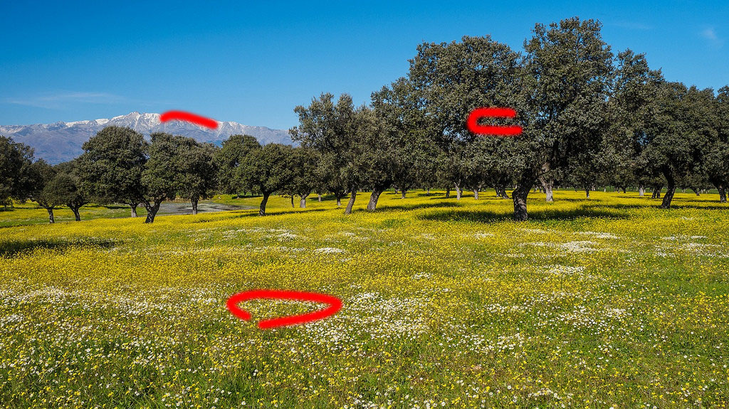
6 is just a bit vague in what you're supposed to be looking at. its 'distance' aspect is just 3 planes, grass, trees, distant mountain.

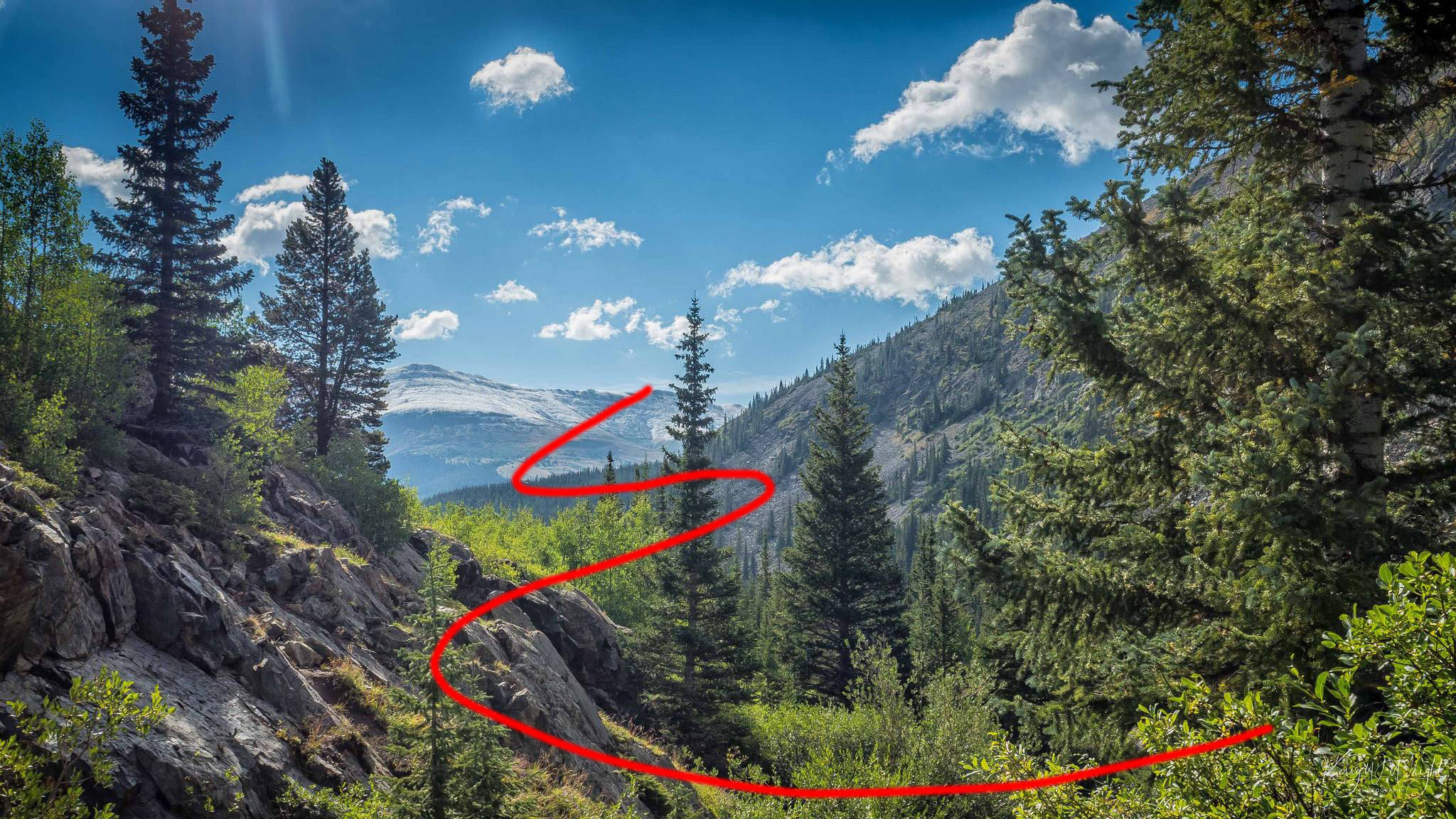
Just using two of the pictures to quickly convey the sense of "journey" through their depth...

This one just pulls you right through from front to back or back to front - even before you start to pay attention to the sky & the lens flare..

I think this one has a more complex journey than I've drawn, but it would look like a bunch of random squiggles if I tried to draw the whole lot.
enter image description here

This one keeps stopping you; you're not sure where to go next...
enter image description here

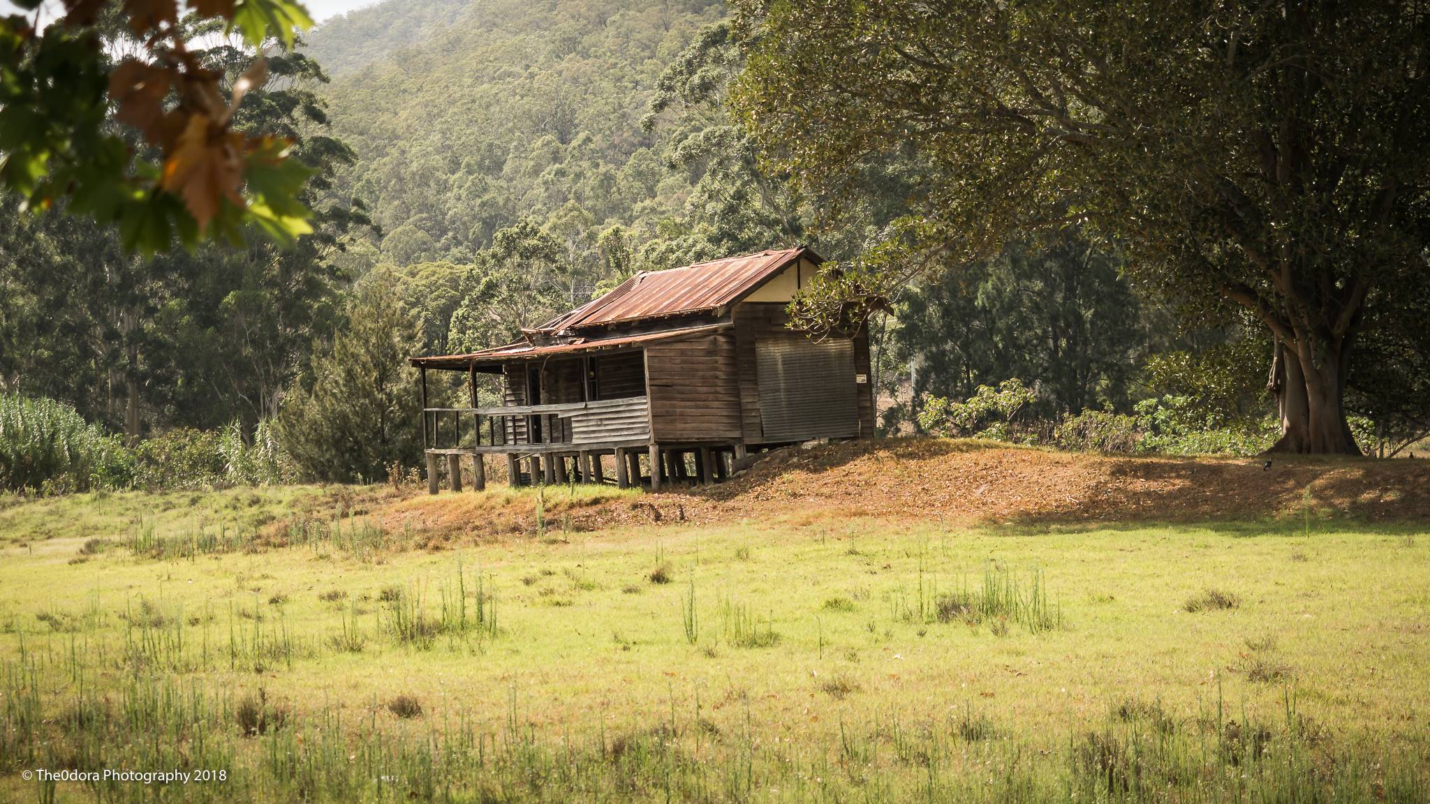
There is one additional depth-cue for the observer & this is a tendency for a hue-shift towards blue in the extreme distance, caused by atmospherics/haze even on the clearest days.
I've left this one til last because there's some discrepancy in your specific examples & I didn't want it to create confusion.

1 displays very little shift, because even the furthest points in the image are still relatively near, yet all the other cues add up to its sense of depth.
3 is the clearest example showing the shift & personally I feel this one contains the largest number of cues overall.
6 has the shift on the mountains, so this cue tells you the mountain is far off, even if some of the other cues are missing.

\$\endgroup\$
10
  • \$\begingroup\$ I think #5 is important. Blueing of objects far away is one of the ways how humans perceive distance, and #5 is all blue, nothing left for the objects in background. They're not far enough, that's true, however overcast sky can ruin the color temperature difference. Similar thing happens with #4 where blue lake competes with the mountains that are too clear. \$\endgroup\$
    – Agent_L
    Commented Feb 19, 2018 at 17:07
  • 3
    \$\begingroup\$ I'm not sure I've enough space to properly set out with why I think 5 is bad; a slight blue cast doesn't even begin to cover it. It could be a question all of its own. "What makes this photo poor?" ;-) \$\endgroup\$
    – Tetsujin
    Commented Feb 19, 2018 at 17:14
  • 1
    \$\begingroup\$ One particular aspect that's relevant to your explanation but you didn't call out explicitly: Haze, which has an additive effect with distance. Even on a day that seems clear to the naked eye, there's usually humidity or other particles that add that gradual shift not seen in #4. \$\endgroup\$ Commented Feb 19, 2018 at 22:37
  • \$\begingroup\$ I agree with with @chrylis in that the perceptual cues coming from the change in dynamic range due to haze seem worth explicitly pointing out... they are very powerful cues. Great answer, otherwise! \$\endgroup\$ Commented Feb 20, 2018 at 8:10
  • 1
    \$\begingroup\$ I called it 'atmospherics'. I can drop the word haze in there but the effect itself was already mentioned, albeit briefly. \$\endgroup\$
    – Tetsujin
    Commented Feb 20, 2018 at 8:13
7
\$\begingroup\$

Without more detail, I would suggest that the biggest difference is one of framing - your preferred samples appear to have carefully considered the inclusion of elements in all of the foreground, midground, and background, where the less favorable samples have not done so as obviously (all three regions are still there in the examples, but haven't been utilized as effectively).

\$\endgroup\$
0
6
\$\begingroup\$

The world is 3D, the photo is 2D, so what the brain needs is clues in the 2D image that things are still not flat. Just like if you block one of your eyes, you no longer have 3D vision, you can still tell that some things are closer and further. There are 3 elements that give clues of depth:

  • Perspective: Things further away are smaller, so if you see a road looking narrower as it does into the distance, then your brain tells you there is depth. The same with elements of a known size, if you see a person and the person is very small, your brain tells you that he/she must be far away.
  • Occlusions: If one thing hides part of another, then you know which is in front and which is in not so you have depth information.
  • Shadows: When an object creates a shadow that goes towards or away from the viewer, it tells your brain that there is depth.

None of the photos you shown actually require anything more than a P&S or cellphone, the technique used there is composition which is mostly influenced by the position of the viewer, direction taking the photo and angle-of-view of the lens.

The first 4 photos have very obvious foreground elements, that is why they look deep. Those all have a foreground, middleground and background that are easily discernible. The last photo is pretty much the same although it has a less strong (mostly flat) foreground, it still has a middleground and there are the mountains forming the background.

The fifth photo has depth mostly because the bridge recedes towards the back which gives a strong leading element from foreground to middleground. Lastly, the small part of the house with leading path gives it a distinct background and its relative size tells your brain that it is much further away, this creating the impression of depth.

\$\endgroup\$
4
  • \$\begingroup\$ Is it just me? I find 5 to be a just series of irritations ;) Why is that seagull there? Who put the weird ƒ shaped path over there that just keeps pulling your eye to half a house. Is that a hotel or a McDonalds in back? Who's AF? Why is the sky in the middle lighter than in the corners? What's that bridge doing in the way of everything? & why is there no water under it? \$\endgroup\$
    – Tetsujin
    Commented Feb 19, 2018 at 15:48
  • \$\begingroup\$ Yes indeed. It the one photo that struck out as a bad of example of a photo! \$\endgroup\$
    – Itai
    Commented Feb 19, 2018 at 16:00
  • \$\begingroup\$ I agree, sorry for the bad example, it's just there cause imho the scene might look more impressive if there was a "feeling of the depth". I've added one more sentence to my question trying to explain my bad example. But thank you for pointing this out. \$\endgroup\$
    – Mike
    Commented Feb 19, 2018 at 16:28
  • 3
    \$\begingroup\$ Actually @Mike - 5 is an almost perfect example of 'what not to do'. It's a jumbled catalogue of distractions, mostly mentioned above - no element leads to any other. It has some bad parallelism/unfortunate tangents [which I haven't mentioned in my actual answer because none of the other images show it] where elements at different distances appear to 'belong' to each other; the wall behind the horizontal strut, which then parallels down through the lines in the grass to the double line on the concrete base. Something could possibly have been taken from there, but that image wasn't it ;) \$\endgroup\$
    – Tetsujin
    Commented Feb 20, 2018 at 9:20
5
\$\begingroup\$

Perspective is important in perceiving depth in a picture, but artists will use a few tricks that photographers should be aware of.

Linear perspective is what renaissance artists perfected where leading lines arising from vanishing points are used to place objections in a logical sequence and scale. That is to say an object placed in front of another identical object will obscure it and appear larger.

Atmospheric (also aerial or colour) perspective describes the effects of the atmosphere on the light in a landscape. Most obviously this is seen as a reduction of tone, colour and detail in objects seen in the distance. Many landscape painters will make the greens of the landscape very blue in the background to emphasise this. They will also add less detail and make things fainter, think of a misty day.

Photographers often use UV filters to reduce haze, but this can be a feature that will emphasise depth, as will using large apertures (small f-numbers) to render the background slightly out of focus as long as you are trying to emphasise a strong mid or foreground feature.

\$\endgroup\$

Your Answer

By clicking “Post Your Answer”, you agree to our terms of service and acknowledge you have read our privacy policy.

Not the answer you're looking for? Browse other questions tagged or ask your own question.