17
\$\begingroup\$

Many times I have noticed people critiquing other people's pictures, saying either - "It is too tightly framed" or "you haven't filled the frame".

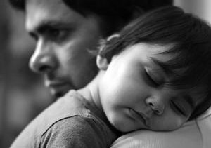
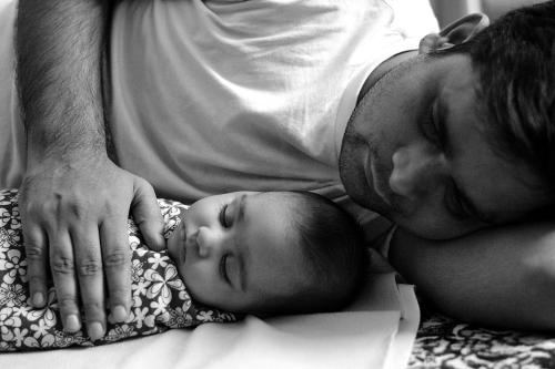
Below are two photographs taken by me. I don't know whether they are too tightly framed (bad) or I have filled the frame (good) or whatever(?).

I wish to understand clearly [with different example photos] which pictures need to "fill the frame" vs are "too tightly framed", and why?

Which composition should be followed out of the two, and in which case?

enter image description here

enter image description here

\$\endgroup\$
5
  • 12
    \$\begingroup\$ This has gotten a few close votes as "primarily opinion-based". I disagree strongly — see meta discussion. meta.photo.stackexchange.com/questions/4748/… \$\endgroup\$
    – mattdm
    Commented Apr 24, 2015 at 15:45
  • 3
    \$\begingroup\$ I agree with Matt here, I don't think this is an opinion-based type question. I think it is a legitimate question that plays a key role in choosing the right kind of composition for images. \$\endgroup\$
    – jrista
    Commented Apr 24, 2015 at 17:40
  • 3
    \$\begingroup\$ Don't vote to close! See blog.stackoverflow.com/2010/09/good-subjective-bad-subjective \$\endgroup\$
    – bwDraco
    Commented Apr 28, 2015 at 3:20
  • \$\begingroup\$ @jrista Who chooses "the right kind of composition" for MY photos? I DO. Anybody else is only offering their opinion, or conventional wisdom, on what constitutes good composition. I get to choose if I want to follow conventional wisdom or what is considered "good composition" I am not saying vote to close, it is useful to understand conventional wisdom and it is useful to ignore it sometimes. It is my decision. \$\endgroup\$
    – Alaska Man
    Commented Apr 27, 2021 at 18:01
  • \$\begingroup\$ @AlaskaMan jrista's (and mattdm's) comments were not directly to OP, they were pointed at people who were voting to close the question (at the time) for being "opinion based". \$\endgroup\$
    – scottbb
    Commented Apr 27, 2021 at 23:20

3 Answers 3

15
\$\begingroup\$

I don't have any other examples immediately, but I'll try to answer the basic question. You're hearing two sometimes-contradictory pieces of composition advice, and are trying to figure out how they relate or balance against each other:

On the one hand, "fill the frame".

This advice is often given because simplicity is power. It immediately eliminates questions like How do I make a landscape photo containing many important elements feel well composed?, because what's there is there, and there you go. There's no question about what the subject is, and no "distracting" elements drawing attention elsewhere. Additionally, when you're up close and framing tightly, the viewer is also transported right there — tight framing feels immediate and intimate. There's a famous quote from photojournalist Robert Capa: "If your pictures aren't good enough, you're not close enough."

On the other hand, "too tightly framed".

There are two different reasons one might hear this. The first, which I suspect is what people are meaning when they say this to you (particularly about the second example) is that some subjects feel claustrophobic without surrounding space. This is particularly true with subjects — people, animals, vehicles — which are depicted as moving, because it feels more comfortable if there is clearly somewhere for them to move into, rather than smacking immediately into the border. It's also the case that people traditionally leave "headroom" in photographs — we have a whole question on that at What is headroom as it relates to photographic composition?, although no really great answers as of this writing.

The second reason is context — those details might not actually be distractions, but part of the story. They place your subject in the world — in fact, in the subject's world, rather than making them an abstract entity. That's shown to great effect in the portraits linked from What kind of 'guerrilla' background / backdrop is being used in Felipe Dana's Cracklands portraits? — the poverty-stricken denizens of an outdoor "marketplace" for hard drugs. If these were tightly cropped to just the subjects against the blank, "distraction-free" backdrop, they could work, but here I think most people would agree that it's particularly the visible context which makes the work interesting.

Oh! And there's actually a third reason to not frame a single subject tightly. Other elements in the frame might not be part of the setting or story in a meaningful way, but can be functional compositional elements. For example, abstract shapes or shadows can direct the eye, provide balance — or imbalance, if desired, or offer contrast (like, stark lines next to an organic subject).

So, in your examples.... I think these both work as compositions, but very differently.

They both show tight framing, although the first, with the father reclining next to the baby, shows a bit more context. In that first image, the father faces into the frame, with head tilted that way, and to me at least, this does not raise an issue of headroom (even though the top of his head is actually even cropped), because the focus of the image goes to the baby. On the other side of the frame, his protective arm makes a nice, natural edge. Here, you could have moved back or used a wider lens for more context, but I think overall this is a good example of the intimacy of a close framing: the viewer feels to be right there as well, part of the family.

In the second image, the father-figure looks out of the frame — in fact, right and the edge. This is where the idea of breathing room might come in, as following his eyeline bumps right against the hard stop. However, it's also what makes this, to me, a more interesting composition than the first, which to me feels like a successful, straightforward, image with nice elements but little interest other than the personal. Here, the framing provides a little bit of a tension — by removing context and arranging the eyelines like this, and I think particularly in black and white, to me, shapes and lines are dominant over the portrait aspect.

In the first image, the framing naturally draws me to the sleeping baby — in fact, if we consider the baby to be the subject, this is actually a loose framing, with the father providing the background and context. In the second, the father, larger but less sharp, and the baby, smaller but the immediate focus, seem to have about equal visual weight. My eye snaps first to the baby, then to the father, and naturally follows his eyeline to the edge of the frame, which leads me to the arch of the baby's back and brighter cheek as the primary form in the image (rather than the faces). I think that definitely works, but it might not have been what you were going for if you were looking for a more conventional portrait of baby and parent; for that, a looser framing with more breathing room would downplay the dominance of this geometry over portraiture.
\$\endgroup\$
6
\$\begingroup\$

The rule of thumb that works for me is that intersections of the subject(s) and the frame edges should be somewhat balanced. And the age old rule that frame edges should not intersect subjects symmetrically.

The first image shows no background. All frame edges intersect the subject. The only thing that bothers me is the elbow in the lower right. Is the elbow angled back under the head or is the arm straight? I can't really tell from the image. I guess either including or excluding the entire elbow could change that. This is nitpicking, the image looks good to me. Does it look good to your, too?

The framing of the second one doesn't work for me as well as that of the first one. The focus is on the child, but his (her?) head is not shown entirely. I don't think that goes together well. If possible, move the right edge furtehr to the right and show the entire head. In contrast, the guys blurred head is shown entirely. The image is essentially about both faces, which are on the left and on the right. A horizontal image (landscape format) would work better to show this. Try either

  • cropping tighter, the subject(s) exceed the top and bottom edge of the frame (both being opposite sides, it appears to be what I called "balanced" above), putting more emphasis on the faces, a bit more dramatic I guess(imagine the right edge to be further to the right as suggested above)

tighter crop on faces

  • or expanding the frame by moving the left edge of the frame far further to the left. What's now in the middle of the image would be one third from the right (rule of thirds). This puts more emphasis on how the guy is holding the child.
\$\endgroup\$
3
  • 2
    \$\begingroup\$ That's an interesting example of how a tighter crop adds more apparent headroom. The relative amount to the man's left is larger compared to the rest of the frame, making it feel less constraining. This crop also definitely puts the emphasis right on the child's face, and much less on the geometry I noted in my answer. Interesting! \$\endgroup\$
    – mattdm
    Commented Apr 24, 2015 at 16:41
  • 2
    \$\begingroup\$ And, venturing into highly opinionated territory, I find your crop to be a more striking portrait, but overall less something I might hang on my wall as a non-family member. \$\endgroup\$
    – mattdm
    Commented Apr 24, 2015 at 16:43
  • 1
    \$\begingroup\$ The fact that the situation on the left side of the picture could be salvaged by additonal cropping was an epiphany for me; this is a good concept to grasp for anybody who likes to take the kind of family photos that don't allow much time for composing. \$\endgroup\$ Commented Apr 24, 2015 at 19:15
2
\$\begingroup\$

Part of the complexity is these are heuristics that can contradict within a given scene, because they depend on what you've identified as subject. They address common issues of clarity and containment of subject matter.

These heuristics guide how to crop in a way that best emphasizes your subject/figure in a figure-ground relationship. A little ground is often necessary for me to know which side is up, let alone what's important. Too much ground and I'm distracted from the subject.

Edge cases: The 'subject' need not be a whole person, but could be an abstraction, or part of a person such as 'love', or the father's touch. In this case, the rest of the baby and rest of the father are sufficient "ground". On the other end, if the literal ground, such as a field in a landscape portrait, is subject (figure), then the conceptual ground is the field's horizon and relation to the sky that's ground.

Both of your examples are probably fine as-is. Unless I have mistaken your intended subject.

  • If it is more specific than I thought, such as "dad's protective hand" then you could stand to crop closer ("fill") so that this is what my eyes are drawn to.

  • If it is broader, such as "dad was so enamored the roaring fire went unnoticed", you should widen the frame to show us what's unnoticed.

  • If your intention is unspecific, such as "how do I make this picture the best it can be," then you're first asking, out of the scene in front of me, what is the most interesting (etc), obvious subject that appears.

\$\endgroup\$

Your Answer

By clicking “Post Your Answer”, you agree to our terms of service and acknowledge you have read our privacy policy.

Not the answer you're looking for? Browse other questions tagged or ask your own question.