37
\$\begingroup\$

In his book The Photographer's Eye, photographer and author Michael Freeman says:

Another consideration is relative brightness. Different hues are perceived as having different light values, with yellow the brightest and violet the darkest. In other words, there is no such thing as a dark yellow, nor is there a light violet; instead, these colors become others — ochre, for example, or mauve.

Freeman is clearly talking about something more serious than the labeling of colors. In The Photographer's Eye, the above quote is part of a relatively small section, but the same concept occurs throughout an earlier book of his, Mastering Color Digital Photography. The idea seems to be that when darkened, yellow loses the essential qualities that make it yellow, and when made bright violet loses the essential qualities that make it violet — in a way that red or blue do not. These qualities are clearly more than their position in a color space, and they're also clearly more than the name which happens to be applied.

Some of the answer may be cultural, but if it were entirely arbitrary, it seems odd that these particular effects would be claimed in reverse for colors which are direct contrasting colors on the color wheel. That seems to imply some technical reason beyond any sort of thing like "purple is royal because of the rareness of the dyes in ancient times."

So, what's the science behind this?

\$\endgroup\$
9
  • 4
    \$\begingroup\$ Could this be linguistic too? Some languages may not have separate words for purple, violet and mauve. In which case it would be dark purple and light purple. \$\endgroup\$
    – Itai
    Commented Mar 31, 2011 at 16:30
  • \$\begingroup\$ Maybe. The conflation of cyan and blue is certainly interesting in that way, too. (But those are definitely different hues, not changes in value, like this.) \$\endgroup\$
    – mattdm
    Commented Mar 31, 2011 at 17:06
  • 2
    \$\begingroup\$ relevant: thedoghousediaries.com/?p=1406 \$\endgroup\$
    – Matt Grum
    Commented Mar 31, 2011 at 18:15
  • 1
    \$\begingroup\$ There is a similar question here: english.stackexchange.com/questions/5799/yellow-versus-orange \$\endgroup\$
    – chills42
    Commented Mar 31, 2011 at 19:50
  • 2
    \$\begingroup\$ I'm seeing a lot of mixup between purple and violet in this question and its answers. \$\endgroup\$
    – Evan Krall
    Commented Apr 1, 2011 at 3:13

8 Answers 8

43
+200
\$\begingroup\$

I'm going to give two answers which appear to be in conflict but which actually aren't:

  • There are dark yellows and bright violets — we're just not used to seeing them.
  • There aren't and can't be dark yellows or bright violets — and here's why.

OK...

1. There are dark yellows and bright violets

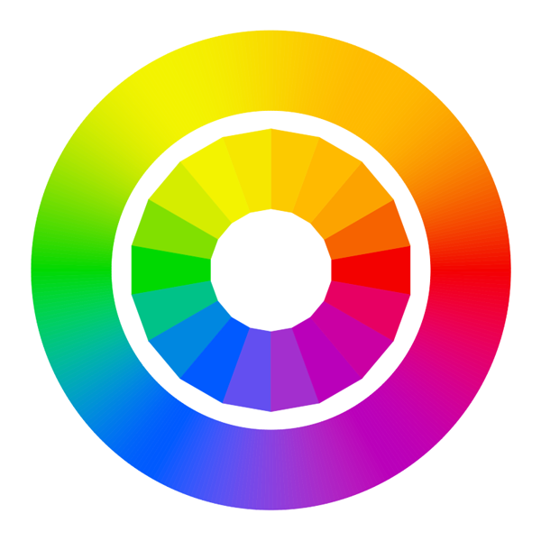
Color perception is relative. Here is a demonstration. If you take a typical color wheel:
100%

And you darken the image to half of its original brightness, then you've darkened every color, including yellow. This produces a dark yellow that looks muddy:

50%

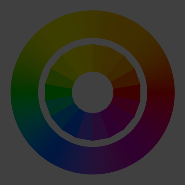
If you darken it again, now to one quarter its original brightness, the darkened yellow is starting not to look much like "yellow" anymore, as it has lost most of it's "yellowness."
25%

However, if you make the image full screen and turn off all the lights in the room, it will again appear as normal. This darkened yellow will look "yellow" again.

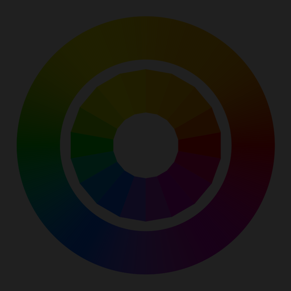
Now if the image is darkened to one eighth of its original brightness, the colors are all so dark now that you can barely even see them:
12.5%

But if you bring down the ambient light in the room to blackness, then the super-dark yellow here will again look to you like "yellow." Everything about our color perceptions is relative.

Conversely, if you go back to the first image and you turn the brightness on your monitor wayyyy up, so that the violet is no longer dark but is really bright, then you've created a bright violet. However, in the process, you've brightened all the other colors as well, so the brighter violet you just made is still dark relative to all the other colors.

2. There aren't and can't be dark yellows or bright violets — and here's why

OK, now for the flip side of the argument. Why is yellow so bright and violet so dark?

The answer has to do with how our eyes perceive luminosity. Each of the color receptors in our eyes — red, green, and blue — perceive these colors at different luminosities. In fact, green is perceived to be about twice as bright as red and about six times as bright as blue. A standard way of computing luminosity from the color components red, green, and blue is to add up 30% of the red value plus 59% of the green value plus 11% of the blue value. In other words:

L = (0.30 * R) + (0.59 * G) + (0.11 * B)

Since yellow is recognized by our eyes as activating both the red and green cones of the retina, its luminosity value can be calculated as:

L[Y] = (0.30 * 1) + (0.59 * 1) + (0.11 * 0)
     = 0.89

That's pretty bright — only pure white can achieve 1.0 using this formula.

On the other end (the dark end), we can see that the darkest color is a pure blue:

L[B] = (0.30 * 0) + (0.59 * 0) + (0.11 * 1)
     = 0.11

So what about violet? Since violet contains red and blue, it is actually slightly brighter (more luminous) than blue, if we constrain R, G, and B to the range [0,1]. But what we think of as "violet" is usually slightly darker amounts of R and B than pure full-on red plus blue. One way to write violet might be R = 0.5, G = 0.0, B = 0.8. This is just one way to assign the numbers; everyone has a slightly different feeling for what "violet" is. Using the luminosity formula above for these RGB values gives:

L[V] = (0.30 * .5) + (0.59 * 0) + (0.11 * 0.8)
     = 0.238

In any case, violet is dark by nature, as it is closer to blue (the darkest of RGB) than it is to red. And yellow is light by nature, because it combines green (the brightest of RGB) with red (the second brightest).

Pure cyan (green plus blue) is also very bright, but less so than yellow.

Here is the color wheel above shown as a hue/luminosity chart. As you can see, yellow has the highest luminosity and blue has the lowest, with purple very close to blue.
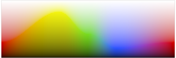
hue-luminosity

3. In summary

All of the above assumes an RGB color model. Although our eyes are wired for RGB receptors, they certainly don't limit values to nice ranges like [0,1]. In reality, our eyes measure brightness logarithmically. Nevertheless, color models like RGB do allow us to represent and recreate a good portion of the visible colors on our computer screens, and although there are other models which take perceptual subtleties into account more accurately than RGB, it is still true that our eyes perceive blue to be less bright than red or green, and this is why violet and blue are always darker than yellow and orange — especially pure blue (sometimes called ultramarine blue). In practice, most of the colors we think of as "blue" in life actually have quite a bit of green mixed in. Similarly, most colors we think of as "yellow" in life actually have a bit of red mixed in, tilting them toward the oranges slightly.

Finally, there's technically nothing in real-life light that prevents there from being a huge spike of blue light reflecting off an object — but it just doesn't happen in practice, due to the way white light is broken down, absorbed, and reflected.

An exception to this is fluorescent colors. With fluorescent colors, you can get bright spikes of purer colors because the energies of nearby wavelengths are collected together and re-emitted on a purer wavelength. If you've even seen a blacklight poster lit by a bright fluorescent blacklight bulb, you will actually see very bright blues and violets — and what's interesting is that they aren't really much darker than the oranges and yellows and greens. (All the normal rules are out the door when it comes to blacklights. :)

\$\endgroup\$
9
  • 4
    \$\begingroup\$ One of the nicest answers on photo.SE! \$\endgroup\$
    – Francesco
    Commented Mar 19, 2012 at 14:26
  • 1
    \$\begingroup\$ Wow, how wrong! Violet is NOT red and blue! That is purple! Violet has its own wavelength. It is monochromatic. Purple is a composite color. See purple vs. violet. \$\endgroup\$
    – TFuto
    Commented Jan 12, 2015 at 20:05
  • 1
    \$\begingroup\$ Also, there is no such thing as "purple", there is a "line of purples". See this wiki page. \$\endgroup\$
    – TFuto
    Commented Jan 12, 2015 at 20:07
  • 2
    \$\begingroup\$ @TFuto — Thanks; I should correct that. Violet can be approximated by a combination of red and blue, but it is not of course red+blue in a real spectrum. \$\endgroup\$ Commented Feb 15, 2016 at 6:19
  • 2
    \$\begingroup\$ There's another subtlety to this that took me years to figure out and that nobody talks about - yellow, cyan, and magenta are abnormally bright on monitors because they're made with twice as many photons as pure red, green, or blue. This is not a situation that occurs in nature with reflected light. \$\endgroup\$ Commented Mar 6, 2019 at 3:44
8
\$\begingroup\$

I think it's a bit more than simply saying "we have other names for those colours." Yes, there is a cultural component. If English didn't have the word "pink" we may very well refer to a colour "light violet." Some languages don't even distinguish between blue and green. But I believe in the case of Yellow, that the way our brain interprets colour means that the very best we can do with "dark yellow" is call it "gold."

Think about describing colour with "-ish" for example. We can have a bluish-green, or an orangish-yellow, but imagine the color yellowish-blue. It doesn't exist. The same with greenish-red. (Scintillating colour-changing fabrics notwithstanding.)

The "pure" colours our eyes perceive and our brains interpret are yellow, blue, green, red, and possibly brown. (See opponent process theory.) Other colour names are cultural and variations on those. For example, orange is a reddish yellow or yellowish red, pink is a pale bluish-red, violet a reddish-blue. So we find it difficult to imagine a "dark yellow" because our eyes and brain are more likely to interpret it as a "dark desaturated green" or possibly a "greenish brown."

\$\endgroup\$
2
  • \$\begingroup\$ Thanks for the pointer to opponent process theory. I think I may have to go read Goethe's Theory of Colors (books.google.com/books?id=qDIHAAAAQAAJ in a kind-of-old translation), which Freeman also references. \$\endgroup\$
    – mattdm
    Commented Apr 1, 2011 at 16:17
  • \$\begingroup\$ I think this comes closest to answering the question, although I'd really love some more details. \$\endgroup\$
    – mattdm
    Commented Apr 4, 2011 at 16:02
8
\$\begingroup\$

I think this has to to with the normal ranges of color that are perceptible by the human eye.

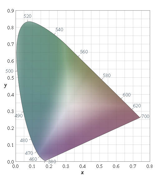
The CIE chart shows the range of human perceptible colors on an x-y table:

http://en.wikipedia.org/wiki/File:CIExy1931_fixed.svg

The numbers in blue around the outside edges (full saturation) represent the wavelength of the light at that point. At the center (roughly 0.35x 0.35y) is white light.

Notice how certain wavelengths for example (520mm) are more distant from the central point than others (580mm). This means that some colors, like green, simply have a wider range of saturation that others, such as yellow.

That means that green can be distinguished as such at a much lower saturation than yellow can.

Impact on photography

Some colors, yellow as one example, don't hold up as well at a lower saturation, but some are still readily distinguished even when you near monochrome levels of desaturation. desaturated version

\$\endgroup\$
3
  • \$\begingroup\$ Hmmm. How would you relate this to luminosity/brightness? \$\endgroup\$
    – mattdm
    Commented Apr 1, 2011 at 16:12
  • 1
    \$\begingroup\$ @mattdm: The second plot has about 50% luminosity, maybe a bit less. Thats the Z axis, which in the case of the Lab color plot, is pointed strait at you out of the screen. \$\endgroup\$
    – jrista
    Commented Apr 1, 2011 at 16:39
  • \$\begingroup\$ First of all, that color wheel is way off. Secondly, blue isn't really the darkest, but violet is, as it's at the end of the spectrum (don't confuse with purple, which is a mix of two). Anyway, that's just linguistic agreement. Thirdly, is it just me... or that BLUE in the last picture before summary looks the BRIGHTEST? \$\endgroup\$
    – user37916
    Commented Feb 20, 2015 at 20:46
3
\$\begingroup\$

Brown is no more dark yellow than it is dark blue, green, or any other color!

Brown is a color formed by the incremental inclusion of that color's compliment. For example: blue with a little orange mixed in to produce a type of brown, or yellow with a little bit of purple to produce another shade of brown.

This is using subtractive color methods.... so, a little bit of color theory for those who don't know. There are primary colors: yellow, blue, red; secondary colors purple, orange, green; and some tertiary colors are recognized in color theory but at that point its just levels of graduation between these "pure colors" on the color spectrum. Why are we calling these "pure" colors? Because they are on the visible part of the electromagnetic spectrum. If you don't know what that is, Google it because the rest of what I'm about to say won't make sense.

So, brown is basically what happens when the eye sees a blended combination of wavelengths that fall anywhere on the spectrum with roughly more than 100nm (nanometers) difference in length.

So call it what ever you want, but brown is not dark yellow.

I minored in biology with a focus on perception and vision science as an undergrad, and given my best guess on why there is no "dark yellow", I would say it probably has specifically to do with the frequency at which cones in the human eye respond to 'color' wavelengths. The normal human eye has a set of three types of cone shaped 'color' light responsive nerves. (Most people have heard of them.) If you are missing one or more of these types, you are considered color blind. What is interesting about the sensitivity of these cones is: they are not evenly spaced out on the visible light portion of the electromagnetic spectrum, nor are they evenly sensitive to their particular wave length, and there is no cone that responds to activity in the yellow part of the wave length spectrum. There is a cone that responds to blue (400 nanometers long) and to red and green (600-700nm range) So, the eye is always just guessing at what is yellow. If you want more info about this kind of 'perceptual guessing' Google "cone sensitivity curve". It's fascinating.

I hope that helps.

\$\endgroup\$
2
  • 1
    \$\begingroup\$ Hi Jae. Thanks for your answer. The second part is particularly, interesting, although I'd be interested in more detail about the "perceptual guessing" and how it might relate dark yellow. Google isn't really helping me out there. (Too much general and technical information; not much focused on this question.) I think the first part of your question is responding to some of the other answers — I don't think I ever claimed that brown is dark yellow (although I understand why some might apply the term "brown" to the muddy sort of color that results from darkening yellow). \$\endgroup\$
    – mattdm
    Commented Mar 8, 2012 at 22:18
  • \$\begingroup\$ Although the subtrative method is more intuitive, I think the additive method is better to tell what a color is. \$\endgroup\$ Commented Nov 20, 2020 at 17:42
2
\$\begingroup\$

I think it's a cultural/developmental/language thing rather than anything to do with the RGB colour space or human perception.

The words for colours are closely related to things, the most obvious example is "orange". I think you can have a dark yellow, it's just that we call it something different. Why? Perhaps because there are objects which are naturally dark yellow - olives! There may be fewer reasons to distinguish between dark red and light red, so the same word is used. However, if for reasons of survival you need to know to pick the yellow fruit but not the olive coloured fruit, it helps to have different words for these colours to avoid confusion.

In short I believe we came to name colours based on convenience, not as some orderly partition of the perceivable colour space.

Note I'm not an anthropologist or etymologist so this is pure conjecture on my part!

There is almost certainly a perception component as well, colours we can distinguish between more easily deserve unique names, whilst there's no point naming colour we can't see very well...

\$\endgroup\$
3
  • 1
    \$\begingroup\$ Yes, I think that the author ignores the impact of linguistics and culture on colour-naming. See for example the word "pink" ... which is "pink" (german) == "hot pink" (english) == "cuisse de nymphe émue" (french) if you want to be exact. If not you'll get a lot of different shades using the common translations "pink" (german) == "pink" (english ~ less bright) == "fuchsia" (french ~ more like magenta). \$\endgroup\$
    – Leonidas
    Commented Apr 1, 2011 at 15:13
  • \$\begingroup\$ Okay, yeah, this steers me to a helpful clarification. Yes, i think there's a cultural/developmental/language thing. The question is: what is special about these particular colors in regards to brightness and darkness? The suggestion that it's individual to each color (bad fruit, in your example) is one possibility, but since these are opposed colors, I can't help but think that there's something more to it than that. \$\endgroup\$
    – mattdm
    Commented Apr 1, 2011 at 15:49
  • \$\begingroup\$ Interesting... FFFF00 is yellow (red and green primary) and 808000 is olive, which codes as dark yellow. But it looks green. I don't think people ever identified it as yellow, so I don't think the special name because of the fruit is true. \$\endgroup\$
    – JDługosz
    Commented Jan 9, 2015 at 20:13
2
\$\begingroup\$

I guess I would consider "Brown" to be "Dark Yellow". From a modern color theory standpoint, which is a three dimensional model of hue, saturation, and luminosity, you end up with brownish or brownish-green (i.e. olive) colors along the "yellow" chromaticity axis when luminosity drops around 50% or lower.

I've never heard of brown listed as a secondary color, outside of maybe some interior design books and magazines. Usually, the primaries are red/green/blue or red/blue/yellow or the combination of the two, and secondaries are violet/orange/cyan/magenta.

One way to gain insight into the question of "color" would be to model color in three dimensions, and examine the radial axis of any primary or secondary color (as radiating from the white/black point Z-axis outwards toward the full saturation of the hue in the X/Y plane.) In three dimensions, at maximum luminosity, you have colors ranging from 0% to 100% saturation, radiating in a 360­° hue circle. But that is only at maximum luminosity. You could divide luminosity into a 5 levels (just to keep things workablyh simple), at 100%, 75%, 50%, 25%, 0%, and for each radial color axis (such as yellow), you would see the colors that fall under that specific hue. The colors Brown and Olive both fall near the "Yellow Hue Axis".

I do think there is indeed a "Dark Yellow", as much as I think there is a "Light Violet". I think it is indeed be very cultural or language bound to separate Yellow from Brown. Brown is just a word we use to describe "Dark Yellow", just as "Pink" is a word used to describe "Light Violet".

\$\endgroup\$
6
  • 3
    \$\begingroup\$ There is indeed a "light violet" occuring naturally -- cobalt arsenide, as Cobalt Violet Light, is familiar to oil painters as one of those unbelievably expensive pigments that can't really be replaced by mixing. Try as you might to arrive at the same tone using either thing glazes or mixing with white, you can never get quite the same optical properties. Last time I bought it about twenty-five years ago, it was over $150 for a two-ounce tube. I wasted more on the pallette than I ever used in a painting, but used pure and strategically, it was irreplaceable. \$\endgroup\$
    – user2719
    Commented Mar 31, 2011 at 20:45
  • \$\begingroup\$ I guess my wording doesn't portray what I was trying to say. Its a linguistic distinction, rather than a color distinction. "Light Violet" or "Pink", regardless of what word we use, its still along the same hue axis. \$\endgroup\$
    – jrista
    Commented Mar 31, 2011 at 20:53
  • \$\begingroup\$ I know what you mean exactly, and that's why CVL is so worth the money when you use it right -- the mind tries to perceive it as a muted, pinky tone, but it just can't do it. Well, not until a couple of decades down the road when the binding oils yellow to the point that it's just another light purply blob, anyway. In any case, it's a unique phenomenon (at least among permanent pigments/dyes) and it does sort of beggar description -- you wind up sounding like an idiot trying to explain it to someone who's never seen it themselves. \$\endgroup\$
    – user2719
    Commented Mar 31, 2011 at 21:05
  • \$\begingroup\$ On secondary colors — the use of primary and secondary in the quote is, I think, conceptual, not scientific. Brown isn't a secondary color in that sense, but think what you'd get in a box of 12 crayons. \$\endgroup\$
    – mattdm
    Commented Apr 1, 2011 at 13:21
  • 1
    \$\begingroup\$ @mattdm: Thats what I was trying to get at. Color can become a very complex thing when you involve the non-deterministic nature of human thought and organization. Brown is indeed a secondary color from an interior design perspective, and also from a graphic design perspective. Its often a muted highlight color or a base color upon which brighter or more vibrant highlight colors are placed. Thats why this really boils down to language and culture, more than science, and thoroughly demonstrates the complexity of color. \$\endgroup\$
    – jrista
    Commented Apr 1, 2011 at 16:44
1
\$\begingroup\$

Because they have their own names. That's why. These are my interpretations of these variants:

Dark yellow is simply known by brown.
Light violet is simply known by pink.

\$\endgroup\$
5
  • \$\begingroup\$ So, I guess, that's not an answer, that's the question. \$\endgroup\$
    – mattdm
    Commented Apr 1, 2011 at 15:42
  • 1
    \$\begingroup\$ I'd also say that pink is light red, but light violet is magenta... \$\endgroup\$ Commented Apr 1, 2011 at 19:22
  • \$\begingroup\$ Brown is desaturated orange, not yellow. (Hue is 30 degrees, not 60). Where do you get pink as violet? Pink is light red. Magenta is called hot pink in fashion but is not pink (and not vilot either since it's not a spectral color). \$\endgroup\$
    – JDługosz
    Commented Jan 9, 2015 at 20:02
  • 1
    \$\begingroup\$ @RowlandShaw violet is a spectral color (the highest), but magenta is non-spectral, meaning it is only possible as a chord and does not represent a frequency in the rainbow. Violet is what turns the color progression into a circle since the Long cone is slightly sensitive to what is nominally extreme blue. I think it's not only a difference between people in perception but in language as well. What you call different dyes when not usingnscientific names or measurements can vary a lot. \$\endgroup\$
    – JDługosz
    Commented Jan 9, 2015 at 20:07
  • \$\begingroup\$ i think you mean yellow Olive, not brown \$\endgroup\$
    – Dmytro
    Commented Aug 8, 2018 at 4:01
1
\$\begingroup\$

According to Steven L. Buck, Ph.D, Professor of Psychology, Adjunct Professor of Radiology, who has publications in visual perception at least since 1979, "yellow and brown are one-directional hues that are dependent on the brightness context in which they are viewed", as published in the article "Brown", in the journal Cell (VOLUME 25, ISSUE 13, PR536-R537, JUNE 29, 2015)

What’s so special about brown (and yellow)? There are four bright primary perceptual hues — red, green, blue and yellow. When red, green, or blue are dimmed, the resulting dark hues still retain perceptual elements of red, green, or blue (Figure 1 top); only yellow changes categorically, to brown. Thus, unlike all other basic hues, yellow and brown are one-directional hues that are dependent on the brightness context in which they are viewed. The bright primary hues are yellow, red, green, and blue — but the dark primary hues are brown, red, green, and blue.

When do we see brown? Any surface that looks yellow when it’s brighter than its surroundings will look brown when it’s made sufficiently darker. This can be accomplished by making either the surroundings brighter or the surface darker. Thus, as a pure yellow light is dimmed, it starts to take on increasing amounts of brown over the ‘butterscotch’ range until it eventually becomes just brown, with no trace of yellow (Figure 1 middle). This explains why we never encounter brown signal lights: lights brighter than their surroundings can be yellow, red, green, or blue, but never brown, because brown is only a dark color.

How is brown similar to yellow? Yellow and brown can both be seen in isolation, with no trace of any other hue. Both can mix perceptually with either green or red: for example, orange is a reddish yellow, olive is a greenish brown. Also, neither yellow nor brown can perceptually mix with blue: blue is perceptually opponent to both yellow and brown and can cancel either hue when mixed with them. It has long been recognized that we don’t see hues that have perceptual components of both yellow and blue, but the same is true for brown and blue.

How is brown different from yellow? Although yellow and brown can mix in different proportions over the range of butterscotch hues, each can be seen in the absence of the other. Different proportions of red and green lights are needed to produce a red–green balanced yellow compared to a red–green balanced brown, so a surface that looks like a red–green balanced yellow when surrounded by black will look greenish brown against bright white. Similarly, a red–green balanced brown will look reddish yellow (orange) against a dark surround. This change of red–green balance gave rise to the longstanding notion that the bright counterpart of brown is orange. In fact, any hue that has a yellow component when bright will have a brown component when dark. Thus, the bright counterpart of brown is yellow, not just orange.

\$\endgroup\$

Your Answer

By clicking “Post Your Answer”, you agree to our terms of service and acknowledge you have read our privacy policy.

Not the answer you're looking for? Browse other questions tagged or ask your own question.