Fix a typo. Be consistent about leading zeroes on decimals.
Source Link
  • There are dark yellows and bright violets — we're just not used to seingseeing them.
  • There aren't and can't be dark yellows or bright violets — and here's why.
L = (0.30 * R) + (0.59 * G) + (0.11 * B)
L[Y] = (0.30 * 1) + (0.59 * 1) + (0.11 * 0)
     = 0.89
L[B] = (0.30 * 0) + (0.59 * 0) + (0.11 * 1)
     = 0.11
L[V] = (0.30 * .5) + (0.59 * 0) + (0.11 * 0.8)
     = 0.238
  • There are dark yellows and bright violets — we're just not used to seing them.
  • There aren't and can't be dark yellows or bright violets — and here's why.
L = (.30 * R) + (.59 * G) + (.11 * B)
L[Y] = (.30 * 1) + (.59 * 1) + (.11 * 0)
     = 0.89
L[B] = (.30 * 0) + (.59 * 0) + (.11 * 1)
     = 0.11
L[V] = (.30 * .5) + (.59 * 0) + (.11 * 0.8)
     = 0.238
  • There are dark yellows and bright violets — we're just not used to seeing them.
  • There aren't and can't be dark yellows or bright violets — and here's why.
L = (0.30 * R) + (0.59 * G) + (0.11 * B)
L[Y] = (0.30 * 1) + (0.59 * 1) + (0.11 * 0)
     = 0.89
L[B] = (0.30 * 0) + (0.59 * 0) + (0.11 * 1)
     = 0.11
L[V] = (0.30 * .5) + (0.59 * 0) + (0.11 * 0.8)
     = 0.238
Added another picture.
Source Link

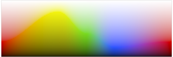
Here is the color wheel above shown as a hue/luminosity chart. As you can see, yellow has the highest luminosity and blue has the lowest, with purple very close to blue.

hue-luminosity

Here is the color wheel above shown as a hue/luminosity chart. As you can see, yellow has the highest luminosity and blue has the lowest, with purple very close to blue.

hue-luminosity

Bounty Ended with 200 reputation awarded by mattdm
added 806 characters in body
Source Link

However, if you make the image full screen and turn off all the lights in the room, it will again appear as normal. This darkened yellow will look "yellow" again. 

Now if the image is darkened to one eighth of its original brightness, the colors are all so dark now that you can barely even see them:

Conversely, if you go back to the first image and you turn the brightness on your monitor wayyyy up, so that the violet is no longer dark but is really bright, then you've created a bright violet. However, in the process, you've brightened all the other colors as well, so the brighter violet you just made is still dark relative to all the other colors.

All of the above assumes an RGB color model. Although our eyes are wired for RGB receptors, they certainly don't limit values to nice ranges like [0,1]. In reality, our eyes measure brightness logarithmically. Nevertheless, color models like RGB do allow us to represent and recreate a good portion of the visible colors on our computer screens, and although there are other models which take perceptual subtleties into account more accurately than RGB, it is still true that our eyes perceive blue to be less bright than red or green, and this is why violet and blue are always darker than yellow and orange — especially pure blue (sometimes called ultramarine blue). In practice, most of the colors we think of as "blue" in life actually have quite a bit of green mixed in. Similarly, most colors we think of as "yellow" in life actually have a bit of red mixed in, tilting them toward the oranges slightly.

Finally, there's technically nothing in real-life light that prevents there from being a huge spike of blue light reflecting off an object — but it just doesn't happen in practice, due to the way white light is broken down, absorbed, and reflected.

An exception to this is fluorescent colors. With fluorescent colors, you can get bright spikes of purer colors because the energies of nearby wavelengths are collected together and re-emitted on a purer wavelength. If you've even seen a blacklight poster lit by a bright fluorescent blacklight bulb, you will actually see very bright blues and violets — and what's interesting is that they aren't really much darker than the oranges and yellows and greens. (All the normal rules are out the door when it comes to blacklights. :)

However, if you make the image full screen and turn off all the lights in the room, it will again appear as normal. This darkened yellow will look "yellow" again. Now if the image is darkened to one eighth of its original brightness, the colors are all so dark now that you can barely even see them:

Conversely, if you turn the brightness on your monitor wayyyy up, so that the violet is no longer dark but is really bright, then you've created a bright violet. However, in the process, you've brightened all the other colors as well, so the brighter violet you just made is still dark relative to all the other colors.

All of the above assumes an RGB color model. Although our eyes are wired for RGB receptors, they certainly don't limit values to nice ranges like [0,1]. In reality, our eyes measure brightness logarithmically. Nevertheless, color models like RGB do allow us to represent and recreate a good portion of the visible colors on our computer screens, and although there are other models which take perceptual subtleties into account more accurately than RGB, it is still true that our eyes perceive blue to be less bright than red or green, and this is why violet and blue are always darker than yellow and orange — especially pure blue (sometimes called ultramarine blue). In practice, most of the colors we think of as "blue" in life actually have quite a bit of green mixed in. Similarly, most colors we think of as "yellow" in life actually have a bit of red mixed in, tilting them toward the oranges slightly.

However, if you make the image full screen and turn off all the lights in the room, it will again appear as normal. This darkened yellow will look "yellow" again. 

Now if the image is darkened to one eighth of its original brightness, the colors are all so dark now that you can barely even see them:

Conversely, if you go back to the first image and you turn the brightness on your monitor wayyyy up, so that the violet is no longer dark but is really bright, then you've created a bright violet. However, in the process, you've brightened all the other colors as well, so the brighter violet you just made is still dark relative to all the other colors.

All of the above assumes an RGB color model. Although our eyes are wired for RGB receptors, they certainly don't limit values to nice ranges like [0,1]. In reality, our eyes measure brightness logarithmically. Nevertheless, color models like RGB do allow us to represent and recreate a good portion of the visible colors on our computer screens, and although there are other models which take perceptual subtleties into account more accurately than RGB, it is still true that our eyes perceive blue to be less bright than red or green, and this is why violet and blue are always darker than yellow and orange — especially pure blue (sometimes called ultramarine blue). In practice, most of the colors we think of as "blue" in life actually have quite a bit of green mixed in. Similarly, most colors we think of as "yellow" in life actually have a bit of red mixed in, tilting them toward the oranges slightly.

Finally, there's technically nothing in real-life light that prevents there from being a huge spike of blue light reflecting off an object — but it just doesn't happen in practice, due to the way white light is broken down, absorbed, and reflected.

An exception to this is fluorescent colors. With fluorescent colors, you can get bright spikes of purer colors because the energies of nearby wavelengths are collected together and re-emitted on a purer wavelength. If you've even seen a blacklight poster lit by a bright fluorescent blacklight bulb, you will actually see very bright blues and violets — and what's interesting is that they aren't really much darker than the oranges and yellows and greens. (All the normal rules are out the door when it comes to blacklights. :)

Source Link
Loading