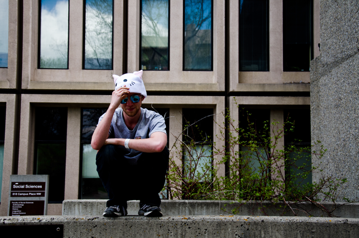
I think the common features to such images are:
- story telling through perspectives; little to do here in post-processing
- dramatic high-contrast scenes (bright sky or artificial light sources and almost black silhouettes and shadows); this can be emphasized with curves;
- undersaturated colors; this can be achieved in different ways, but saturation slider is the easiest way;
- color tints (and also split-tones, with one tint in shadows, and another tint in highlights); through channel combinations, separate color curve adjustments or with a dedicated instrument/filter;
- emphasized or artificial vignetting (darker corners like in cheap lenses); radial gradient masks and channel combinations or a dedicated instrument/filter
All together this gives slightly wrong colors and lo-fi look, and somewhat resembles vintage amateur photography. Overall it may give a surprisingly good impression, and there are countless variations.
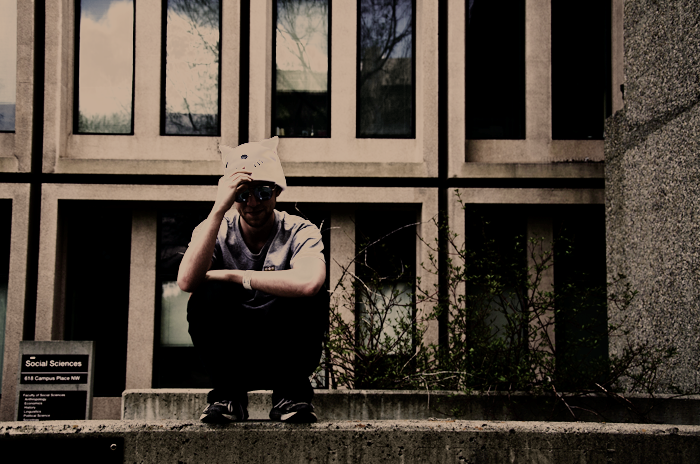
Your photo processed this way in Darktable, saturation reduced to 65%, split tone (cyan in shadows, red in highlights), vignetting; curves untouched:

Increased contrast may be great sometimes, but I think you overdid it in your processed example. There is enough of it already in this photo. Undersaturated colors stand out from the oversaturated colors of commercial imagery around us, and have a retro feel. They are also more forgiving for custom color tints. Color tints help to avoid dull gray of the modern urban architecture, and also make even distant accidental colors appear closer and more harmonic. They define the general warm or cold apperance of the image. Split tone may be used to increase color contrast though, and in some shots may help the subject to stand out. Vingetting darkens the border of the frame, to draw attention to the subject in, otherwise, often too noisy street photo composition.


