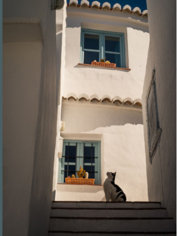
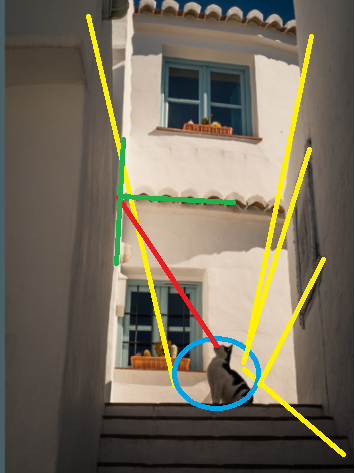
The composition in this image is all about leading lines and how they guide the viewer's eyes around the frame.

The lines outlined in yellow all lead to the cat. The posture and head position of the cat leads us to look along the red line to see what the cat is looking at. That line leads us to the intersection of the green lines which is the intersection of (roughly) a vertical 1/3 line and a horizontal 1/2 line.
These leading lines are reinforced by the way our human brains are wired to 1) visually notice animals at a higher priority than inanimate objects and 2) to look and see where that animal is looking. The cat's posture indicates a possible source of danger or food at which it is looking, and we're evolutionarily conditioned to see if that might also be a source of danger or food for us.
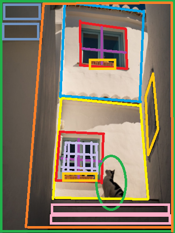
Additionally, you have sets of of "boxes within boxes within boxes" or "frames within frames." The one near the top has the inner box centered in the outer box. The one on the bottom has the inner box shifted to the left which leaves space to the right for the cat. There's also the skewed box formed on the wall to the right by the artwork which really gives that wall, and the image, a dimensionality it would not otherwise have. You also have the rectangles at the lower right (pink) balancing against the rectangles at the upper left (light blue).

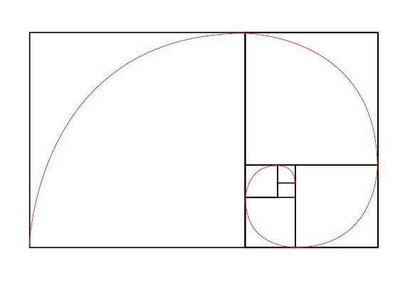
Combining simple geometric shapes next to or inside another is an oft used compositional technique. Some have suggested that the "secret" to the golden ratio (if there really is such a "secret") is that it allows a rectangle to be endlessly redacted into proportional squares. Circles inside squares or triangles, five pointed stars within circles, etc. are all common compositional combinations of regular geometric shapes.
