2
\$\begingroup\$

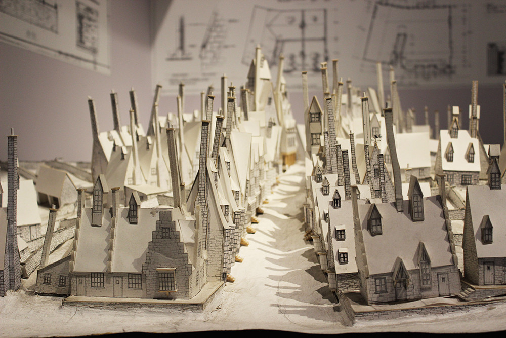
I really like that this picture seems very sharp and crisp but also a little hazy (but not in the lowered-clarity way), like if you looke at the spaces between model houses. How do the shadows seem so faint but the darks are defined at the same time? Likewise with the brighter elements.

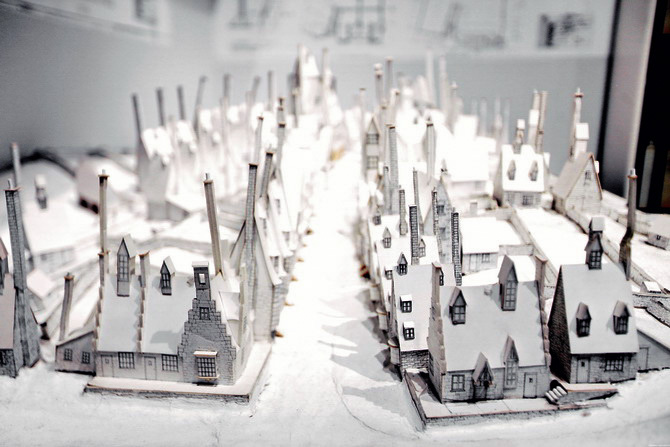
I know it may have been shot like this, but editing tips appreciated. For comparison, second image is a more "true to life" one from a different source.

enter image description hereenter image description here

\$\endgroup\$

3 Answers 3

0
\$\begingroup\$

I almost, but not quite, matched the photo in Lightroom. One thing to note is that the second picture is slightly different. You can tell by the shadows on the front buildings on the left and by how the chimney is missing the very top. I also think that either the first photo used a fast prime lens or else stood back father with a telephoto as the DOP is shallower.

Anyways, what I first did was set the photo to B&W in the color panel. I played with the white and black clippings as well as the highlights and shadows. I ended up pushing the highlights all the way down to -100, the shadows and whites to +100, and blacks to -60. Still wasn't quite there so I messed with contrast. Contrast was set to -33.

Still not quite right. I pushed the yellow and orange down a tad. To finish it off, I decided to use graduated filter with sharpness set at -77 to imitate the deep depth of field. Did not exactly work as the chimneys were getting unsharpened the same as background elements.

Anyhow, I ended up with this photo: enter image description here
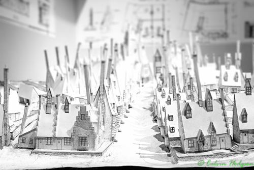
Oh, just copyrighted the photo somehow. For education purposes. Shadows might be a touch too dark in comparison to the original.

Amendment

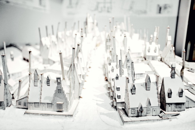
The first photo does have color as can be seen from the doorway on the right-hand edge of the photo. Also, converting to B&W in PS really does show how there is a slight amount of color about the whole image.

From what I can discern, the saturation of orange and yellow was pushed near black and white (about -85 and -70, respectively) but not all the way. Vibrancy was added around ~10 to give it a pop of color. Still not quite, but messing around with the sliders will give you around that look. Highlights, shadows, blacks, and whites were all processed the same way as what I did for the above photo.

\$\endgroup\$
5
  • \$\begingroup\$ There's more compression in the second shot as the background looks wider compared to the first. This indicates a longer focal length (or smaller sensor) used from a further distance. The elevation of the second shot was also lower. Focus seems to also have been centered a row or two further back from the front in the second image, whereas the first seems to be focused dead center on the second house to the right on "main street". \$\endgroup\$
    – Michael C
    Commented Feb 14, 2016 at 2:33
  • 1
    \$\begingroup\$ Also, I don't think the first image is black and white. You can see a little bit of yellow in the very back row of houses and some red in the middle. \$\endgroup\$ Commented Feb 14, 2016 at 2:37
  • \$\begingroup\$ Thanks for this awesome answer, Kel! I do agree with Michael Clark that I think this was taken in color. Do you think it's possible the orange/yellow decrease was some kind of vibrance/saturation decrease? And that there's compensation in the other factor (saturation or vibrance) to make up for that? If you see the full set of these photos (found it at thecherryblossomgirl.com/harry-potter-studio-tour/35126) there's something interesting on with the colors, too they look faded and saturated at the same time, that's why I ask. \$\endgroup\$
    – Jessica W.
    Commented Feb 14, 2016 at 4:02
  • \$\begingroup\$ @user1118321 Yeah, I could tell the image had some color to it. I can sure see the differences between the two more clearly now that you point them out. \$\endgroup\$
    – Kel
    Commented Feb 14, 2016 at 5:02
  • \$\begingroup\$ @JessicaW. for sure it was shot in black and white. For all intents and purposes, I was trying to recreate it via B&W at first thinking they had done the same. I can tell upon closer inspection that there is color in the middle-right edge from the doorway that is brown. In that case, it is more than likely selectively reducing the colors down. The same concept still applies for the highlights, shadows et. al. Yellow and orange dominate this. The vibrancy is actually pushed UP a bit. Converting between B&W in PS shows that there is the hint of color. I'll amend my post as comments has limit \$\endgroup\$
    – Kel
    Commented Feb 14, 2016 at 5:25
0
\$\begingroup\$

I see a few things:

The first picture has a neutral white balance, whereas the second picture has a yellowish white balance.

The first picture is slightly overexposed, whereas the second is normally or maybe slightly underexposed.

The first picture has a shallow depth of field, maybe f/1.8 or f/2.8, whereas the second picture has a much deeper depth of field.

\$\endgroup\$
0
\$\begingroup\$

I think there are two light sources in the first image. There could be a light on the top. Also, the first image is too over-exposed.

If you have shot this in raw, you would have been able to recover those shadows in post processing, provided there isn't light coming from above.

I tried to edit the picture. And, this is what I got.

enter image description here

\$\endgroup\$

Your Answer

By clicking “Post Your Answer”, you agree to our terms of service and acknowledge you have read our privacy policy.

Not the answer you're looking for? Browse other questions tagged or ask your own question.