3
\$\begingroup\$

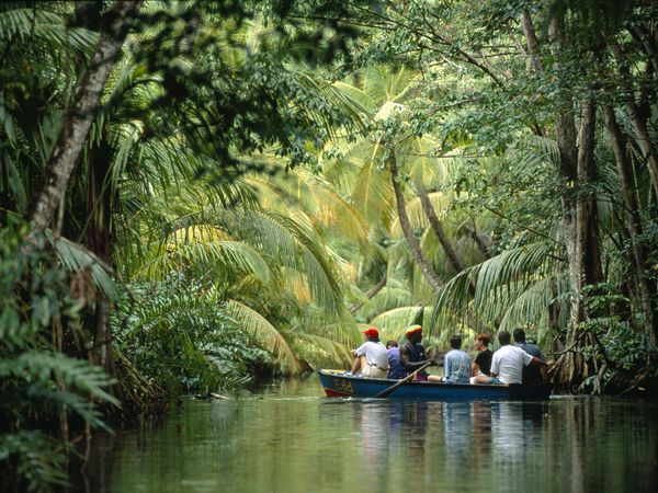
Pictures like this (and I know this is an already-beautiful rainforest) remind me of how a place looks when you imagine it in your head. They have a kind of magical, dreamy touch while also being fairly true to life.

I think the effect I like is what I perceive as the low depth of field (which I assume is the key here?) –– but beyond the blur/focus factor. I'd like to understand how to recreate these admittedly contradictory things about it:

  • color: very vibrant (red hat, yellow exterior leaf tips) and also desaturated (green leaves in darker part) and never fake-looking.

  • edges: Strongly defined, even sharp (grainy?), while soft, light, and faint.

  • detail: Also defined, as if shadows were lifted and highlights decreased (if we're talking post processing) – but what would be defining the stronger blacks then? There doesn't seem to be a whole lot of darkness.

  • lighting: very intense but somewhat diffused and soft.

In general, the image is soft, and it pops at the same time. So, what's the effect and how do I get it in these two ways?

In camera: wide aperture? Increased exposure? Slower shutter speed? Higher ISO? Lower ISO but slower shutter speed? And so on..

Post production: Increased exposure with stronger blacks? Increased shadows with stronger blacks? Decreased contrast with stronger blacks? Increased contrast with weaker blacks? Vibrance up, saturation down? Selective saturation and desaturation? Tone curve? Sharpness up, clarity down? Clarity up, sharpness down? Sharpness down, grain up? You get the idea... Thanks for your help!

source:Michael Melford via National Geographic

\$\endgroup\$
3
  • 8
    \$\begingroup\$ I don't see anything "vintage" about this image personally \$\endgroup\$
    – osullic
    Commented Feb 13, 2016 at 11:26
  • \$\begingroup\$ I think what feels vintagey is the "binocular" effect the below person mentioned. Reminds me of something from a 1970s travel catalog. Any further ideas about how to achieve it, both in camera and post, are appreciated. \$\endgroup\$
    – Jessica W.
    Commented Feb 13, 2016 at 19:48
  • \$\begingroup\$ I watched a video from B&H about a Nat Geo photographer and how he does his process. If this was shot for Nat Geo–and not a personal project–then not a whole lot is done via post-processing as publications want to keep photos as true to life as possible. \$\endgroup\$
    – Kel
    Commented Feb 14, 2016 at 1:48

2 Answers 2

6
\$\begingroup\$

In-camera: the film/sensor may have been at least full-frame, maybe medium-format, or otherwise larger than usual, which gets you what I'll call the Brenizer look. Telephoto lens for compressed perspective, giving the appearance of looking at the scene through a window or binoculars, if you will. Don't forget the strong composition.

Lighting: it looks like there's a mixture of soft overhead light and a bit of hard light. The former creates the muted tone in the majority of the image.

I can't speak too much for the postproduction side of things, but I'd agree with you that it's a combination of accurate color, slightly boosted shadows, and slightly lowered blacks. Vibrance up, saturation down perhaps?

\$\endgroup\$
3
  • \$\begingroup\$ National Geographic doesn't like post-processed photos unless it is to color correct (besides the camera doing processing internally). Matter of fact, most publications have very little done to them. B&W had a speaker from Nat Geo talk about his process and the industry. It was great to get insight into the business of publications. \$\endgroup\$
    – Kel
    Commented Feb 14, 2016 at 6:17
  • 2
    \$\begingroup\$ When Melford started shooting assignments for Nat Geo in 1998, they weren't publishing any digital images. He shot the first digital assignment ever produced for the National Geographic Society in 2001. \$\endgroup\$
    – Michael C
    Commented Feb 14, 2016 at 8:44
  • \$\begingroup\$ @Kel Really? The McCurry photo of an Afghan girl on a 1985 cover has since been shown to have been touched up, and evidence points to NatGeo's editors being the culprits in that case. On the other hand, McCurry did plenty on his own as well. \$\endgroup\$
    – Michael C
    Commented Aug 3, 2019 at 3:00
6
\$\begingroup\$

First, it's all about the composition and lighting. Always.

Imagine what this same shot would look like if the man wearing the red hat was wearing, instead, a dark olive hat on that day? The "pop" of that red hat in the middle of the locus of that light yellow-green vegetation surrounded by the darker green trees and water is what really makes the shot. The swooping lines created by several of the fronds lead the eye right to that red hat. Swap the red hat with the one worn by the man rowing and you have a totally different photo, aesthetically. Swap the very light and very dark colored shirts each is wearing and it gets even more different.

How do I give my images this vintage travel photo effect?

You can shoot them properly exposed on a medium format camera with quality, low speed film. That's what this shot appears to be. If shooting digital you can use a camera with large pixels at low ISO and keep contrast and saturation under control. Expose properly when you take the photo. Do as little as is necessary in post. A scene such as this shouldn't take much, if any, post processing when properly shot.

It looks vintage because, like large format low speed film, there's very little noise/grain and good image detail.

Also like premium film, the color is vivid while being nowhere near as saturated as most digital cameras set to "Vivid" or "Eye-bleeding" color saturation. And don't even mention those who would try to create technicolor-ed rainbows of vomit using an HDR application to "enhance" this photo.

The same goes for contrast. There's not twice as much contrast as is needed. There's just enough. Kind of like properly developed and printed low speed film.

The photo has the "look" of one made with either a camera with large pixels or a camera with a larger than 35mm film negative. But at only 600x450 pixels, it is hard to tell. In the right hands today at that resolution, other than the shallow depth of field, it could have been taken using a phone with a decent camera. And the aspect ratio is 4:3 (most cameras with Four-Thirds and smaller sensors), not 3:2 (most FF and APS-C cameras). It could be a MF camera though. Or it might just be cropped.

If it was taken with a fairly long/narrow angle of view lens, the telephoto compression would distort the shape of the boat's hull at that angle. The lack of such distortion leads me to think it was made at a fairly normal focal length: one close to the diagonal length of the imaging sensor. If that is the case, then a wide aperture was also used. At 600x450 there's not enough detail to be sure, but the bow of the boat seems to be just a tad softer than the stern, so the depth of field looks fairly shallow.

External Clues

The image was taken by National Geographic contributor Michael Melford. He began doing work for National Geographic in 1998 and started receiving feature assignments in 2003. Feature assignments for NatGeo usually meant being totally immersed in a project for months at a time.

His string of 13 features published in just over 7 years between 2005 and 2012 may have left little time for an assignment located on Dominica. None of his feature articles published during that span sent him to anywhere in the Caribbean where this was captured. That leads me to conjecture that this image could have been made during the 1998-2003 time frame when most of his assignments were for NG Traveler and may well have been captured using a 645 medium format film camera using either film (most likely) or an early digital back.

Based on this dated bio and this one on his facebook page, he shot mainly with Contex medium format film cameras until his first digital project in 2001 when he used a Contex 645 with a Kodak digital back to shoot The National Geographic Society's very first digital photo assignment. He later moved to the Canon EOS 1Ds which was in production from 2002 to 2004.

On the other hand, the earliest reference to this image on the web found using tineye is a 2008 National Geographic Traveler travel guide featuring the island of Dominica. However, the image has also been used as a file image for several various other travel guides published since by National Geographic and others. It may be possible the original print publication of the image was prior to the digital publication of National Geographic Traveler. The fact that the largest resolution of the image found by tineye is 600x450 supports the theory that it is a file image that existed prior to that usage.

\$\endgroup\$
7
  • \$\begingroup\$ I love your detective skills! So... no tips from your end on recreating this in post then, I take it? And you mention HDR, and I see that a lot of his images look very HDR-y, but this one doesn't to my eye. I personally don't enjoy his more HDR-looking photo sas much. What makes you say that about this one? \$\endgroup\$
    – Jessica W.
    Commented Feb 14, 2016 at 19:27
  • \$\begingroup\$ "...no tips from your end on recreating this in post then, I take it?" Expose properly when you take the photo. Do as little as is necessary in post. A scene such as this shouldn't take much, if any post processing. That's why I proposed that a current cell phone in the right hands could have captured this for display at 600x450. \$\endgroup\$
    – Michael C
    Commented Feb 15, 2016 at 3:20
  • \$\begingroup\$ "And you mention HDR, and I see that a lot of his images look very HDR-y, but this one doesn't to my eye. I personally don't enjoy his more HDR-looking photo sas much. What makes you say that about this one?" That's just the point. This one has no resemblance to most (poorly done) HDR photos. Melford didn't really go off a little too deep into his HDR edits until the financial woes at NG (and pretty much the entire print magazine industry) forced him to trade in special assignments for teaching workshops on expensive tours. Amateurs with more money than sense eat that stuff up. \$\endgroup\$
    – Michael C
    Commented Feb 15, 2016 at 3:23
  • 1
    \$\begingroup\$ Downvoter: I'm wondering why the downvote? Michael's answer is textbook reverse-engineering, with a detective-level eye for detail to pin down how/where/when this photo was probably shot. Is this answer fundamentally wrong, or can it be improved so as to not earn the downvote? I'm not challenging you, I just would like to encourage more constructive criticism of what to my eye appears to be a very thoughtful answer. \$\endgroup\$
    – scottbb
    Commented Feb 17, 2016 at 2:15
  • 1
    \$\begingroup\$ It was a mistake! I agree that this is an amazing answer. Corrected (I think?) \$\endgroup\$
    – Jessica W.
    Commented Feb 23, 2016 at 2:15

Your Answer

By clicking “Post Your Answer”, you agree to our terms of service and acknowledge you have read our privacy policy.

Not the answer you're looking for? Browse other questions tagged or ask your own question.