As others have said, it's largely lighting. As much as people like to moan about the quality of "entry level" cameras and affordable lenses, almost anything beyond point-and-shoots and camera phones these days is actually better from a purely picture-making perspective than anything the dedicated professional small-format photographer had in his/her arsenal when I was a youngster. (Ruggedness and "build quality" are another matter, and have more to do with reliability and longevity than with picture quality.)
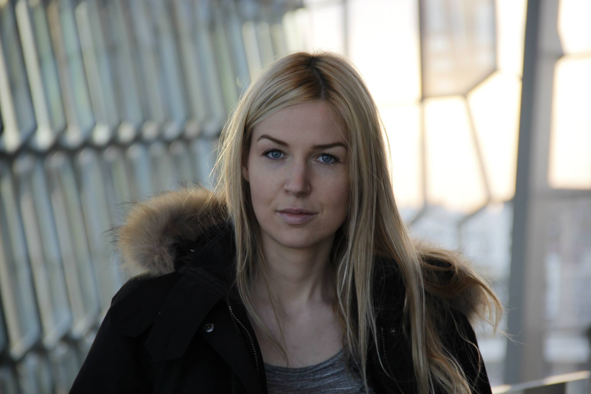
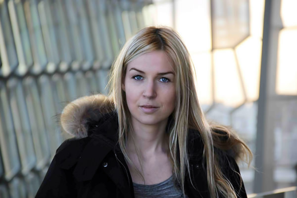
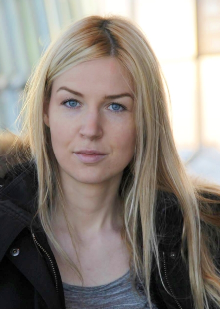
It is very difficult to tell exactly what your camera captured because of the high amount of JPEG compression, but a rather quick trip through Photoshop to simulate a slightly contrastier, but otherwise similar, light yielded this:

Very little was done to the image; it consisted mostly of applying a curves layer (set using "Auto" just on the face and shoulders) and masking it to the subject only. The curve was then pulled back to about 80% opacity because I've learned over the years that when it looks good to me, I've overdone it. (I'll always thank myself for doing that the next day.) That introduced — or, rather, enhanced — some colour artifacting, which I cleaned up to keep the image from looking, well, unfortunate. I used samples of good skin tone on a layer set to Color blend mode above the low-frequency layer of a frequency separation, in case anyone's interested. (Working from a raw image or a clean high-quality JPEG would have made that step unnecessary; without it, working on the supplied image would have been unflattering to the point of insulting the subject. By the way, I have reason to believe that a full-rez, HQ version of this image could easily become a wall-hanger with only a few minutes of work.)
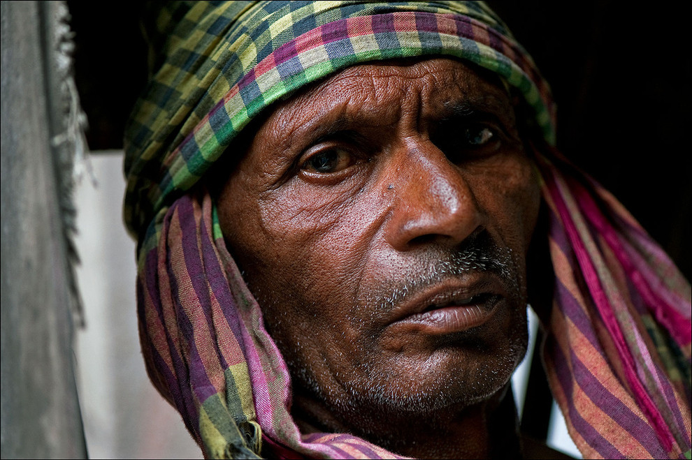
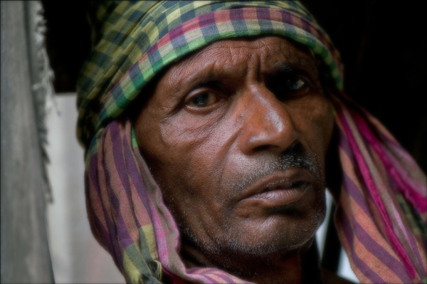
Conversely, sucking all of the contrast out of the other example image (both locally, to simulate much softer light, and globally to simulate flatter light) results in this:

(My apologies to the original photographer. I will gladly take it down upon request.) Please note that I haven't blurred anything in any way, I have simply reduced the contrast of the small details (under 3 pixels). This may well be very close to the image as it came out of camera; there is really no way to tell. And no, there's nothing much I can do with the image to overcome the size of the subject in the frame, the courseness of the man's complexion compared to the lovely subject above, or the stark difference between the specular reflections on this subject's skin and the darker skin tone. But still, as it stands it's a lot more point-and-shoot than "stunning portrait" at this point.
The point was to demonstrate that "detail" is really just contrast. A very high-quality lens on a very high-quality, high-resolution sensor can generate smaller, more localised contrast, so there is some point to using better equipment. But while flat, soft lighting is "safe" and easy to use with people, that "safety" consists mostly of avoiding details that may not be entirely flattering. More contrast and more attention paid to where the highlights and shadows are falling is more difficult and "dangerous", but it almost always results in better pictures (for some value of "better"). And yes, you may need to process out some amount of detail after capture/development, but while softening parts of an image (or healing problems) can solve the "too much detail" problem, no amount of sharpening can add detail that wasn't there to begin with. Mind you, the bumped-up version of your image is still very soft lighting, it's just no longer as flat as in the original.
Shade is a wonderful thing, but look for shade that forces a direction to the light. Stay close to the entrances to shady areas. When you use fill, don't overfill. Contrast (within reason) is your friend. And if the contrast is there in the captured image, but at a lower level than you'd like, it's often just a matter of bringing it to the fore to go from meh to stunning — it's just a matter of knowing when and how to do it, of recognizing the cut diamond in the rough stone.
