16
\$\begingroup\$

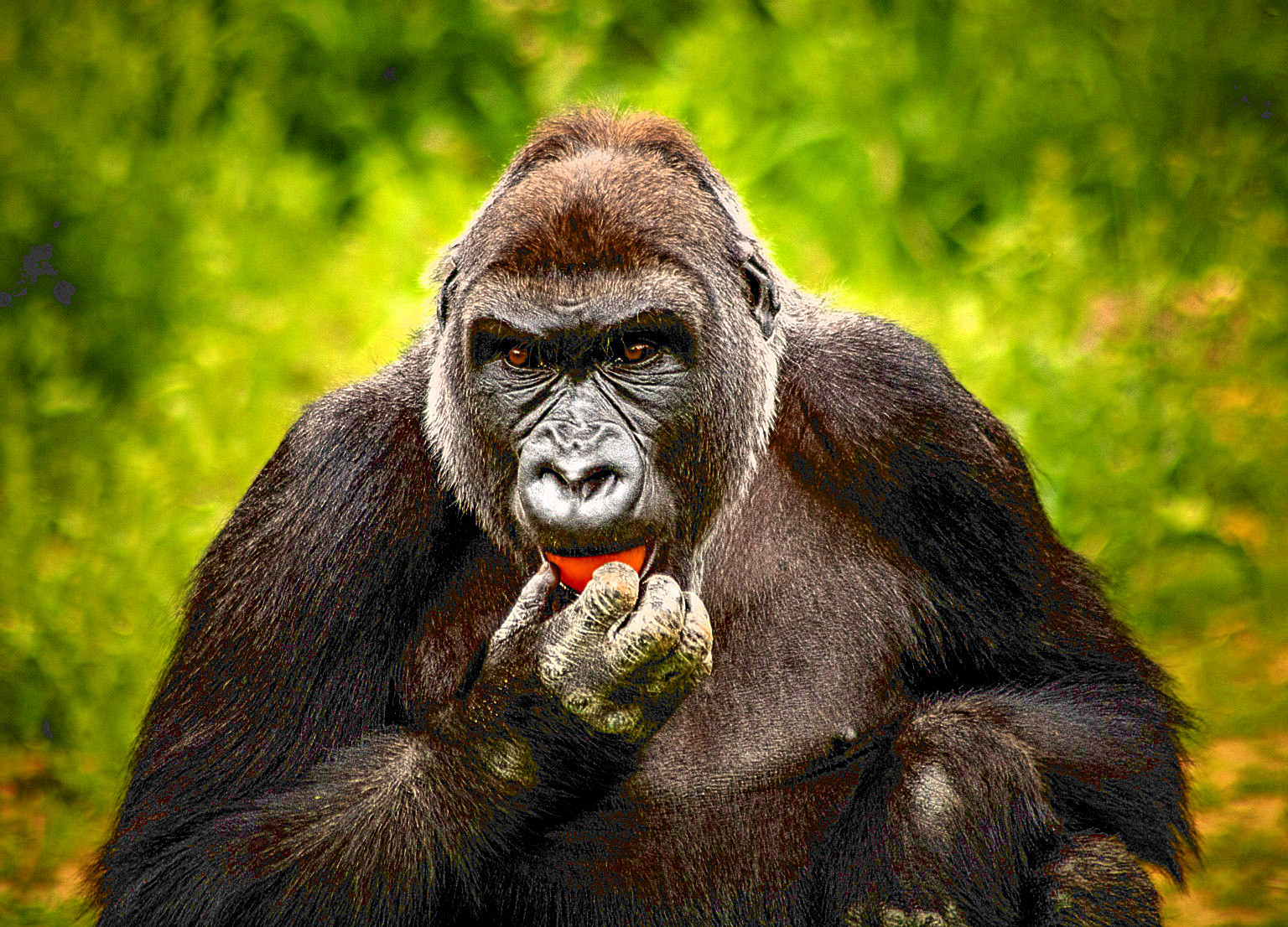
enter image description here enter image description here

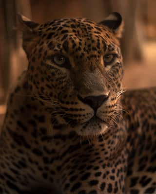
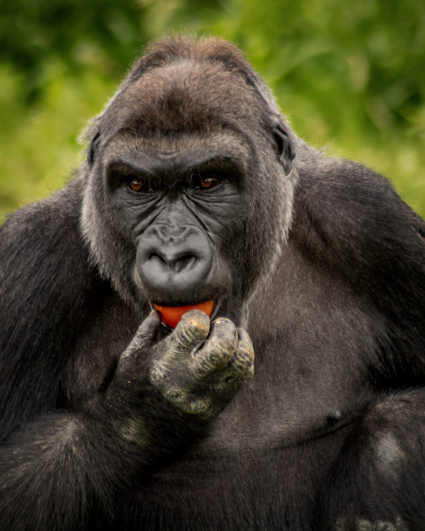
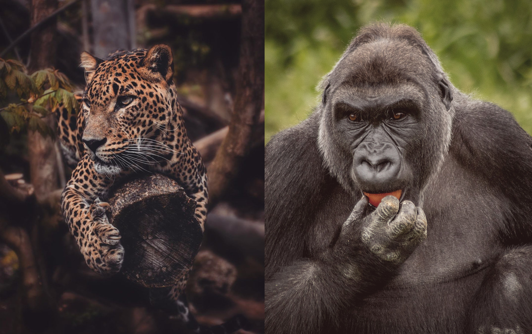
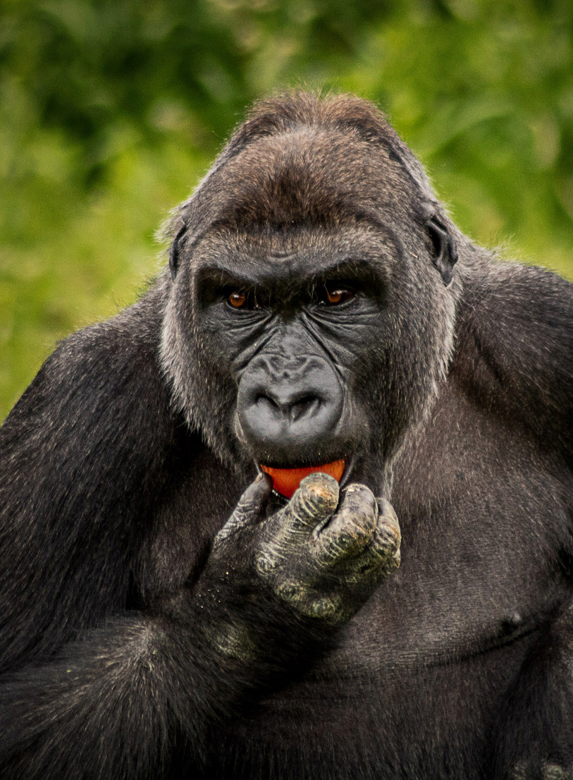
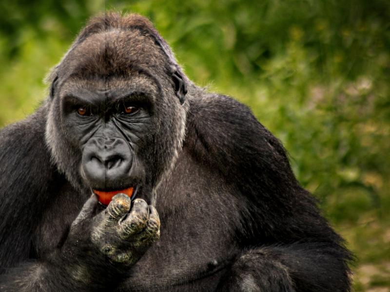
The first photo (Gorilla) is one I took, whereas the second photo was taken by a more serious (not sure if professional) photographer.

The second photo is clearly better but I'm not sure what the biggest factor is, or which of the following three options would have the most effect in making my photos look as good as his.

In this instance I'm not concerned about the skill of the photographer as I only do it as a hobby.

Body

I used a Canon 750D, whereas a Nikon D5600 was used for the Leopard.

Both crop-sensors so I'm assuming there's not a HUGE amount of difference here?

Lens

I used a Tamron 70-300mm f/4.0-5.6 Di LD (Cheap lens ~£100 new). Unfortunately, I'm not sure what lens he used.

Post-Processing

Other than cropping, the only post-processing I did was with the Camera Raw Filter. I can't remember exactly what I did but it would've been along the line of:

  • Vignette

  • Reduced exposure

  • Increased contrast

  • Reduced highlights

  • Increased clarity

  • Increased dehaze

  • Increased saturation

  • Radial filter to darken area around subject

Additional info requested in comments

  • Photo taken at 300mm, f/5.6, ISO-800, 1/640 sec, Handheld

  • I use manual focus on the Tamron lens because the AF is a bit slow and clunky.

  • My only goal with the photos really is to make them look as if they could've been taken in the wild (not at the zoo). However, I do also like the 'dramatic' look if possible.

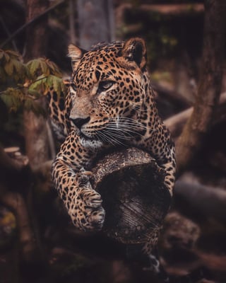
EDIT Thanks for all your suggestions. I went and took a picture of a leopard myself (Used the Canon nifty fifty) :)

leopard

\$\endgroup\$
5
  • 1
    \$\begingroup\$ Well, how would you describe what you like about the second one which you feel is missing from the first? \$\endgroup\$
    – mattdm
    Commented Sep 9, 2019 at 11:37
  • \$\begingroup\$ @mattdm Tricky to say but I think it's mainly that the second photo seems much sharper and higher quality. In terms of post, It looks to me as if it has a slight magenta overtone which fits nicely with the background (Probably wouldn't suit my photo, but perhaps an equivalent exists) \$\endgroup\$
    – Xander
    Commented Sep 9, 2019 at 12:47
  • \$\begingroup\$ @Xander How about "What's the biggest difference in quality between these two photos?" \$\endgroup\$ Commented Sep 10, 2019 at 8:40
  • \$\begingroup\$ I have updated the question with a photo I took after reading everyone's answers. Thank you :) \$\endgroup\$
    – Xander
    Commented Sep 20, 2019 at 7:36
  • 1
    \$\begingroup\$ "The second photo is clearly better". I don't see this statement as clear and obvious. A lot of it is to do with taste. Both photos are equally unremarkable IMO. If they were part of a larger exhibition, I'm sure I'd walk right past both. \$\endgroup\$
    – osullic
    Commented Apr 3, 2023 at 21:21

10 Answers 10

25
\$\begingroup\$

The second picture is 'better' mainly because it's a glamorous big cat looking glamorous and dangerous. It's better for the same reason pictures of James Dean are better than pictures of me.

Compositionally I like the fact that the leopard picture is portrait rather than landscape (this is mostly personal preference however) and that the whole cat is in the frame, with narrow-enough DoF to mean that you just get hints of most of it. I like the leaves in the RHS of the leopard picture. In your picture most of the gorilla is missing, and in particular the left hand is missing which annoys me.

For the gorilla I don't think you could have had all of it (hmm, I feel bad calling a gorilla 'it' but not a leopard, which is linguistically interesting) in the frame while keeping attention on the whatever is being eaten which is the focal point of the image. It might have been better to be closer (or zoom more) and just frame the interesting part. Perhaps something like this:

cropped

Although I spent approximately zero time thinking about composition when doing this crop (it wants more space at the top I think, but that's the top of the original frame, so there's none to be had). However I'm of the rather pretentious print-the-whole-frame-with-a-black-line-showing-the-rebate school generally so I feel bad about crops. Again that's just me.

That crop as it is is not really sharp enough even for me, especially the eyes: I don't know if that's because I'm doing it from an already-downsized JPEG &/or imgur is further lowering the quality. But it may be there just isn't enough resolution to be had, in which case the answer is a longer lens or (better!) being closer ('if your pictures aren't good enough, you're not close enough'). Or it might be the focus is wrong but I don't think so.

In terms of image quality and all that stuff: don't care, your picture is fine. Again, that's just me: I like pictures & the stories they tell. I'd be very pleased if I'd taken that picture.

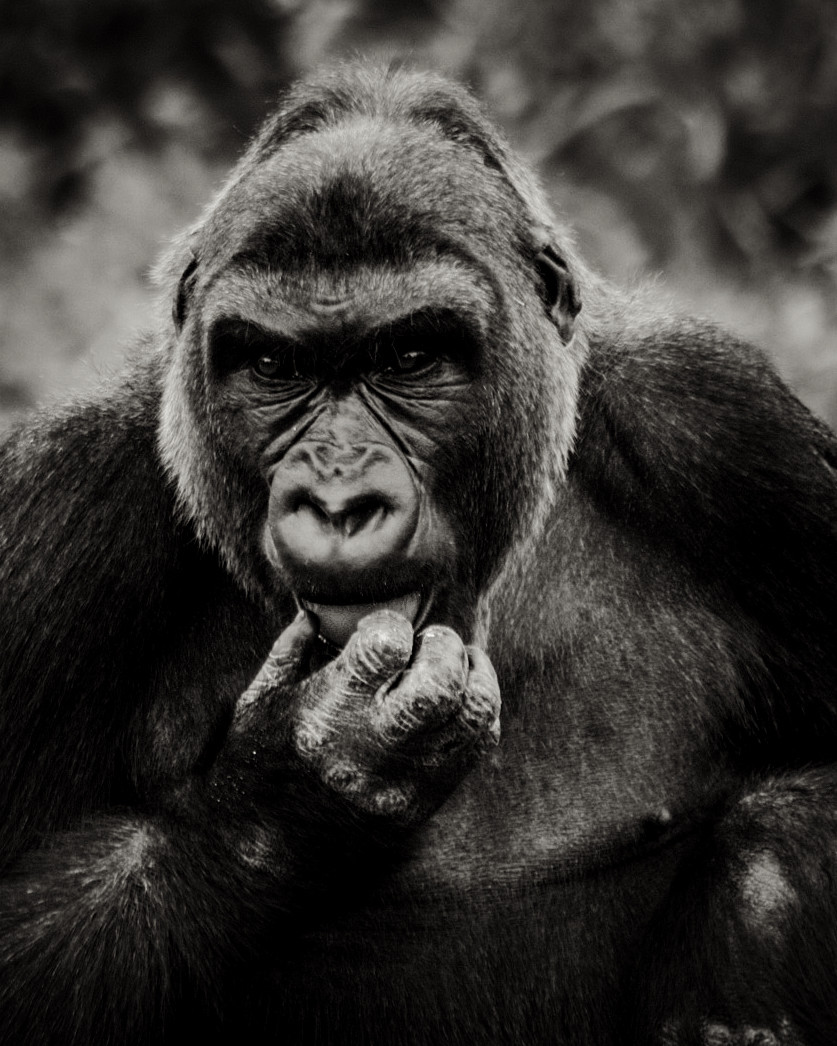
(And of course, I'm always tempted to say that everything looks better in black and white:

cropped-bw

even with a very rudimentary conversion. Except it doesn't look better: it looks more 'filmy' because the slight unsharpness now looks a bit like B/W 35mm film, but it is missing the colour of the thing being eaten which is critical to the image: so this needs to be in colour. So I'm wrong about that.)

\$\endgroup\$
6
  • 9
    \$\begingroup\$ I don't agree this particular pic looks better black and white. The color of the food and gorilla's eyes are major highlights of the image. \$\endgroup\$ Commented Sep 9, 2019 at 7:26
  • 1
    \$\begingroup\$ @TomášZato: yes, neither do I. As you say this needs to be in colour. \$\endgroup\$
    – user82065
    Commented Sep 9, 2019 at 8:43
  • 3
    \$\begingroup\$ "if your pictures aren't good enough, you're not close enough", I second this. A big part of why the leopard looks more '3D' than the gorilla is that it shot closer up with a shorter focal length. Getting closer increases the contrast between subject and background/foreground, thereby increasing the feeling of depth in the scene. \$\endgroup\$
    – AkselA
    Commented Sep 9, 2019 at 16:32
  • 2
    \$\begingroup\$ I +1ed entirely because of the first sentence. Gorillas aren't terrible animals, but Leopards (and arguably all cats) will always leave other animals looking less impressive by the sheer nature of their elegance. \$\endgroup\$
    – Pharap
    Commented Sep 10, 2019 at 3:35
  • 2
    \$\begingroup\$ @Pharap: I once was asked why I gave money to charities involved with tigers: the answer is 'because there should be tigers in the world'. So, yes, \$\endgroup\$
    – user82065
    Commented Sep 10, 2019 at 11:35
27
\$\begingroup\$

Short answer because there are many good explanations already:

  • The brightest part of your picture is the background.
  • The brightest part of the second picture is the subject.
\$\endgroup\$
2
  • 1
    \$\begingroup\$ And what do you recommend for backgrounds when taking pictures of a black object? \$\endgroup\$ Commented Sep 14, 2019 at 0:44
  • \$\begingroup\$ @user1118321 good question. :-/ I think having a brighter background all around the subject would help, in order for the viewer's eyes to stay centered on the subject. Then, I suppose rim lighting for the shape and specular highlights for the texture would both bring bright parts to the subject without changing his tonality. \$\endgroup\$ Commented Sep 14, 2019 at 2:36
20
\$\begingroup\$

There is an additional element not taken into account in other answers: Color grading.

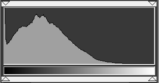
First, let us compare the two histograms. Here is the kitty one.

enter image description here

And here is your photo's histogram.

enter image description here

As you can see, the kitty's one, even if there are zones that are clearly on a dark shadow, like behind the trunks you do not have any black.

This is perceived as a higher dynamic range image. These days can be just trendy, but adjusting it on your image gives a more cinematic look.

I applied an aggressive sharpening not even done in Ps, so do not be afraid to use it if it helps your photo. I, personally, like to see the contrasted hairs. But let us focus on the color grading.

  1. Adjust the histogram moving the darker zone like 10% to the right.

  2. Decrease saturation. A very saturated image looks like a "cheap" trick to enhance it. This helps to reduce the distracting green and red fruit.

  3. Now apply a bit of warm tint. I just pulled up a bit of the red channel.

enter image description here

Now both images could be from the same series of animal photos.

enter image description here

\$\endgroup\$
4
  • \$\begingroup\$ Thank you, what method do you recommend is best for sharpening? Also, how did you choose to increase the red channel? Would a curves adjustment layer be appropriate? \$\endgroup\$
    – Xander
    Commented Sep 9, 2019 at 8:28
  • \$\begingroup\$ To increase the red channel I just pulled up the final point on the red curve. A clumsy method but works. \$\endgroup\$
    – Rafael
    Commented Sep 9, 2019 at 8:30
  • \$\begingroup\$ For sharpening... There are some refined methods involving a mask that basically detect the edges. Newer versions of Lightroom have these masks as a slider. \$\endgroup\$
    – Rafael
    Commented Sep 9, 2019 at 8:32
  • \$\begingroup\$ Cutting of black to a light grey greatly affects the overall mood and adds depth. I don't know the blog but clickinmoms.com/blog/lightroom-color-curves covers this pretty good. \$\endgroup\$
    – bam
    Commented Sep 10, 2019 at 13:32
11
\$\begingroup\$

The second photo is much sharper than the first. This is probably a combination of:

  • A sharper lens. The examples I've seen of the Tamron 70-300mm f/4-5.6 Di LD are not sharp enough to produce the second photo, even when perfect technique is used. Cheap 70-300mm zoom lenses, such as your Tamron, are almost universally softest at 300mm compared to other focal lengths in their range. There are much sharper lenses available, and the second image appears to have been taken with one of them. I'd be VERY surprised if the leopard was not captured with a very high quality prime lens.

  • The second photo is most likely shot on a stable support such as a tripod. There's no substitute for a rock steady platform when maximum detail is desired. Image stabilization only goes so far. Because of the slight misalignment of lens elements that VR/VC/IS/etc. uses, for absolute maximum sharpness, VR should be turned off and the camera stabilized.

Beyond that:

  • One is an ape and one is a cat
  • One is taken from a distance with a long focal length, the other appears to have been taken from closer with a shorter lens
  • One is taken in bright light with a diffuse green background, the other is taken in more subdued lighting with a more complex background
  • One animal is still breathing, the other looks like a taxidermied display at a museum of natural history somewhere (I could be wrong, but that's what it looks like to my eye.)
\$\endgroup\$
2
  • 1
    \$\begingroup\$ As far as I know, both animals are still alive and pictures were taken in a zoo. I assumed the second photo was also taken with a zoom lens but I suppose all I can do is be jealous if he managed to get that close with a prime. \$\endgroup\$
    – Xander
    Commented Sep 9, 2019 at 7:14
  • \$\begingroup\$ @Xander The perspective suggests a very close shooting distance with a wider angle lens. It's not hard to get close with a prime to a stuffed cat. \$\endgroup\$
    – Michael C
    Commented Sep 9, 2019 at 10:49
7
\$\begingroup\$

Many differences have been suggested already, many of which I agree with, breifly.

  • One's a gorilla, the other's a big cat. Cats look cool, they can't help it.

  • Gorilla is landscape, cat is portrait.

  • Gorilla is cropped, including missing a hand. Cat is full.
    I can see [or rather, thankfully, not see] the reasoning behind this - gorilla 'parts'… somewhat distracting as a picture on granny's wall.

  • Gorilla is quite flat. Cat has an elongated shape going back into the picture. Nicely 3D.

  • Cat was taken from fairly close on a short lens - increases depth perception. Gorilla from further on a long lens - decreases depth perception.

  • Gorilla is darker than the background. Cat is lighter & the overall lighting is very moody.

  • Cat pic looks like it has lifted blacks & overall pushed towards 'sepia'. Again very moody. Gorilla is very much 'natural light', though his greying hair does give it a hint of 'hair light'.

but here's the new one.

  • Cat is sharpened to within an inch of its life. Whether that's a much nicer lens, a helping hand in post, or both, I can't tell at that resolution.

Gorilla could be 'helped' the same way in post, so here's my crop & sharpen [2 mins effort, you could do better from the original].

I pushed him over a bit too, so he's looking across the frame rather than out of it.
I think it makes him look more like he's contemplating his next move rather than his next snack.

Cropping this tight also heightens the depth of the subject, even though the long lens & enforced distance has somewhat flattened the apparent perspective.

enter image description here

\$\endgroup\$
4
  • 1
    \$\begingroup\$ You might be surprised at just how close you can get to big cats in the wild without them taking any notice of you... facebook.com/vjosullivan/videos/10156818321826596 This leopard was taken from the same vehicle: facebook.com/photo.php?fbid=10156835676491596 \$\endgroup\$ Commented Sep 8, 2019 at 16:54
  • \$\begingroup\$ Your "new one" was also noted in other answers a day before this answer was posted. \$\endgroup\$
    – Michael C
    Commented Sep 9, 2019 at 4:31
  • \$\begingroup\$ @MichaelC - I don't see anyone else saying it has been post-pro sharpened. If you mean about whether it's dead or alive, frankly I don't care & I'm pulling that bit of opinion back out, as being irrelevant to the issue. \$\endgroup\$
    – Tetsujin
    Commented Sep 9, 2019 at 6:11
  • \$\begingroup\$ "Whether that's a much nicer lens, a helping hand in post, or both, I can't tell at that resolution." The observation had already been made that the second image was much sharper. You may have speculated that some of that was from oversharpening in post (which the visual evidence argues against - the expected artifacts are not there) but you then immediately backtracked to basically "It's sharper for whatever reason." \$\endgroup\$
    – Michael C
    Commented Sep 9, 2019 at 6:31
3
\$\begingroup\$

I see the following:

  • the red ball or tomato draws much attention.
  • the green background look unnatural, like in a zoo.
  • the Gorilla is not doing something interesting. It just sits there and seems to watch the photographer (almost). Again, like in a zoo.
  • the visual path is right into the center and stays there.
  • everything is perfectly symmetrical. The gorilla sits there like a pyramid, not gonna move.
  • seems a bit blurry, although it's still possible to identify single hairs.

In contrast, the Leopard

  • has no distracting other highlight
  • has a background the Leopard nicely fits in, hiding himself. Nothing reminds of a zoo. We don't see the cage in the background etc.
  • is looking somewhere else, not at the photographer. Maybe some eadible animal?
  • has several visual paths: the face, the claws and the direction of his eyes
  • It's not perfectly symmetrical. One claw is facing forward, the other hanging down. The branch help creating an unstable environment. Something's gonna change soon.
  • seems sharp, maybe just because the single hairs are easier to see.

I took the symmetry out of it in an unusual way (try the head on the right side, it'll not be the same). This opens some possible questions: didn't the photographer have more time to prepare? What's on the left side that we can't see? Sharpening also helps, I think (I sharpened the left two thirds, you can see the edge through the nose).

Proposed

\$\endgroup\$
1
  • \$\begingroup\$ To me the cat looks like a really good taxidermist has worked on it. If that is the case, ain't nothing ever changing as far as the cat is concerned. \$\endgroup\$
    – Michael C
    Commented Sep 9, 2019 at 2:10
1
\$\begingroup\$

I think one thing that is different is the muted look on the picture of the leopard.
Maybe it's intentionally muted in post processing or maybe the scene is just a bit muted there.

On the other hand the gorilla shot is colorful and vibrant.

Maybe the colorful scen makes the gorilla look less dangerous?
I mean lots of colors make me think of children and children's toys.

The dark scen and the leopard almost hiding in the colors of the background perhaps makes you more scared when you notice that it's not all branches and leaves in the picture.

\$\endgroup\$
1
\$\begingroup\$

Squint your eyes at the pictures. The gorilla is too dark and becomes a jumble whereas the cat is plenty bright. If you look at the histogram of the image, you can see the cat photographer had originally taken the image too dark and someone used a "brightness" control to lighten it. (However, whoever edited it is not a professional as they reduced the dynamic range when they did so; they should have used Curves instead of Brightness so that blacks would stay black instead of turning dark grey).

You mentioned you like "dramatic" pictures, so here is an example of how you could increase the brightness while also sharpening the contrast and colors.

Gorilla + LOMO filter + Auto Contrast + Richardson-Lucy Sharpening (masked to B-channel of LAB decomposition)

Obviously, you could do a more subtle modification to the image, if you wished. The method I used for this was to apply a "LOMO" filter, followed by Auto-Contrast Enhancement. For fun, I used Richardson-Lucy Sharpening to make the hair and eyes pop. Although probably not necessary, I also added a layer mask, based on the B-channel of the LAB-decomposition, to keep sharpening artifacts from leaking into the background greenery.

\$\endgroup\$
0
\$\begingroup\$

Leopard: The main reason this is a better photo, is the leopard looks relaxed and seems like you can reach out and touch it. People can relate to the feeling of the leopard. The tones are warm and harmonious. (People love cats).

Gorilla: The gorilla looks distant. It also looks slightly manic. The composition of the photo is not as good as the leopard. The strong green (and plain) background is distracting. To improve the photo, I would crop closer.

Lastly, the photo would be better if the gorilla was looking at the camera, perhaps the lower body was seen more, the fruit was messy, another gorilla was missing out on the food... or something.

\$\endgroup\$
0
\$\begingroup\$

My first reaction to this question was 'WHICH one does he think is better?'

Is one technically superior? Hard to tell on screen.

One's a great picture of a gorilla. One's a great picture of a cat.

Personally, I like gorillas.

\$\endgroup\$

Your Answer

By clicking “Post Your Answer”, you agree to our terms of service and acknowledge you have read our privacy policy.

Not the answer you're looking for? Browse other questions tagged or ask your own question.