1
\$\begingroup\$

Please help: I've been having a bizarre, frustrating issue for quite some time . . .

In general my workflow is:
(a) launch Adobe LR CC (ver 2015.2.1), browse images in the Library Module; (b) open desired image in Develop Module . . . (c) apply adjustments, >>> open in PS (cc 2014) for final tweaking.

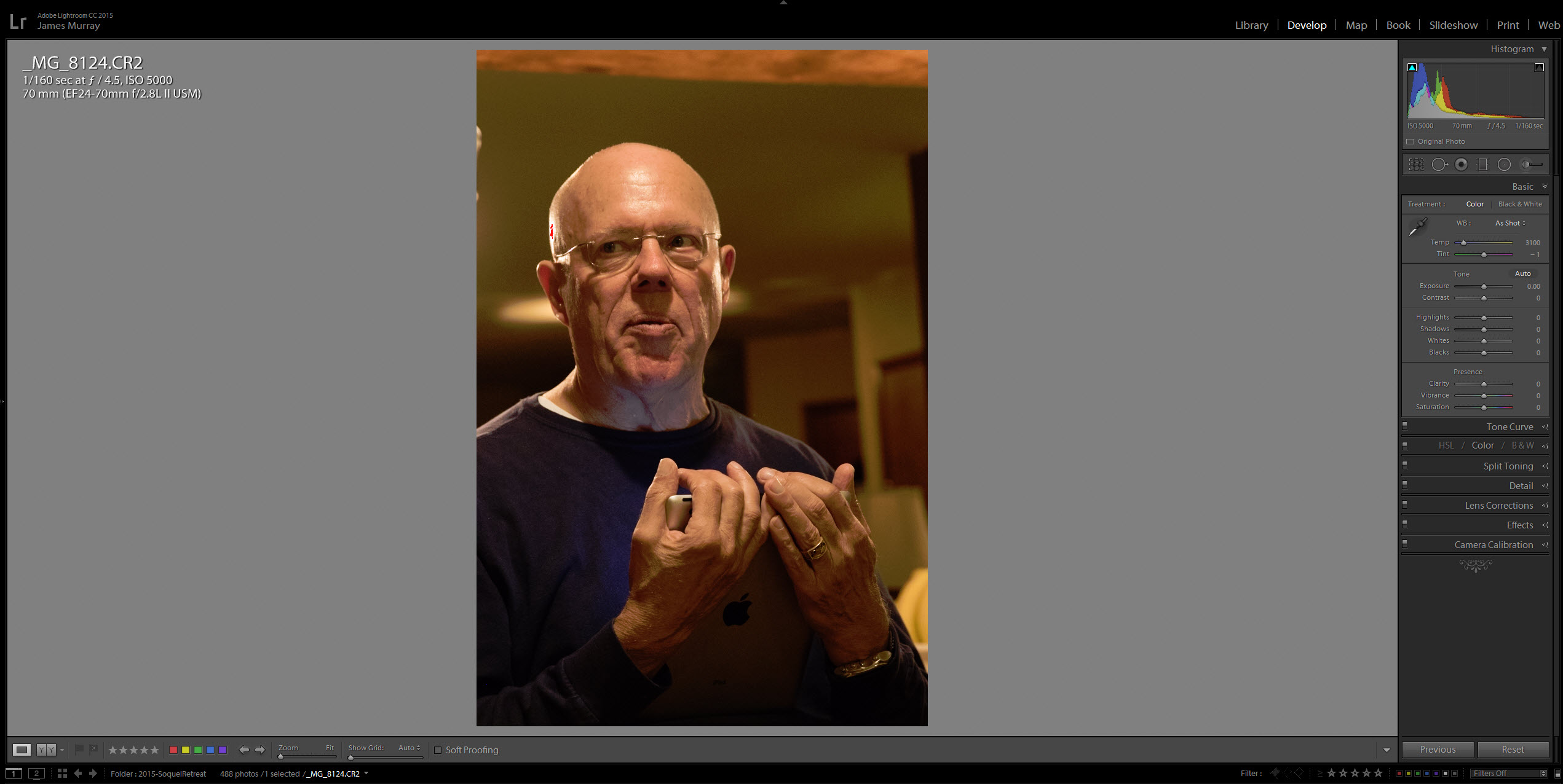
The majority of the time -- but not always (??!!??) the image's apparent exposure and hue/saturation characteristics are significantly different in the Development module, particularly for images shot in low-light conditions: the image in the Development module view is considerably darker than it's Library module source, and the overall hue/saturation of the Development view images are shifted significantly towards the reds and much darker overall.

I've scoured all manner of Preferences, presets etc. and have thus far been unable to solve this problem . . . the Library module views are much more reflective of the original view (as shot), and by being forced to overcompensate for the unwanted skewing of the image characteristics in the Develop module I'm left guessing which version of the image is valid as my "working negative".

I've searched Preferences and presets, so far without any success. locating any "feature" / item / option / choice which would explain this unwanted, dynamic adjustment to my image.

Consequently it's very much a hit/miss, guessing game as to how I should really adjust my photos prior to posting/printing.

I'm shooting Canon 7D / 7D Mk II, in CR2 raw mode, and import the .CR2 raw images into LR without (known) presets/adjustments.

I'm attaching two samples here: screen shots of a single image as it appears in LR Library vs. Development modules without any adjustments applied on my part.

I've spent MANY hours trying to solve this problem, so far to no avail. I could really use a sanity check and some guidance here.

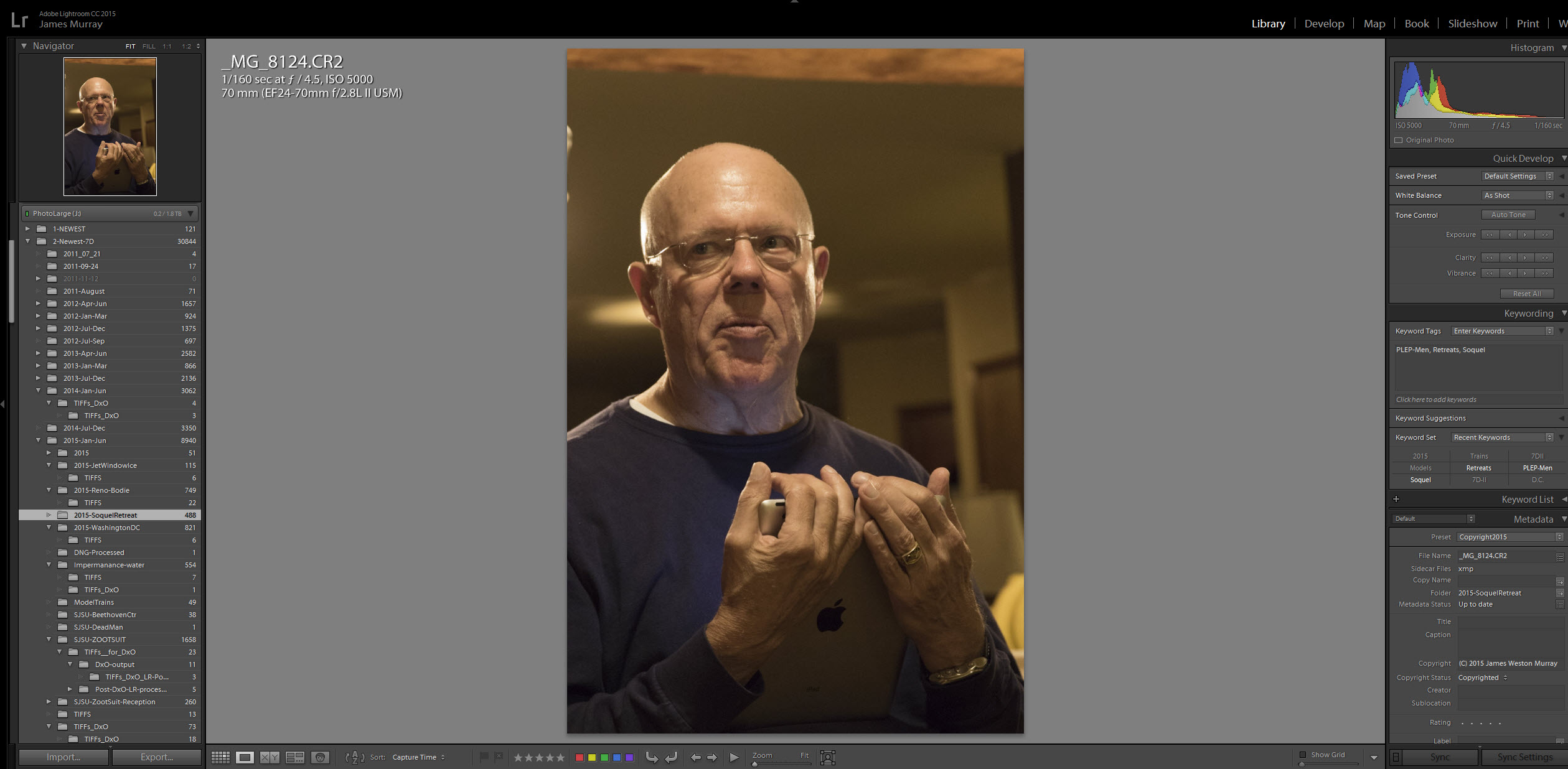
Thank you, James Image as it appears in LR Library module

The same image, opened in the LR Develop module (from with Lib. module)

\$\endgroup\$

2 Answers 2

4
\$\begingroup\$

It looks from your example images as though it could be a colour management issue. Lightroom uses different colour spaces for the Library and Develop modules, as explained here. (Key excerpt below)

Lightroom primarily uses the Adobe RGB color space to display colors. The Adobe RGB gamut includes most of the colors that digital cameras can capture as well as some printable colors (cyans and blues, in particular) that can’t be defined using the smaller, web-friendly sRGB color space.

Lightroom uses Adobe RGB:

  • for previews in the Library, Map, Book, Slideshow, Print, and Web modules
  • when printing in Draft mode
  • in exported PDF slideshows and uploaded web galleries
  • when you send a book to Blurb.com (If you export books as PDF or JPEG from the Book module, however, you can choose sRGB or a different color profile.)
  • for photos uploaded to Facebook and other photo-sharing sites using the Publish Services panel

In the Develop module, by default Lightroom displays previews using the ProPhoto RGB color space. ProPhoto RGB contains all of the colors that digital cameras can capture, making it an excellent choice for editing images

Unfortunately, there doesn't appear to be any way to set Lightroom to use the same colour space for both the Library and Develop modules.

To help you adjust your photos correctly for printing, Adobe suggest:

In the Develop module, you can also use the Soft Proofing panel to preview how color looks under various color-managed printing conditions.

and:

When you export or print photos from Lightroom, you can choose a profile or a color space to determine how the colors you see in Lightroom will appear on the device you’re sending the photo to. For example, you can export using sRGB if you’re going to share photos online. If you’re printing (other than Draft mode), you can choose a custom color profile for your device.

\$\endgroup\$
1
\$\begingroup\$

I just experienced the same annoying problem. After setting the color space profile in Windows10 to sRGB for my monitor the renderings in the library and develop modules are now looking similar again. Check out the explanation for all this on dpreview: https://www.dpreview.com/forums/thread/3855275 Hope it works for you, too.

Best, Moses

\$\endgroup\$

Your Answer

By clicking “Post Your Answer”, you agree to our terms of service and acknowledge you have read our privacy policy.

Not the answer you're looking for? Browse other questions tagged or ask your own question.