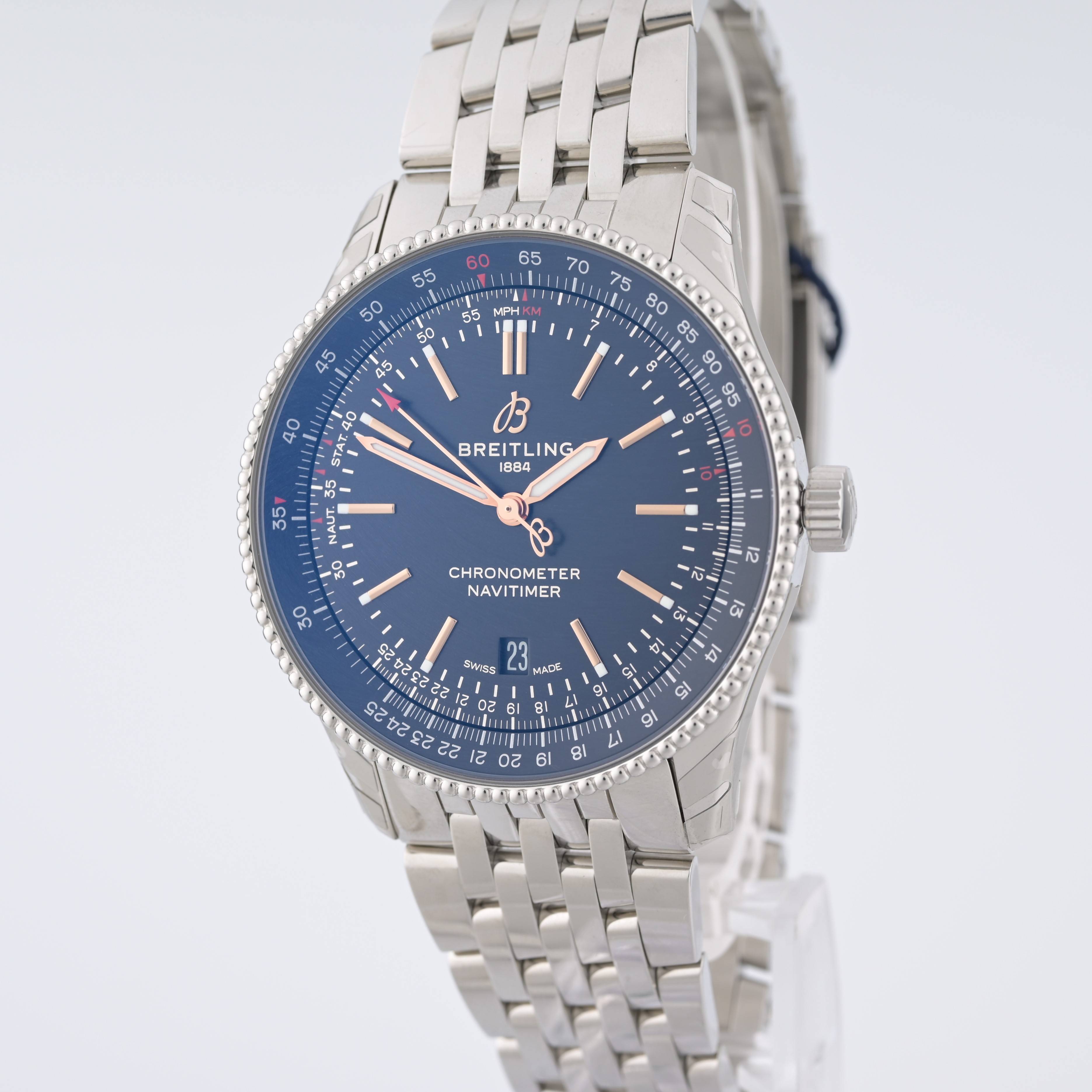
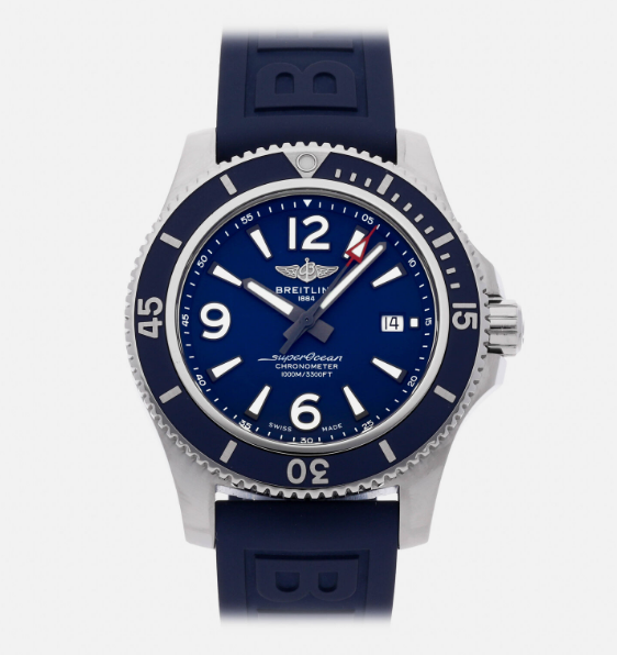
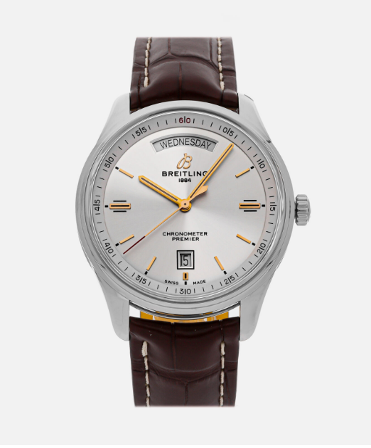
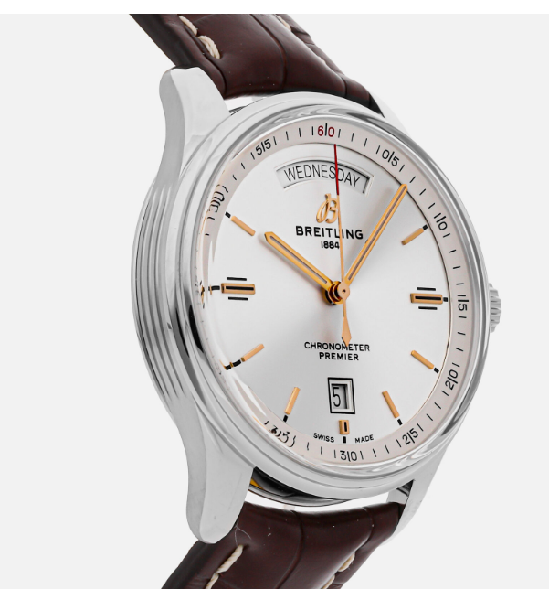
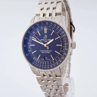
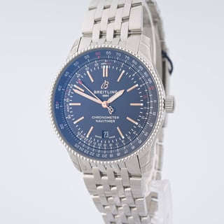
The first photo is mine and the rest are thewatchbox.com photos which I'm trying to replicate. Their photos have deeper colors and pop more. Mine seems to have a grey tone to it. Anything I can do pre or post production to enhance my photos? I use 3 strobe lights, a cylindrical cone that I place over the watch to diffuse the light evenly on the watch and a z5 camera with upgraded lens. ISO 100, 1/125, and f13 settings.
-
4\$\begingroup\$ Your first image looks nice. You need to be more specific about what you do not like in the editing part. \$\endgroup\$– RafaelCommented Aug 24, 2023 at 4:45
-
\$\begingroup\$ post-process is key in these cases. Even if the original shot OOC is accurate, good looking, client will always want it, expect it, to look different, better, edgier...think loads of layers, each one tweaking a certain aspect of the overall picture. \$\endgroup\$– blobbymcblobbyCommented Aug 24, 2023 at 17:03
-
1\$\begingroup\$ @blobbymcblobby post processing may be the key, but the solution is easier in the pre-pre-process: light setup. \$\endgroup\$– EarlGreyCommented Aug 25, 2023 at 11:13
-
6\$\begingroup\$ Are you sure that the pictures you have posted are not digital renderings? \$\endgroup\$– Vladimir CraveroCommented Aug 25, 2023 at 11:48
-
1\$\begingroup\$ @EarlGrey just saying based on experience. I am absolutely for 'in camera' - it follows through to post too: if the lighting and set up result in a great shot, thats great, it means the post (because there is always post..) will be more straight forward and a more pleasant ride. This comes from someone who loathed the post process... :P \$\endgroup\$– blobbymcblobbyCommented Aug 25, 2023 at 14:25
5 Answers
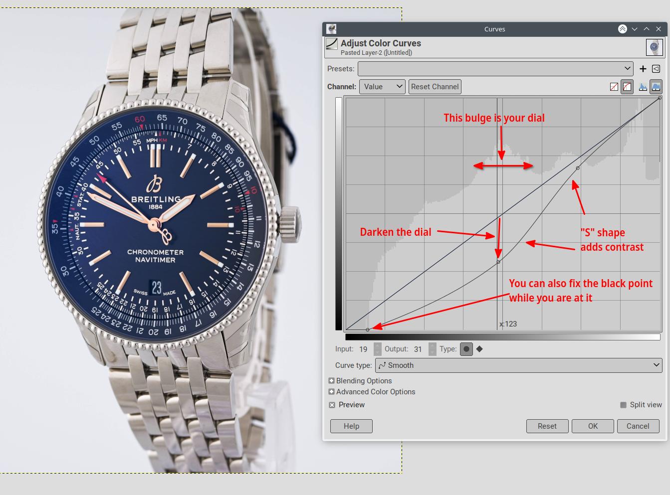
To me, it is just that you dial is over-exposed, easy to fix with the Curves tool of your editor:
In other cases, just using the contrast tool could be easier, but here this would blow out the wristband.
When shooting, the camera may be giving too much importance to the dark dial and try to compensate for it. So making the exposure metering more global may mitigate the problem. Another way is to use a more neutral watch or masking the dial with a gray card while metering.
-
6
-
\$\begingroup\$ Yeah, the grey card to set and lock exposure is good advice. Cameras try to be too clever by far these days to compensate for casual users who do not have or want any photographic skills. Shooting raw and selecting the tones of interest will provide maximum post flexibility. \$\endgroup\$– KalleMPCommented Aug 28, 2023 at 6:12
You might be surprised by how good the simple 'Auto Tone' command is in Photoshop [Image menu].
It's always worth giving it a go before getting into any more detail. Sometimes it just gets it right straight away. You can always adjust curves a bit more manually if it's not quite there.
Original for comparison
-
1\$\begingroup\$ One thing I do not like about auto tone is that it changes the white point. You can see that it warmed the metal and cooled the background. \$\endgroup\$– RafaelCommented Aug 24, 2023 at 17:19
-
1\$\begingroup\$ @Rafael - not enough to bother me - here's a quarter crop inserted - i.sstatic.net/Ss9Mm.jpg & one more with auto colour - i.sstatic.net/A7QTo.jpg [My Breitling has a black face, so I don't know which blue is most accurate.] \$\endgroup\$– TetsujinCommented Aug 24, 2023 at 17:32
-
1\$\begingroup\$ @Rafael I'm almost sure there is a way to tell Photoshop to not do that. \$\endgroup\$ Commented Aug 25, 2023 at 15:19
-
I think that rather than starting from the post-processing, you should consider another lighting approach.
If you look at the images you posted as examples of what you want to achieve, they all have a gradation of shades and reflections that make the images more interesting. Even the first one that doesn't have many shadows, plays with the fact that there are different tones of blue.
For the watch you have chosen, your lights are too evenly distributed and don't create enough shadows. That gives a flat impression that is more difficult to remove in post. It can be done masking part of the image but with a lot more effort.
Once you have a 3d effect, it gets easier to play with colour curves and some targeted HSL fine tuning.
-
2\$\begingroup\$ "a cylindrical cone that I place over the watch to diffuse the light evenly on the watch" the picture is coherent with your analysis and with OP description. However, you correctly point out that it is the correct way to achieve a 2d photo, not a 3d photo like the comparison OP is providing! \$\endgroup\$– EarlGreyCommented Aug 25, 2023 at 11:12
-
\$\begingroup\$ +1 for acknowledging it is flat and the OP might need to look at other lighting solutions. \$\endgroup\$ Commented Aug 25, 2023 at 14:29
Move your lights lower relative to the cone, or move them farther away.
The two options will have different effects... to understand them it is easier to think of it in terms of creating the environment the reflective object (watch) is going to reflect, rather than in terms of "lighting" per-se.
To prevent washing out the crystal you have two options. You can make the reflected environment more even (i.e. more diffused/less directional/larger). Moving the lights farther away from the cone would do that (more even lighting of the reflected cone).
Or you can make the lighting of the crystal less bright than the rest by changing the angles/reflections. Lowering the lights relative to the cone would do that by allowing the crystal to reflect the edge of the gradients created on the cone; with the bezel/band/bg reflecting more of the brighter portions of the gradient. You can also use negative lighting to block some light from the crystal (creating a dark area to be reflected).
Both options will increase the contrast, clarity, and detail/sharpness in the watch face; but the overall results will be quite different... the second option will have much more contrast/falloff (highlights/shadows).
While you are using a diffusion cone, your results are not really particularly diffused/soft (which might not actually be desirable). That is apparent by the relatively hard/directional shadow of the hands being reflected by the watch face. And the resulting angles/reflections are what is causing the loss of contrast on the watch face.
Some editing is almost always required; and your ideal image may actually be a composite of the two different types of lighting.
-
\$\begingroup\$ +1. The problem does indeed look like light reflection from the crystal. \$\endgroup\$ Commented Aug 26, 2023 at 10:59
-
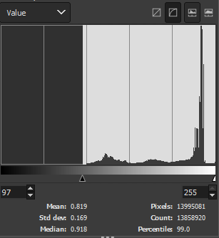
When your photograph looks like it has a grey tone, or seems like you're looking at it through a fog, it means that very few of the pixels have the darkest values. In your photograph, 99% of the pixels have a value (brightness) greater than 97 out of a maximum of 255. The picture lacks contrast because it only uses the top 2/3 of the possible brightness values.
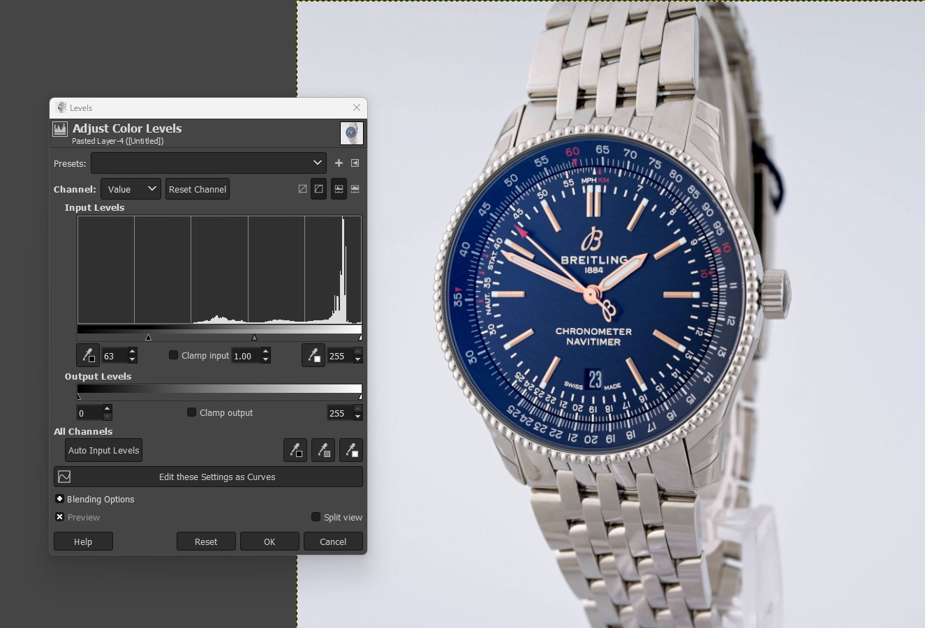
The easiest tool to fix this is the Levels tool. I only adjusted the black point to fix the contrast, making sure that I wasn't losing detail in the dark blue of the dial and the shadows within the wristband.
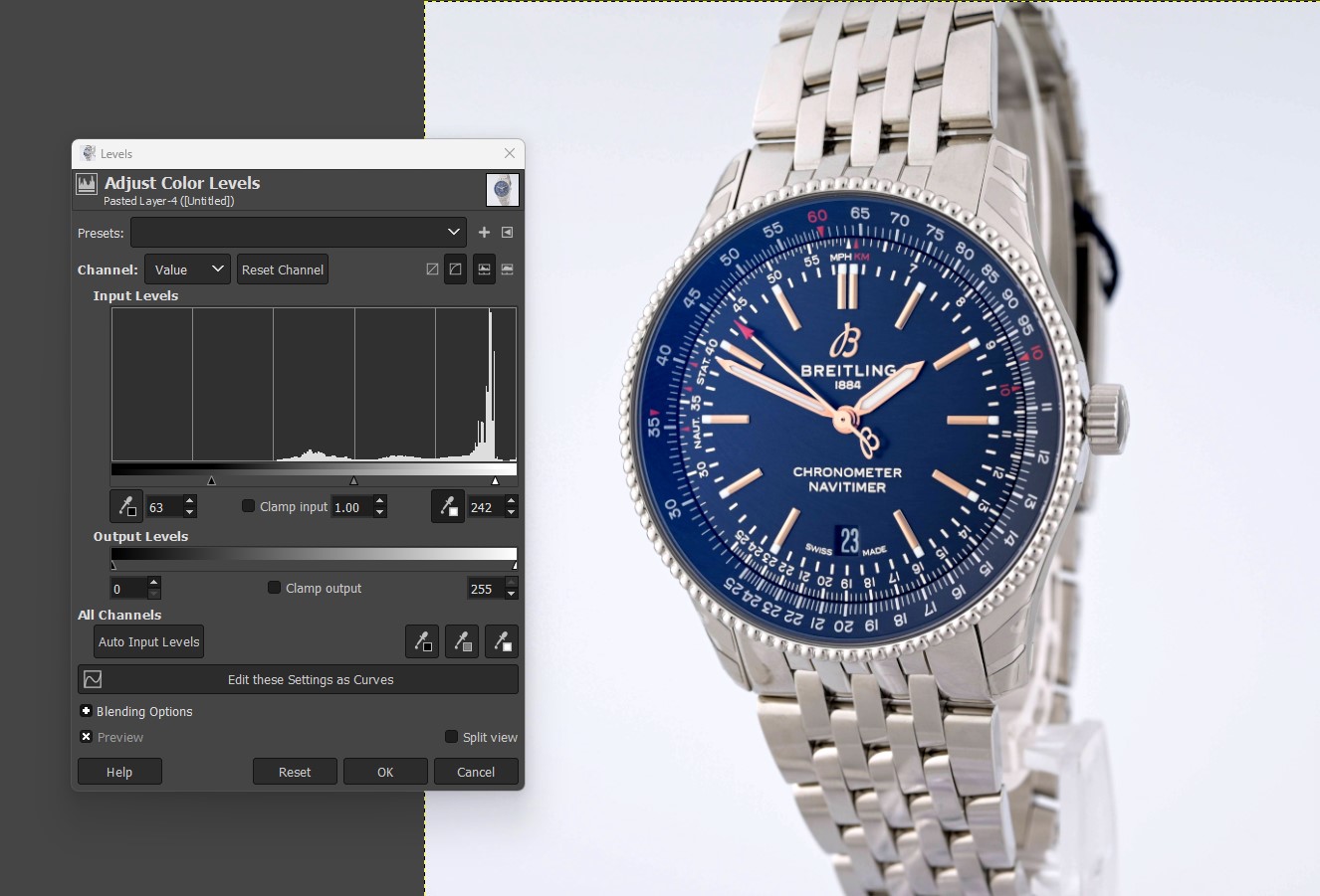
Since this adjustment makes the picture darker overall, I adjusted the white point to restore the brightness of the original picture.
Whether further adjustments are needed depends on how well the picture now matches the watch.
After these adjustments, 99% of the pixels have a value greater than 50. The greater range of brightness values corresponds with a greater contrast in the picture, which makes it look less grey and foggy.
Whether low contrast is a problem depends on the picture. Take this image of a polar bear in snow. 99% of pixels are brighter than 213. This picture works not despite the low contrast, but because of it. This style of photograph is called high-key if you want to look up more examples. The opposite, low-key, results in photographs that are mostly black with small areas of brightness.

