3
\$\begingroup\$

This is a photo that I volunteered to fix. There was many folds/dents in the photo, and I think I cleaned up most of the big ones, but my next step comes in. I would like to remove the yellowing (that represents the age of the photo) and have the color scheme follow the rest of the photos color. I don't have enough rep, but this is the photo I am working on.

https://i.sstatic.net/g7Vau.jpg

enter image description here

\$\endgroup\$
4
  • 2
    \$\begingroup\$ It would REALLY help if the link worked. :) \$\endgroup\$
    – Phil
    Commented Mar 14, 2013 at 5:06
  • \$\begingroup\$ Try AutoTone in Photoshop. surprisingly, this simple feature often works very well for photos with shifted color balance. \$\endgroup\$ Commented Mar 14, 2013 at 13:03
  • \$\begingroup\$ @Phil fixed it. \$\endgroup\$
    – Joe
    Commented Mar 14, 2013 at 19:40
  • \$\begingroup\$ I'm puzzled about what's happened/happening here. My answer appears to be correct in general terms and the fact that the while image shows remnants of massive colorisation did not seem to have been obvious to anyone else. But the complete lack of votes or comments on my answer seems to suggest that I've got it wrong somehow. Any thoughts? \$\endgroup\$ Commented Mar 17, 2013 at 15:52

3 Answers 3

3
\$\begingroup\$

There are a number of ways to correct the yellowing in Photoshop. I think the easiest to try is to use a curves or levels adjustment layer, and use the grey dropper to select a neutral area. That should neutralise the yellow cast.

  • Create a Curves Adjustment Layer
  • Select the middle of the three dropper tools (grey dropper)
  • Click on a neutral area of the image (something that should be some shade of grey - white may work)
  • This should instantly remove the yellow cast from the image. If it does not, or overcorrects it, try clicking on other neutral areas - if it's overcorrected you might be able to reduce opacity.

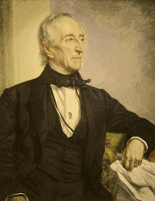
Below is a before image I artificially faded.

enter image description here

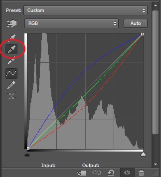
I selected the grey dropper (circled) and clicked on the cloth/paper under his left hand, which looking like it might be white or grey. You can see the blue has been raised, and since blue and yellow are complementary, that reduces the yellow in the image.

enter image description here

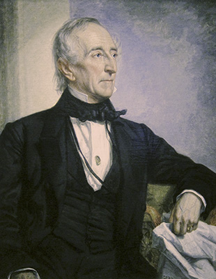
You could do the same thing with the Color Balance adjustment layer, moving the Yellow-Blue slider to the right. Below is the result, possibly a bit overdone, but the yellow is gone.

enter image description here

\$\endgroup\$
5
  • \$\begingroup\$ I tried this, and I couldn't get it prefect. Here is the photo i.imgur.com/pG8R03s.jpg \$\endgroup\$
    – Joe
    Commented Mar 14, 2013 at 19:40
  • \$\begingroup\$ Ah, it's a black and white photo. You can follow Stan's steps, or possibly try a Black and White adjustment layer, and adjust the yellow slider to adjust how the yellowed areas are rendered. For instance, after B&W conversion, the white areas of the original may be slightly lighter than the yellowed areas, so move the yellow slider to the right and lighten them - you may be able to get those "stains" to go away. \$\endgroup\$
    – MikeW
    Commented Mar 14, 2013 at 21:22
  • \$\begingroup\$ Something I hadn't thought of is that my method will work if the discoloration is fairly uniform throughout the image. If there are only spots that are discolored it will not work, as it will affect the entire image. \$\endgroup\$
    – MikeW
    Commented Mar 14, 2013 at 21:23
  • \$\begingroup\$ It looks like a color photo to me, that is very much faded. It could have been colorized in the past, though. \$\endgroup\$
    – Skaperen
    Commented Mar 15, 2013 at 7:33
  • \$\begingroup\$ @Skaperen -- nope, definitely not a colour picture. They simply don't have that kind of neutral (silver) density when faded. It appears that some colours were hand-tinted, but not the whole (though it was probably toned originally). \$\endgroup\$
    – user2719
    Commented Mar 15, 2013 at 8:37
1
\$\begingroup\$

With that particular photo (and other, similar, photos), the easiest thing to do would be to use two Hue/Saturation adjustment layers. The first one would have everything else left alone, but have the saturation set to 0 and the layer blend mode set to Color (that will minimize side-effects in tonality and somewhat de-emphasize the spotty stains). That, unfortunately, loses the photo tone altogether, so you'll need a second Hue/Saturation layer to fix that, with the "Colorize" checkbox checked. Playing around, I found that a hue value of 34 and a saturation value of about 10 gives a suitably vintage look without looking like you're trying to create a vintage look.

That still leaves you with a bit of clean-up work from the leftover staining, mostly on the dresses of the two little ones up front (and how much you do is up to you; most of the spots get lost in the fabric design) but the majority of the problems will be solved. And you may want to do some additional spotting once the colour issues are resolved; the girl at the left of the picture really need some work on her face that should be fairly easy to do if you go at it with a light touch.

\$\endgroup\$
2
  • \$\begingroup\$ How is it the two bows have so much color but nothing else does? \$\endgroup\$
    – Skaperen
    Commented Mar 15, 2013 at 7:32
  • 1
    \$\begingroup\$ @Skaperen - Hand tinting. It was a very common practice before colour printing became practical (early processes were either terribly fugitive or complicated and expensive), and different cultures did things differently. Sometimes only expensive/precious things were picked out for prestige. \$\endgroup\$
    – user2719
    Commented Mar 15, 2013 at 8:31
0
\$\begingroup\$

I think that you may have a major problem.
You seem to be treating the photo as monochrome.
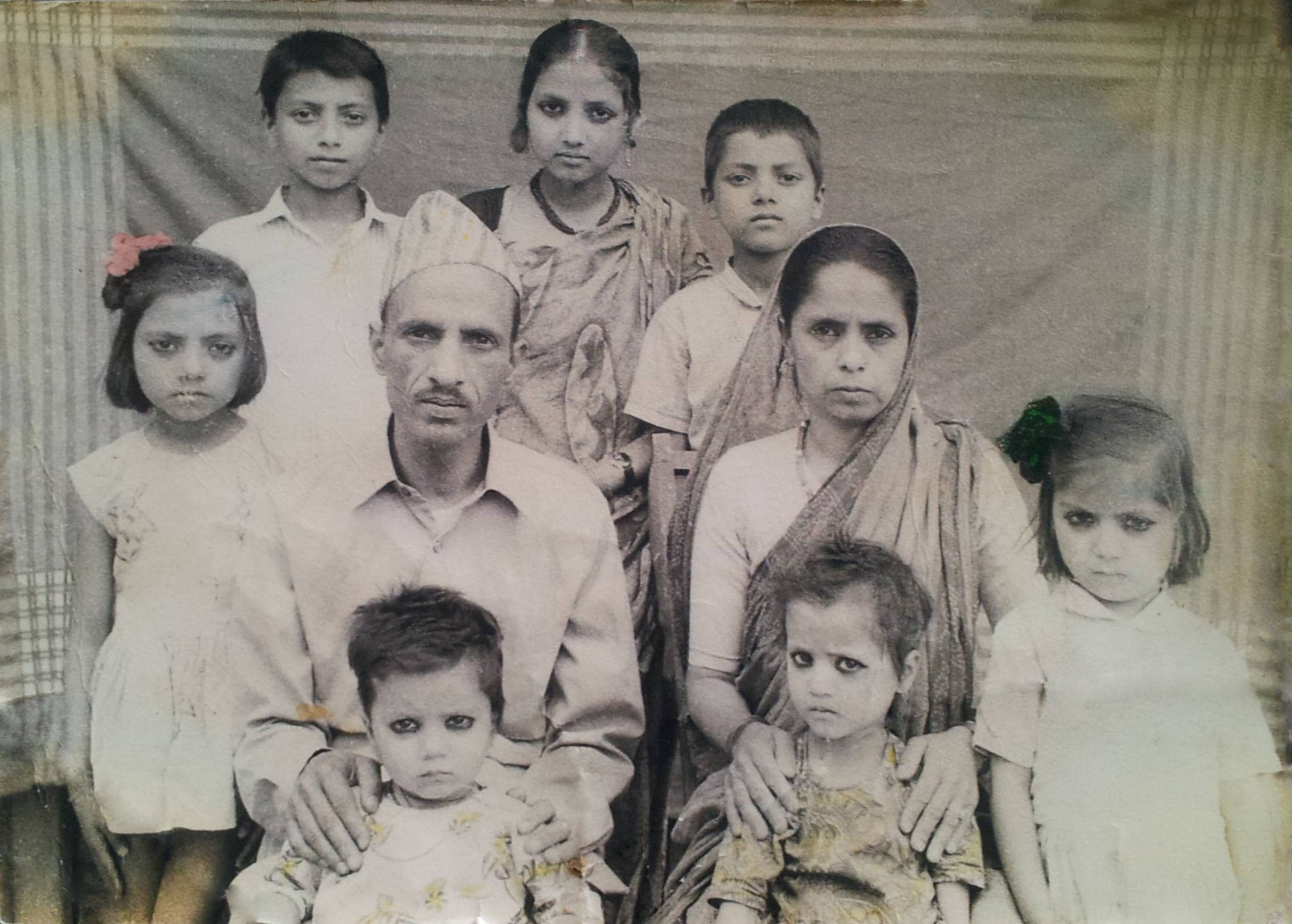
However, the yellowing you see is not from aging of a monochrome photo, but the differntially faded remains of manual "colourising" at some stage that has faded badly.

The picture below shows the colours that are present. This is not meant to be an attempt to optimise what is there but just a 'revealing' of what is present. The bows are still visibly red but it seems that the whole photo was coloured and has faded to various extents. You are going to have to decide what to do with the remaining colour.
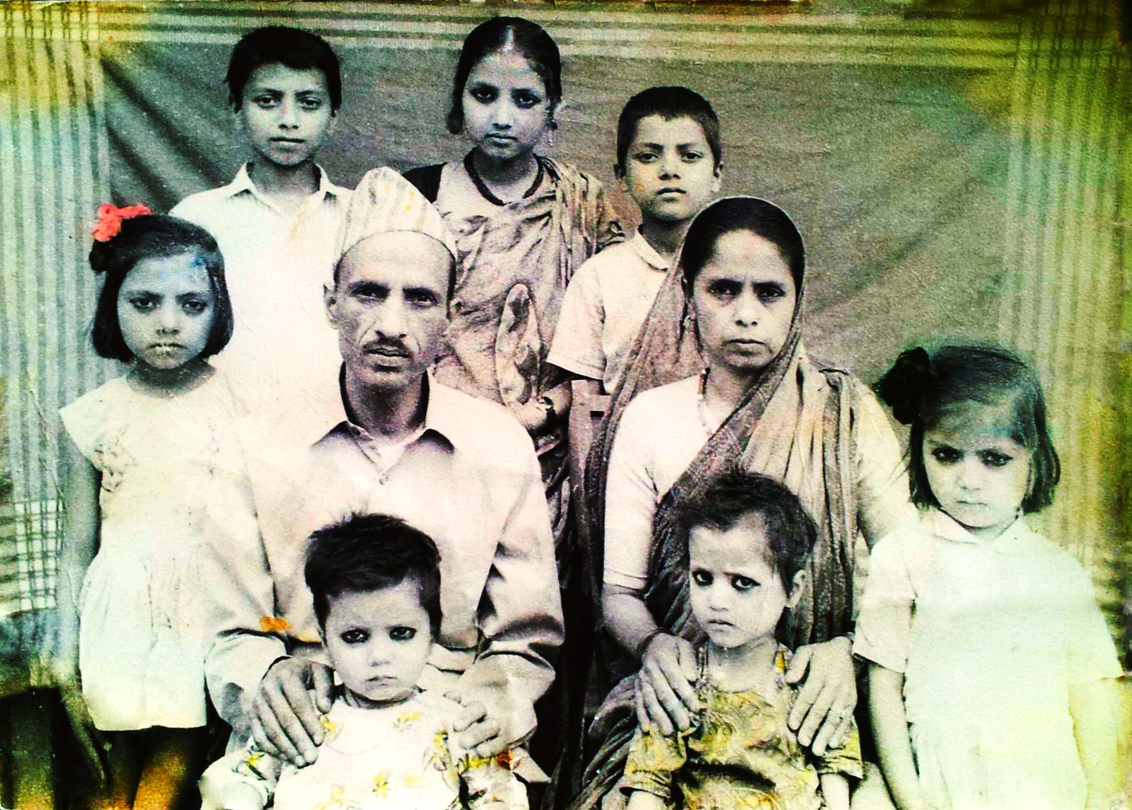
enter image description here

Just monochrome converting the image will affect the relative contrasts depending on what colours were originally present and how much they have faded.

A monochrome conversion COULD look like this. Again, no effort as put into optimising this for the colour effects on contrast - it just shows what sort of result might come out of such an effort. Arguably, the photographic quality of the original has been severely impacted by the colouring process and unless the result is of great importance it is possibly acceptable to make best efforts globally. One could try masking and layering and applying different treatments based on colours and degree of fading, but it would have to be especially valuable for some reason to make this worthwhile.
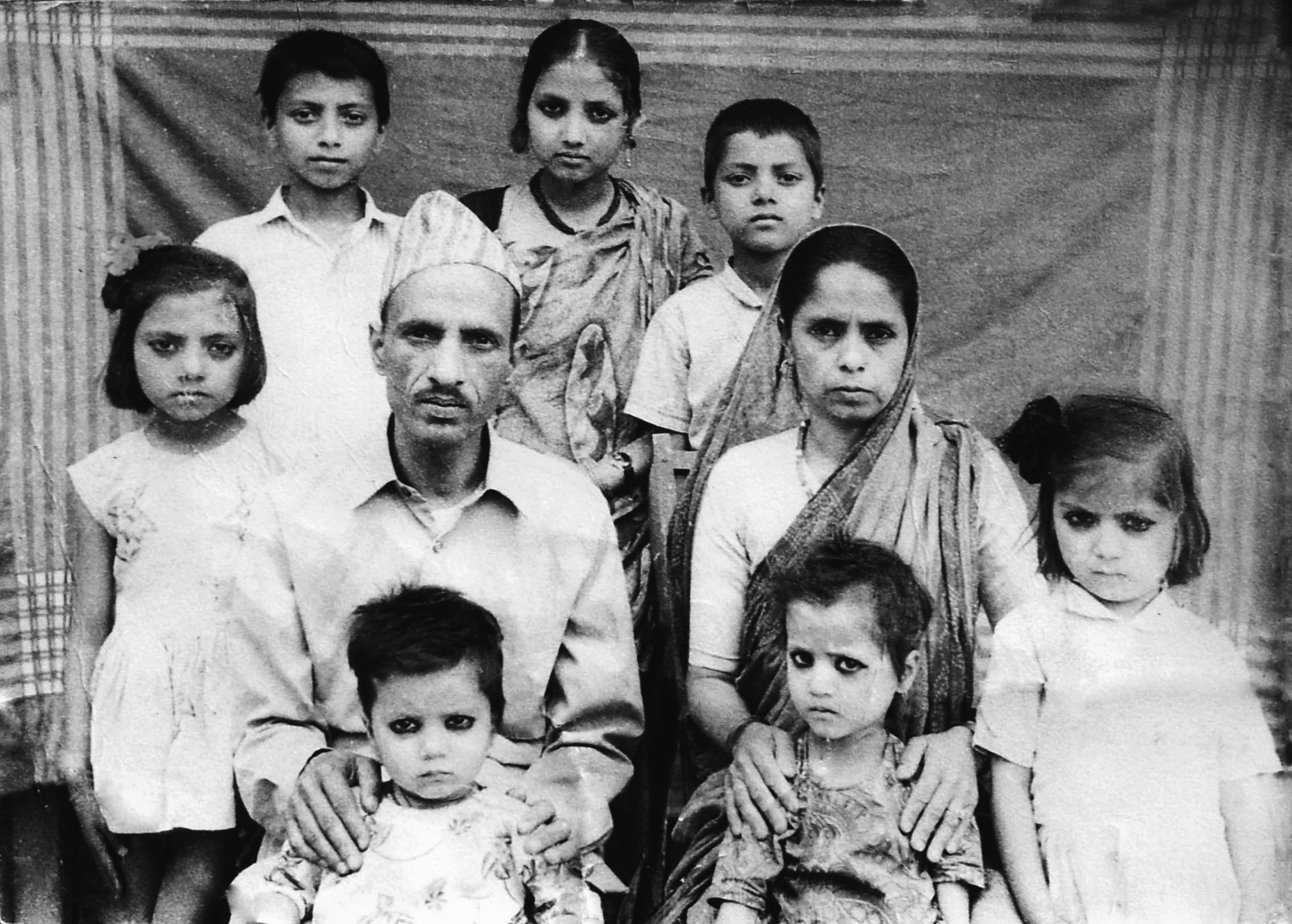
enter image description here

For interest, can you tell us something about the photo's history.
\$\endgroup\$

Your Answer

By clicking “Post Your Answer”, you agree to our terms of service and acknowledge you have read our privacy policy.

Not the answer you're looking for? Browse other questions tagged or ask your own question.