I'm sure some of the time, such as Shutterstock use AI to do the first pass, so if something doesn't fit the 'rules' it's kicked straight out. It's as though they want a big neon sign saying "This is the subject" & if they don't spot it immediately, it's rejected.
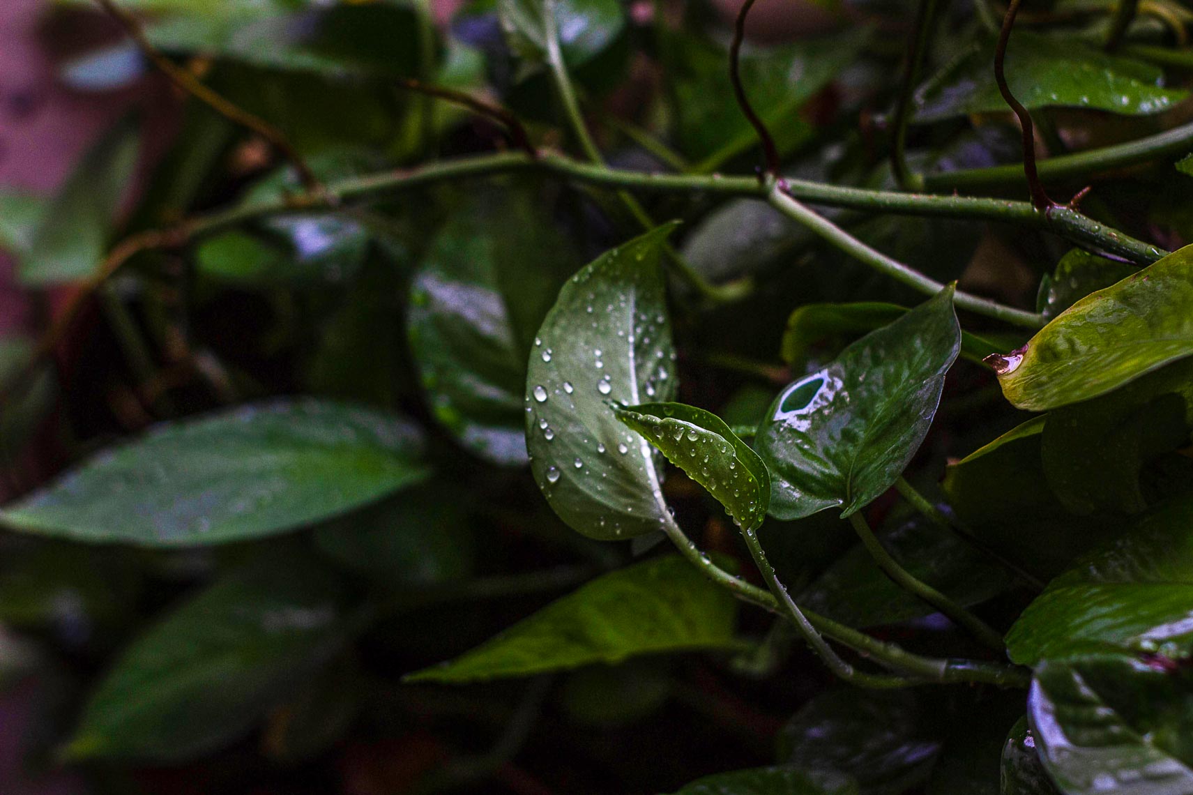
However - this picture has no 'big neon sign'. At first glance it's all 'just leaves'. Look closer & you might think it's the three in the middle. Look closer still & you realise the only sharp area in the photo is the small leaf right at the front.
As that's, at a guess, less than 10% of the total image, the AI would kick it out at that point.
However, had it passed on to a human, there are larger issues.
Even if the main group of three leaves had all been sharp, there's still little to differentiate foreground from background.
Overall, it's very dark - not itself a bad thing, but in this case as the entire image is fairly homogenous it's an issue. The tiny bits of specularity on the three leaves aren't enough to really lift them into the foreground.
If you were to boost the lighting, there's still no real separation. Here's a fairly hard push & sharpen, ignoring that it brings the noise with it. In fact this is probably worse, it makes the background more distracting. To have a proper go at it I'd separate the foreground from background & emphasise one whilst softening the other.
Further, in terms of separation, not only are the background leaves all very similarly lit, they also not really out of focus or soft enough to fully draw the eye to the subject. Overall, it comes over as a bit 'messy' or distracting.
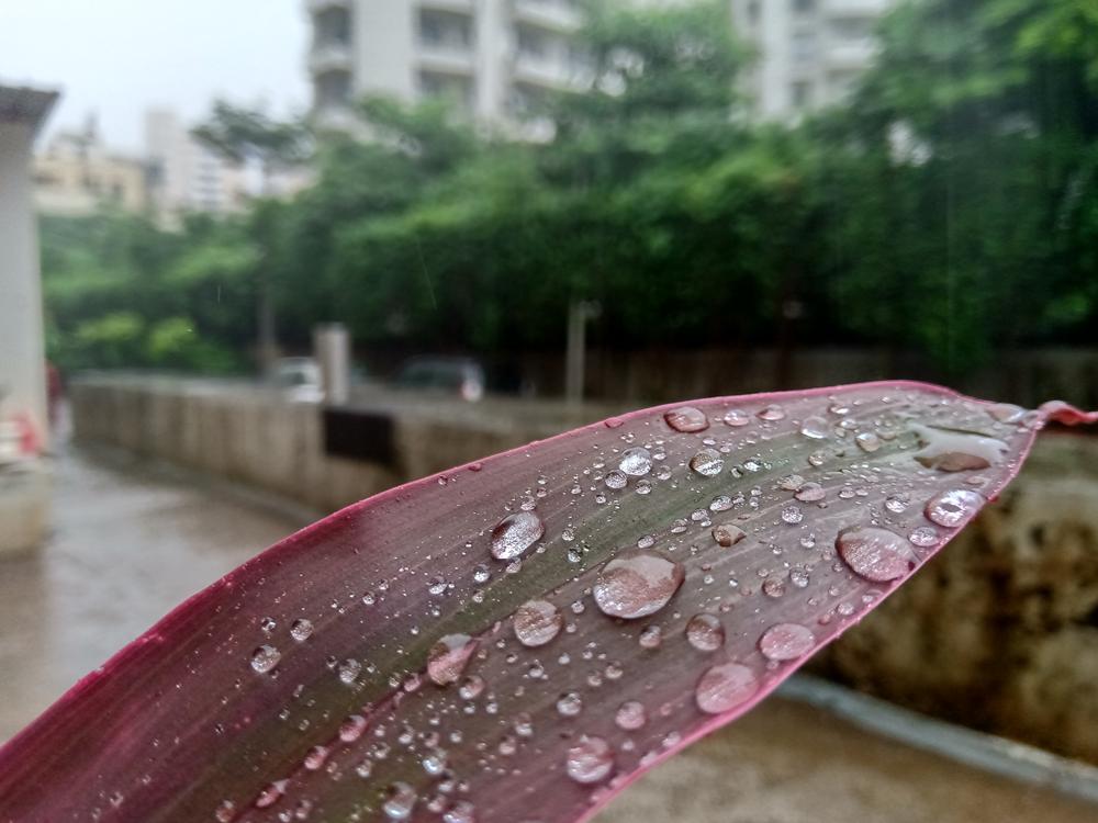
There was a question on here a while ago, where someone wanted to 'rescue' a shot of a leaf against a confusing background. They didn't have the same overall homogeneity issue, but there were a lot of distractions.
How to crop this photo of water drops on a leaf to improve the composition?
TL:DR was that we took this…
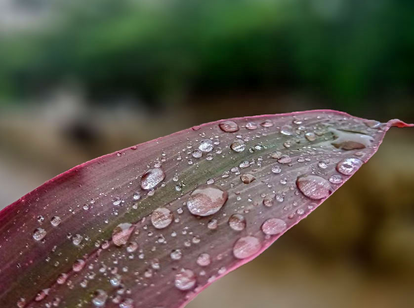
and turned it into this…
Overall darker than the original, but a greater percentage of the final frame in sharp focus & much less in the way of background distractions.
So, to summarise:
More distinct sharp subject, filling a greater percentage of the image.
Differentiated background, by colour, contrast and/or softness.
Negative space works but it needs to be more clearly differentiated.
Cull distractions eg the horizontal twig, yellowing leaf.
I'm sure others will think of more things to think about, but that's my 'starter for ten', as they say.


