I am new to photography. I want to improve my pics, so I need some input from you all.
[![][1]][1]
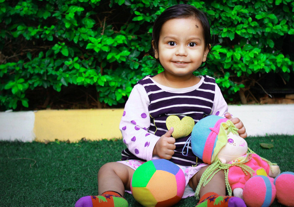
Please look at this pic and guide me on what went wrong. How could I have improved this picture? I edited this pic in Photoshop to pop the colors.
I am new to photography. I want to improve my pics, so I need some input from you all.
[![][1]][1]
Please look at this pic and guide me on what went wrong. How could I have improved this picture? I edited this pic in Photoshop to pop the colors.
The first and obvious problem is framing. Almost never do you want to put a small head in the middle of a large picture.
There is much space to the left of the child in the picture, but it doesn't add anything (in my opinion).
My first instinct would have been to use vertical format, probably capturing a little above and below the child, then deciding in post-processing what I really want to keep. I really don't see the point to why you left a lot of room above the child's head, but clipped off part of her feet.
Going with the clipped feet, here is a possible treatment:
The main point is the child and the look on her face. The toys add context, but we don't need to see all of them for that.
Something about the color still looks weird to me. I suspect a slight pink cast, but I wasn't there so don't really know. Here it is with the background part of her shirt made white:
That looks a little more plausible to me, but again, I don't know what color the shirt really was.
The white parts seem just a little blown out. That can probably be fixed by going back to the raw image.
I can certainly believe you saturated the colors. That's more a matter of taste and what you want to show, but probably does help somewhat with this picture. The contrast seems a little too high, as evidenced by the slightly blown highlights and something just not looking right around the edges of the child's face. However, now we're getting into personal preference and artistic expression, where there is no right or wrong. I may also think differently after seeing some alternatives.
In addition to what has been written (cropped feet), in my opinion the greed hedge in the background draws a lot of attention away from the child because it is so heavily saturated.
Since the background is green, a colour far away from any skintones, one could try and desaturate the green of the whole picture a little.
How far you go with this is a matter of taste. I desaturated green and also yellow (which often helps with leaves more than pure green, also this reduces the saturation of the curb). This of course also affects the rest of the picture; you can see a big difference with the green and yellow sides of the ball. But in my opinion this does not really hurt the picture.
Another thing whith the white balance in pictures whith a lot of green (leaves, gras etc.) in them: my own camera tends to bring up the tint to high in automatic white balance, as if to compensate for too much green. Maybe your camera does that, too. Try to manually reduce tint in these cases.
Now, these measures might seem counterproductive. In my opinion it is always important to get a correct white balance first, and then change colours/saturation to your liking, especially whith faces in the picture.
The leaves in the background aren't an interesting part of the photo, and they're a bit of a distraction. Blurring the background by shooting at a wider aperture (smaller f-number) would turn the background into a soft field of green and draw more attention to the child. I used a gaussian blur to simulate the decreased depth of field that a larger aperture would give you, and I think it works better:
(The slight glow around the child is just due to my quick and dirty selection. You wouldn't get that shooting at a large aperture.)
As others have pointed out, tighter framing of the child would also help. You can do that in camera by shooting much closer to the subject. That will also increase the camera-to-subject:camera-to-background distance ratio, which will help put the background out of focus.
To improve your portraiture, try simplifying your composition to better focus the viewer's attention on your subject.
How? (No particular order):
Your high-key exposure of her face may be a touch too hot, or it may be that you like the "clean" look--either way, the lighting is good, as is her engagement with the camera. Keep practicing, Alok--your model is adorable!
Overall, the composition of the photograph is sound as an abstract image, the spacing of the elements is pleasing in the abstract. It's the 'semantic' content of a human face that shapes our expectations in ways that work against the composition.
One way to approach composition is as a sculptor approaches a block of marble. The marble contains a latent statue and the sculptor's task is to bring it bring it out. The sculptor does so by:
The photograph contains a lot of 'semantic noise.' On the right, the sprinkler head and sidewalk and whatever intrudes to the top right corner. On the left, more curb and and hedge and grass. All I really care about is the child's smiling face.
Cropping the image removes some of the semantics of the backyard location.

Portrait orientation tends to meet our expectations of portraits but at the expense of the abstract composition.
To me, one of the biggest distractions in many photos is verticals and horizontals that are unintentionally just slightly off. In the case of this photograph, the curb in the background is all the more jarring because it causes the photograph to 'defy gravity'.
Leveling the curb removes some of the distraction.
Having an artistic vision is important. Post processing is a way to hone that vision over time and amplify it in a particular image.
Portrait orientation is a change to the proportions of the crop. Balancing the original compositional intent with 'noise reduction' can be pursued by a crop between original landscape proportion and portrait orientation.
An example with 5x4 proportion.

It is also an chance to 'go all in' on an a moment of artistic inspiration. Maybe the slight gravity defying rotation in the original suggest a bold experiment:

Sure maybe the experiment fails, but it may suggest new ways of photographic expression when I'm out with my camera tomorrow. Here the strong diagonals reinforce the subject far more than in horizontal rotation.
Post processing is a great tool to improving composition. Perhaps it is against someone's notion of purity. That's fine, just don't publish modified photographs. Studying composition in post processing will still probably improve composition of future images.
Straitening horizontals/verticals will improve many images.
Cropping will improve the semantic content of many images.
The vegetation in the background is way more saturated than everything else on the photograph and that it looks rather disturbing — I have never seen leaves saturated that much. Leaves should be almost as saturated as the toys or probably even less.
People made very valid points about your composition, so I'll talk about something else: your light.
Light is everything in photography. The reason why you felt the need to "pop up" your colors in Photoshop is probably that you found the original quite dull. And it very possibly was quite dull. And, at least in my opinion, when a photograph is dull it's almost always because its light is.
Some people have commented on how bright and obnoxious the background leaves are, and have proposed desaturating them. If it were me, I would darken them, which has the combined advantage of making the background less distracting and making your subject stand out more, if you get your lighting right. For example:
How exactly you achieve this depends on the conditions. Ideally, there will be enough difference in luminosity between the subject and the background and just using exposure correction to "underexpose" a bit will do the trick*. Other times, you may need to do this in post-processing.
How to make sure that your subject receives sufficient light for you to be able to make it stand out like that also depends. Of course, it helps if your subject is itself bright. Other than that, you can learn to work with natural light (which is great because it's free), or with lighting equipment. Lighting equipment doesn't have to be expensive either, depending on the kind of pictures you want to take, a desk lamp or even a candle can work great:
* I put "underexpose" between quotes because that's what the camera will tell you: the picture will be underexposed relative to the camera's reference point, but it is important to keep in mind that the camera's reference point is not the One True Correct Exposition. The correct exposition is the one that gives you the result you want.
Ignoring the composition, color and editing that everyone else has answered perfectly clearly, I'd like to point out the blanched areas on the cheeks and forehead.
These areas are a product of overhead light which has blown out all the color in the top surfaces of the baby's face.Your use of fill (flash round reflections in pupils) can't fix that and may have added to it.
These areas are the prime example of not shooting in direct overhead light, particularly direct sun. Children's skin is thin and that strong direct light just blows right through any color thats there.
Aim for open shade where the light is directional but soft. The directional light makes shadows, giving texture to the skin but all these shadows are small and delicate.
Neither the posing or the lighting need be dramatic, just soft and gentle with the children's skin.
In my view the problem is depth of focus. The distracting background of the hedge needs to be softened by being out of focus. If your camera allows, try setting aperture priority with a large aperture, and get the focus exact on the face. Personally, I don't like saturated colours.
I would also try an angle which is not square-on - try shooting from higher at an angle to the body, with the child looking up.
The girl is very cute, but it has this "deer in the headlights" look, what Joshua called a "fake looking smile" in a comment. That's unfortunate because I feel drawn to look at a cute girl in a nice setting which still also carries a slightly uncomfortable note. I think she would like to continue playing ;-). What we learn about her — what this portrait communicates — is how she behaves when she is interrupted and poses for a picture. What would be more interesting is to see her immersed in her play, oblivious to her surroundings. Or presenting her favorite doll, beaming. We would like to see a glimpse of her little life, of her emerging personality in the picture.
The "deer in the headlights" look is sometimes very difficult to avoid, in particular with some children. That's one thing which great portrait photographers do (besides being technical masters and having a sense for shapes and colors): They establish a certain genuine emotional relationship between themselves and their subject. (It does not have to be mutual sympathy. Google "leibovitz bush cabinet" images and look at the first one.) Some children take on this "deer in the headlights" look even more than this little girl as soon as they see a camera.
I had limited success taking the time to establish a more casual mood. Or, sometimes I shoot when they are not aware of it, from the hip, talking to them. The latter ventures in the direction of Lomography — horizons will be slanted, the framing unconventional, but it can give great results. Taking many pictures costs nothing but the time to sort through them later.
There are many ways to improve this picture. The green in the background and the ball was brutal, I turned them down. The grass looked a bit strange. I brightened it up a bit.
Many of the other answers suggest to focus on the girl, and cropping to portrait orientation.
When I look at the picture, I see two characters, the girl and the doll. They are sort of a couple. The doll is looking to the right. I would have left even more space to the right if it was possible. And yes, the picture would be much better if the feet were complete. With some margin of gras under the feet, the picture could become square.
Apparently this only makes sense if the doll is important to the child (or if you choose to make it look like it is important).
The horizontal white and yellow curb in the background is very very distracting. It draws your eye away from the subject. The subject is also incomplete - you cut off the feet.
Having the subject completely bump up against the bottom of the frame also loses a sense of balance.
If you had a wider aperture, you could open it up more to blur the background more, or move the subject further from the background, which would also blur it more.
It looks like you are already framing the subject in a rule of thirds manner (both horizontal and vertical), so that is good!
White balance and subject lighting look good as well.
Looking at the toys - I would ask: "What do they add?" - they're not helping to tell a story about the subject. IMO, if you have other objects in a portrait, they work better if they are background, or if they are the focus of the portrait subject. There's no relationship between the child and the toys - they just appear to all be in one pile.
The current photo tries to strike a balance between a photo of the child playing with toys, and a photo of the child engaging with the camera - and as a result doesn't really achieve either.
Also, the child is not doing anything. Children are rarely doing nothing so this feels un-natural.
I'm a know-nothing internet guy, I take lousy photos, you shouldn't listen to me, but here's an uneducated opinion anyway.
My first impression was that I like this picture. Her beaming smile would make any picture, great, though - you're totally cheating by having such an adorable subject!
That aside, though: you can see right up her skirt, or pantsleg. Unless that's what you're trying for, upskirt shots are bad, especially with a child, and on the internet.
Others have suggested centering her. That's certainly an option, but personally I'd go in the other direction.
At the moment, her head is in that awkward place between "centered" and "off center".
The diagonal of head -> arm -> doll, drags the eye away from her face and off the edge of the picture: the eye ends up fixated on the doll's big rounded feet.
If you'd aimed the camera to the right, she'd be far less "balanced", and yet, to me, this off-centeredness is more aesthetically appealing, but I cannot (without talking about nonsenses like golden spirals and such) express why.
Were the doll on her other side, this would help "balance" the picture somewhat.
As it is, it needs another thing to fill that empty space. Here's my crappy attempt at moving the ball over.
With this layout, I feel that the eye is led up to her face, and her eyes and her smile grab the viewer. I actually find it hard not to look at her face, and to even notice my terrible bodge job on the rest of the picture. Pretend I know how to draw shorts.
Only after doing this did I really even notice her face, delightful smile, and startling eyes.
Turning her body towards the center of the picture would have made the picture more contained, and given a feeling of interaction between her and the balancing object (the ball, in this case).
Turning her away from the center would make the balancing object seem rejected.
About those eyes. Her eye reflections are WEIRD. How did that reflection happen, outdoors? It looks wrong, and yet, because of that, her eyes are dark pools with a bright glint, and her gaze is positively mesmeric.
That dark patch on her head - at first I thought it was a fly. For a temporary blemish, I'd conceal or shop it out, but if it's a permanent mark, then you've done the right thing having it clearly showing, even highlighted by her parting framing it: it'll become part of her personality, of who she is, her beauty spot. Leaving it out of the picture or obscuring it in some way would be to tell her that she should hide it and be ashamed, and that would be a sad thing.