Additive vs Subtractive Color Space
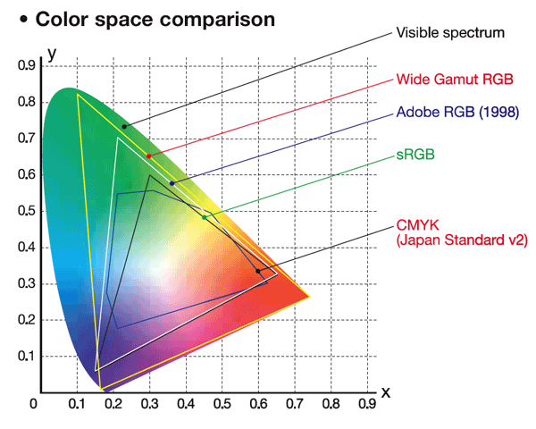
One thing to think about is that an additive color space (RGB) is different from a subtractive color
space (CMYK or others). There are colors you can display that you cannot print, and there are colors that you can print that you cannot display.

Notice how some yellows will print, but are not displayable, yet some greens are displayable, but not printable.
Blacks
Black is another really good example of a color that prints very differently that it displays, and displays differently depending on what device it displays on. Black on a CRT is the absence of light. Black on a cheap LCD is just very dark. (This is because an LCD is backlit and the back lighting is always on. Even when the cells are turned opaque some light leaks through.) You would think that this would mean a CRT would better contrast but in practice LCDs can get much brighter than CRTs.
Glow
Another aspect of displayed images is that they are luminous. A printed image needs room lighting reflecting off of it to be viewed. (And of course the color of the room lighting matters!) Consider the same image printed on paper and printed on transparency, a slide. Now illuminate the back of the slide. I suspect the slide will appear more vivid, since the brighter areas will glow.
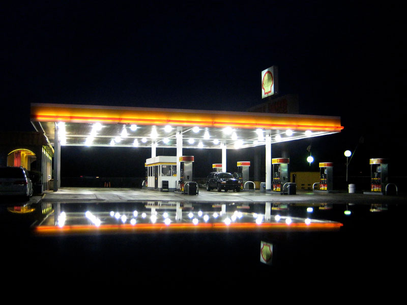
This is a perceptual change, one that you probably can't account for while shooting, but I don't know. For example, I know this photo of mine has far greater impact displayed rather than printed:

Non-Traditional Inks
Another area is that printed images can have non-traditional inks, say a varnish or a foil. This would be exceptional difficult to capture on a display. (This is also getting way out of the realm of photography and into commercial printing, but it is worth noting in such an interesting question!)
Aspect Ratio
If you sell you work matted and framed it is prudent to restrict yourself to a small number of aspect ratios and sizes. This avoids an annoying, and expensive, inventory control problem. For example, I only sell 11x14, 10x20, and 12x12 images. (And I'm phasing out 12x12!) This restriction sometimes impacts your artistically. Your subject might not fit into either ratio but you are essentially forced to move to one of those ratios. This also changes the way you shoot. I constantly frame the shot and then widen it some, which is a challenge since I almost also shoot wide angle, say in the 20mm range on a crop body, and widening it sometimes isn't possible. I do this so there is some extra image in case I need to crop it just so.
This is not the case with displayed images. You are free to crop each image exactly like your vision tells you to crop it, which means you are free to shoot it exactly like you want to shoot it. However, almost all displays are landscape, not portrait, and if you are shooting for a display you'll probably find yourself avoiding portrait shots.
Future Proofing
From a future proofing standpoint I think you would need to say the image and the post-processing steps in a non-destructive and open format so that future display technologies could re-render your image. That's pretty pie-in-the-sky thinking though.
One thing you can do is shoot in Adobe RGB, not sRGB, just so you have a wider color space.


