7
\$\begingroup\$

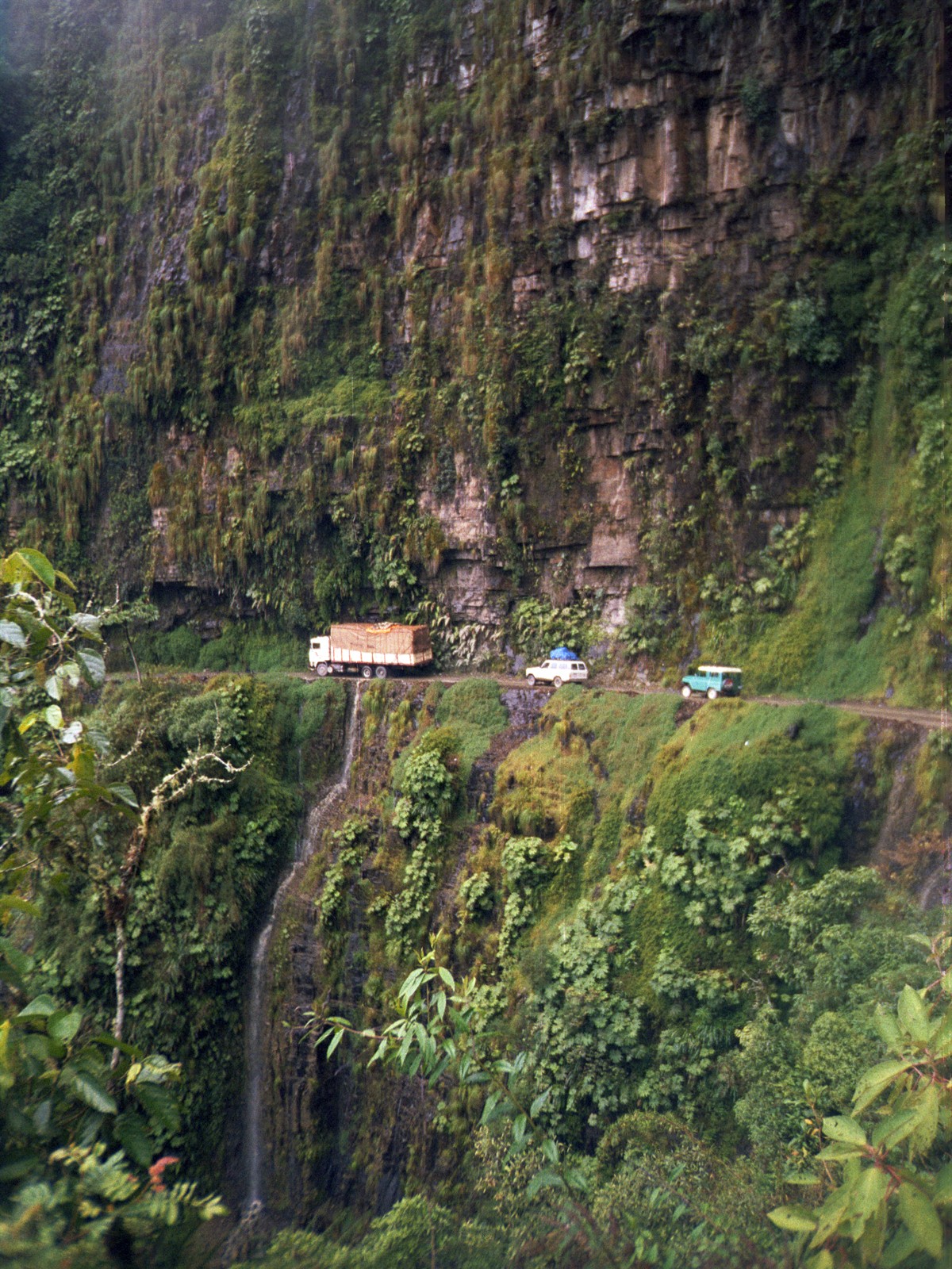
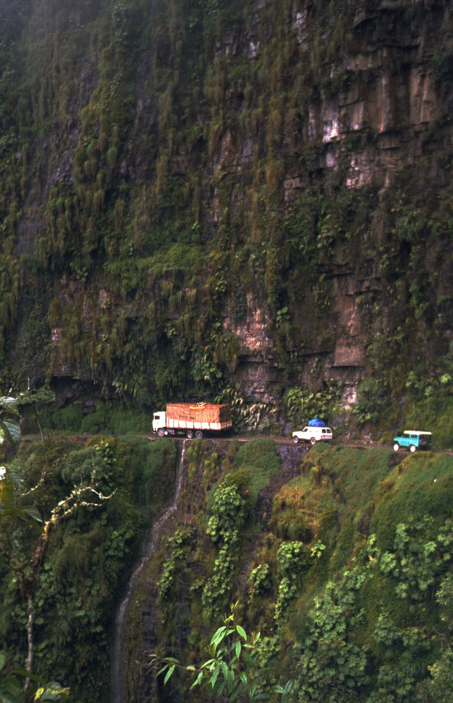
https://en.wikipedia.org/wiki/File:Bolivia_Yunga_Road.jpg Bolivia Yunga Road

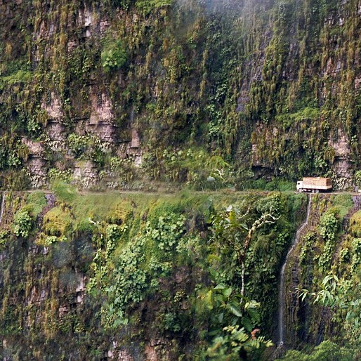
Here I could notice great height and depth because the road and the vehicles were placed in the center of the picture. Therefore they were looking quite tiny.

But, I don't find that photograph worth staring at since the road is diving the photo into two halves and thus removing any tension.

How to show great heights and depths without the road dividing the picture into two halves?

\$\endgroup\$
2
  • 2
    \$\begingroup\$ It could also be a mossy trunk with toy cars. :) \$\endgroup\$
    – eogavy
    Commented Dec 25, 2015 at 10:10
  • 2
    \$\begingroup\$ By "tension", do you mean some kind of fear/awe caused by the natural elements (cliff+depth) ? If so, maybe a good way to convey such feeling would be to try making a photo where the spectator "belongs" to the scene (takes part in something adventurous). Your example feels more like "I've seen that" than "I took part at that". What do you thing about this picture : st.depositphotos.com/1068784/2021/i/950/… ? So maybe something like that : i.dailymail.co.uk/i/pix/2014/04/01/… \$\endgroup\$
    – Olivier
    Commented Dec 26, 2015 at 0:11

7 Answers 7

5
\$\begingroup\$

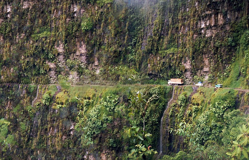
In this case, I like the road across the center, showing both "a long way up" and "a long way down". So, what to do to increase dynamic interest? If possible, I'd do it horizontally, taking the photograph in landscape orientation (or perhaps square), putting the vehicles to the right of the frame with empty road ahead. Something like this:

enter image description here

That way, you're not cutting off the steep cliff above or below, but everything isn't all centered.

Of course, this is a quick hack with Liquid Rescale and the clone tool, just to show the idea. It might be that the actual real world and cliff face doesn't support this. In that case, maybe just wait until there's a lone vehicle and catch it as it enters the frame on the right.

\$\endgroup\$
2
\$\begingroup\$

But, I don't find that photograph worth staring at since the road is diving the photo into two halves and thus removing any tension.

Is that your own personal feeling? Or is it with no exception something that would be repulsive or not interesting?

If you refer to composition rules, one of the compositions rules is saying you should break those composition rules in order to achieve interesting or creative outputs.

If we are referring now ONLY to this picture, and the only problem here would be the road splitting the picture in half and since the picture is not showing either a top end neither a bottom end of the scene (skies or whatever would be at the bottom of the depth), you could just crop the picture or re-compose while taking the shot to have the road at 1/3 of the picture (and follow the standards).

One other thing you could do, is create a vertical panorama out of more shots

Cropping this very picture a bit differently would also dramatically change the perception of the viewer. Tuning the contrast, levels, saturation would also contribute to the visual impact. Is this version any better from your point of view? enter image description here
\$\endgroup\$
2
\$\begingroup\$

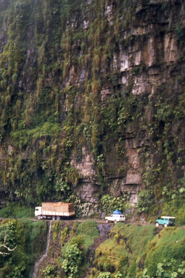
It depends what you are trying to show. If this picture is for a scientific purpose, then exactly what it is may be the best. If the point is asthetic, then putting the road at either top or bottom would be better.

For example:

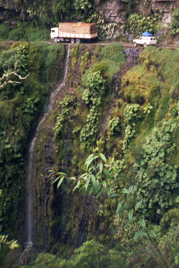
Or:

In both cases I would have included more of the cliff to get a more dramatic scale and to give the viewer something to "anchor" against. These crops are just to illustrate the concept.

\$\endgroup\$
2
\$\begingroup\$

Perspective-wise, you could try to convey a sense of height by looking up at the vehicles from slightly below the level of the road, rather than including as much area below them in the frame as above. Of course, this might be easier said than done in terrain like that in the photo...

\$\endgroup\$
2
\$\begingroup\$

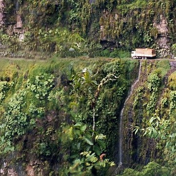
Combining Olin Lathrop's answer, mattdm's answer, and my own views I feel that the following photographs look more dynamic as compared to the default one.

Reasons are as follows:

  • The photos have been cropped in the square format as opposed to the default landscape format. Our eyes will now seeing something which it is not used to seeing.
  • The number of vehicles have been reduced to 1. This looks like a lonely vehicle in a dangerous area.
  • The vehicle has been moved to the corner as opposed to keeping them in the dead center to create some tension, and let the eye explore the rest of the landscape.

Though the first photo still has the road in the center, but I find it to be equally dynamic to the other photo where I have tried to follow rule of thirds (due to the reasons mentioned above).

enter image description here

enter image description here

\$\endgroup\$
2
\$\begingroup\$

Just Quickly and without tools to do this myself: -What would happen if you mirrored your image, so that the cars seem to move from left to right instead?

Left to right readers tend to think that left of the image happened before right of the image. That is in conflict with our knowledge of how the cars are moving in your image. We know they are moving from right to left. If you make our "time-reading" (left->right) agree with our knowledge of the cars movement you are likely to remove an unsettled feeling and let the eye see the rest instead.

\$\endgroup\$
1
\$\begingroup\$

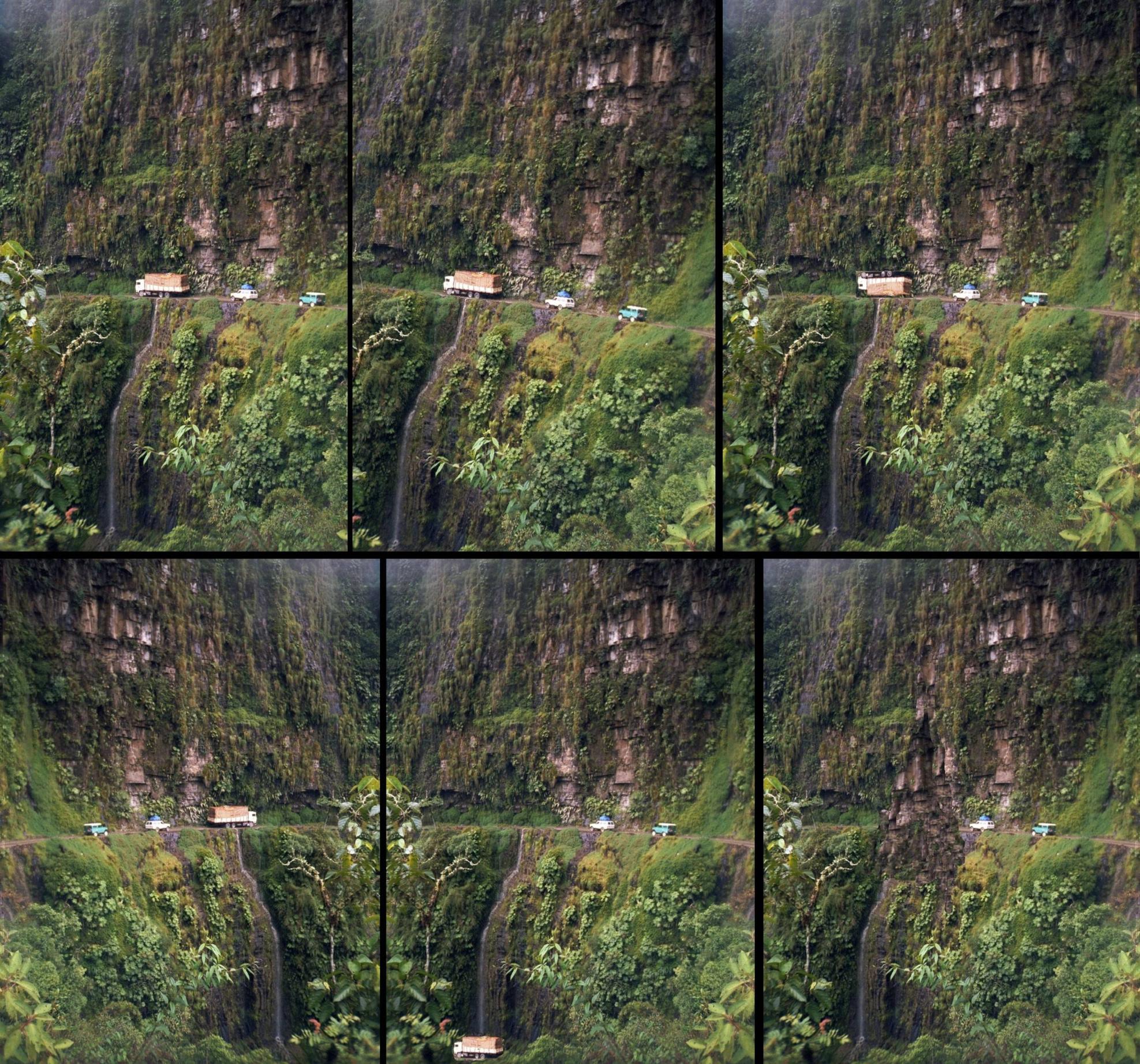
Key

1 2 3
4 5 6

1,2 & maybe 4 are "serious".
3, 5, 6 are "Happy New Year" mode.
(Editing quality is 'concept demonstration level' :-) )

I feel that 2 is most useful if it can be done without doing violence to the image.

1 Crop behind (right) - feels somewhat improved to me but that's subjective)(as are most such changes)

2 Tilt picture somewhat - the aim is not to suggest that the road is sloping but to change apparent photographer location. If this was done in real-life the perspective would change the image somewhat and it should look more natural. Perspective modification to original image could be carried out.

3 This would be hard.

4 Horizontal flip - changes 'feeling' but also changes reality.

5 Very hard - fortunately

6 Not hard enough - unfortunately

Happy New Year!

enter image description here

Larger - should one care :-)

\$\endgroup\$

Your Answer

By clicking “Post Your Answer”, you agree to our terms of service and acknowledge you have read our privacy policy.

Not the answer you're looking for? Browse other questions tagged or ask your own question.