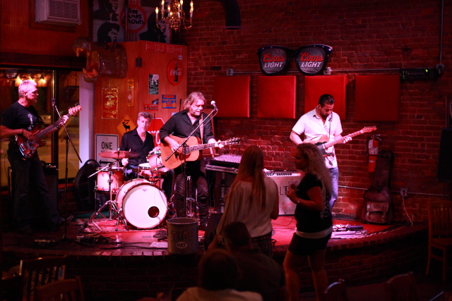
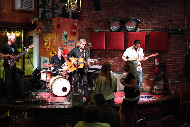
With strange mood lights, color temperature and tint won't fix it because it doesn't follow that pattern.
Your problem is that if you turn down the blue, you have an ambiguity in whether or not the object had any blue for real. Consider two shirts, one grey and one blue, that look the same under that light.
I had a similar issue a short time ago, with crazy colored lights in a hotel convention meeting room.

I started with the white eyedropper and fiddled with the sliders to get the skin looking something in the pink range.
I thought this was (still) terrible, but drew acclaim from others who were using just smartphones and "auto" white balance. :)
Then in PS I used the hue filter to adjust only pink to dial in the skin tone. I decided to go with a desaturated overall look to better deal with lack of strong accurate color: just use less overall!
Then move on to other identifyable colors: without uniforms, who cares if a shirt is purple or cranberry? You might not even know or recall. In my case, the green leaves needed to look like leaves, so I adjusted a hue range again, and happily this had no affect on skin tones so I did not have to mask.
You get the idea: fix the skin tone, then adjust hue on anything else that draws attention. Never mind if the rest of it is accurate, just unobtrusive.
If you have very low saturation in some colors (as explained above) reduce the others to match, or artisticly add them back in where needed.
Not shown here, I also that weekend completely replaced skin tone and clothes by using a Photoshop adjustment to paint color whike leaving the hue and saturation unchanged.


