6
\$\begingroup\$

There aren't many options for RAW development for the Fujifilm's X-Pro 1 because of its unique sensor layout. However, Fujifilm has clearly spent a lot of time working on the in-camera JPEG results, which get high praise, especially in the rendition of skin tones.

There are a number of options for controlling these, including tweaks to "color" (by which they appear to largely mean saturation of color) and changes to highlight and shadow "tone", but the Big Switch is what Fujifilm calls Film Simulation. In addition to a number of monochrome options, these are described in the manual like this:

  • Provia (Standard) Standard color reproduction. Suited to a wide range of subjects, from portraits to landscapes.
  • Velvia (Vivid) A high-contrast palette of saturated colors, suited to nature photos.
  • Astia (Soft) Enhances the range of hues available for skin tones in portraits while preserving the bright blues of daylight skies. Recommended for outdoor portrait photography.
  • PRO Negative High Offers slightly more contrast than PRO Negative Standard. Recommended for outdoor portrait photography.
  • PRO Negative Standard A soft-toned palette. The range of hues available for skin tones is enhanced, making this a good choice for studio portrait photography.

These descriptions are better than some I've seen, but they're pretty short on specifics. In my testing, I've seen that what the "Pro Negative" settings actually do is make tanned or pink skin very pale, and strongly boost contrast in the shadows — somewhat at odds with the description.

Is there a way to get a better handle on what these effects do, and which I want to be using if I'm shooting in JPEG? (Because, hey, that's where the money went.) I can take a bunch of test shots, but going through all the permutations seems time consuming (especially since the in-camera RAW development is tedious). Is there a shortcut to understanding?

I used the "film simulation bracketing" feature to make these:

ProviaVelviaAstia

Which are Provia, Velvia, and Astia respectively — to my mind, that's "neutral to the point of bland", "overcooked", and "I would say overcooked if I hadn't just seen the previous".

My Pentax camera has range of image tone options similar to these "film simulation" choices, but for each of these, on the back of the screen there's a hexagonal color spider chart showing the effect of the settings. This isn't a perfect representation, but gives some idea of what's going on.

Is there a straightforward way to produce those for this camera (or for any generic camera), or has someone already done the work?

\$\endgroup\$
3
  • \$\begingroup\$ Which are Provia, Velvia, and Astia respectively — to my mind, that's "neutral to the point of bland", "overcooked", and "I would say overcooked if I hadn't just seen the previous". Is that right? I'd expect Astia to be the bland one, based on experience with the slide films. \$\endgroup\$
    – coneslayer
    Commented Apr 30, 2012 at 1:12
  • 1
    \$\begingroup\$ @coneslayer — I double checked, and yeah. Which I guess is an addendum to the question: can familiarity with the film after which these options are named really help? (And the answer, apparently, is no.) \$\endgroup\$
    – mattdm
    Commented Apr 30, 2012 at 1:30
  • \$\begingroup\$ Regarding tone curves: yes, there is a relatively simple method of deducing actual tone curves given that you may do RAW and JPEG of same exposure. I may explain it in details. \$\endgroup\$ Commented Apr 19, 2016 at 17:28

2 Answers 2

4
\$\begingroup\$

If you want to evaluate color reproduction and accuracy, you need to use a color checker card. X-Rite is pretty much the source for such devices today, as they purchased Gretag Macbeth some time ago. I personally use the X-Rite ColorChecker Passport, which is a handy pocket-sized clamshell device with the standard colorchecker pattern, an enhanced color calibration chart, and an 18% gray card inside. You can also get a larger "standardized" colorchecker pattern chart with the standard pattern, a large extended pattern chart (with LOTS more color swatches), and a few other options. I would say the standard pattern is plenty.

You just set the color checker card up in a known lighting type, say sunlight, set the camera's WB setting to match, and take shots under each picture style. You can then compare the results of these on your computer screen to the actual card (just hold it up to next to the replications on-sceen.) I believe these days there are also digital versions of the color checker card that can be used for comparison purposes as well, although you need to make sure you calibrate your screen appropriately so as not to skew the digital version. (Really, you should probably calibrate your screen to a normalized medium anyway...I would check X-Rite's site for proper use of their color checker card, as it has been quite some time since I did all this calibration myself.)

You should be able to readily perceive differences in color reproduction and saturation for each camera setting. Its also important to keep in mind, the tool you use for RAW processing, if you wish to check RAW, will affect color reproduction as well. Most, such as LR/ACR, Aperture, etc. have their own approximations of in-camera picture styles, but they are rarely exact. You will need to use manufacturer-provided tools for the closest RAW replication of in-camera JPEG picture styles. You should be able to compare similar settings for your Pentax as well, and see how both cameras fare relative to the standardized swatches themselves, as well as to each other.

\$\endgroup\$
2
  • \$\begingroup\$ Datacolor would be the other name in color management. I've switched to the Spyder 4 since both my Huey Pro and X-rite i1 are useless on my Mac now. I gave up on X-rite after that, just too annoying in that respect. \$\endgroup\$
    – Joanne C
    Commented Apr 29, 2012 at 17:22
  • \$\begingroup\$ JoanneC: Aye, totally agreed there. I own the DataColor calibration suite, including the Spyder 4, their print calibrator, etc. Their products are great, although I have not actually used their camera calibrator. I would imagine its pretty good, as it comes with companion software that should make calibration comparisons between camera and the actual swatch colors a breeze. \$\endgroup\$
    – jrista
    Commented Apr 29, 2012 at 17:33
3
\$\begingroup\$

Fujifilm released a blog series explaining what each film simulation does: https://fujifilm-x.com/us/x-stories/the-world-of-film-simulation-episode-1/

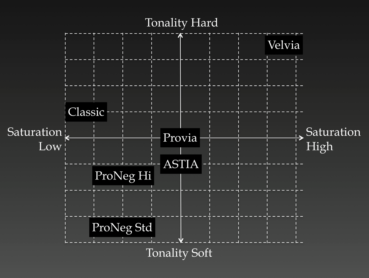
You will also find the following image about the film simulations on that link:

enter image description here

Here's some key points that I believe summarize each film simulation. I've included some quotes from the blog post too. If you are a Fujifilm shooter, I would recommend reading it.

Classic Chrome

Focusses on tonality over colour, by using low saturation and slightly harder than average tonality. Tonality is harder in the shadow range than in the highlight range.

Minimized saturation and one of a kind tonality that make the subject stand out, this is all to tell the story as clear as possible. We would like the photographers that advocate for contents, to also use this film simulation.

Velvia

Focusses on colours, as opposed to Classic Chrome. This is designed with what Fujifilm calls "memorized colour" in mind. It has high saturation, but it is not just that. They, for example, add magenta to create more vibrant blues.

The epitome of Velvia is the communication through color between the photographer and the viewer. There are certain emotions that only "Image Color" can deliver.

PRO Neg.

There are two PRO Neg.'s: PRO Neg. STD and Pro Neg. Hi. Both are aimed at portrait photography. Both have low saturation. STD has overall softness, while Hi has softness in the skin colours. STD is aimed at studio photography where you have perfect control over lighting, while Hi is aimed at situations where you have less control over lighting, think the catwalk.

The two film simulation compliment each other. “PRO Neg. STD” is good for still subject and “PRO Neg. Hi” is good for active subject.

ASTIA

My personal favourite. This one is also aimed at portraits. I love this one for outdoor cosplay photoshoots. It is soft in the skin colours, but not in other colours, allowing for the often vibrant outfits to shine while the skin still appears smooth. It also adds a little contrast and makes the shadows a bit harder.

"ASTIA" is designed to be used under little or no lighting and subject in action. The film simulation is carefully designed to express the soft skin tones and not to wash out at the high end while making the shadow end a little hard. Tonality is designed so that it is sharp enough even without the use of lighting.

Provia

Fujifilm's "Standard" film simulation. It sits in the middle. I shoot cosplays and nature, so you'll find me using Astia and Velvia, but I like going to Provia if I am not certain about my film simulation.

You can use PROVIA for various applications. The expression is limitless. The dot on the chart should be replaced with a wide circle. PROVIA is like Ace of Spades. This is the strongest card of all, and you can be confident of the outcome even when you do not know what to expect.

\$\endgroup\$

Your Answer

By clicking “Post Your Answer”, you agree to our terms of service and acknowledge you have read our privacy policy.

Not the answer you're looking for? Browse other questions tagged or ask your own question.