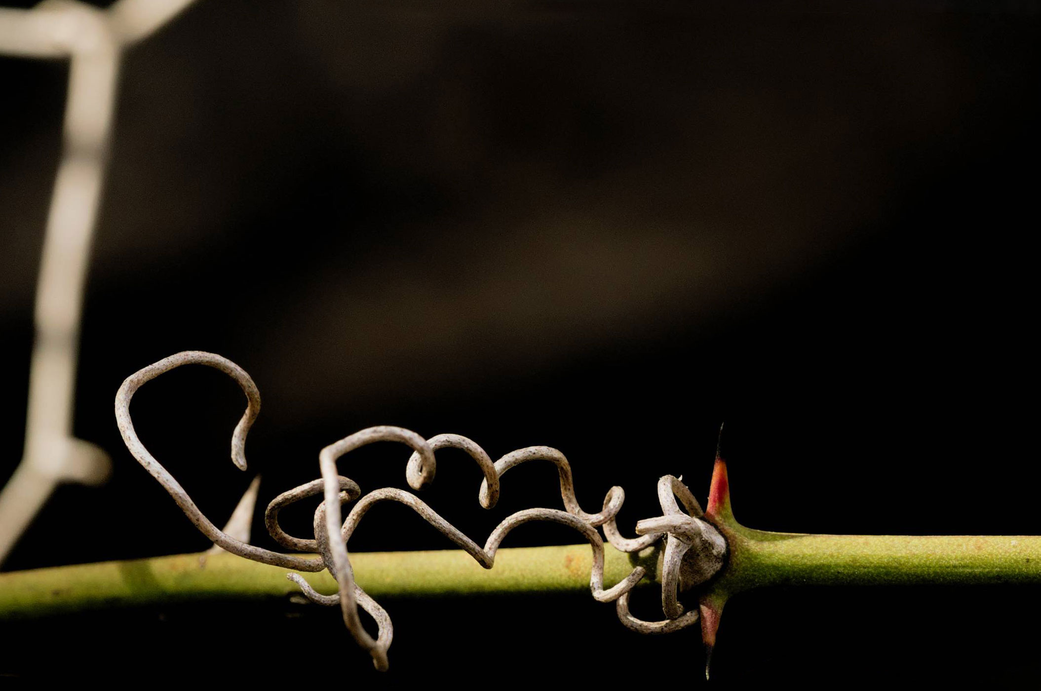
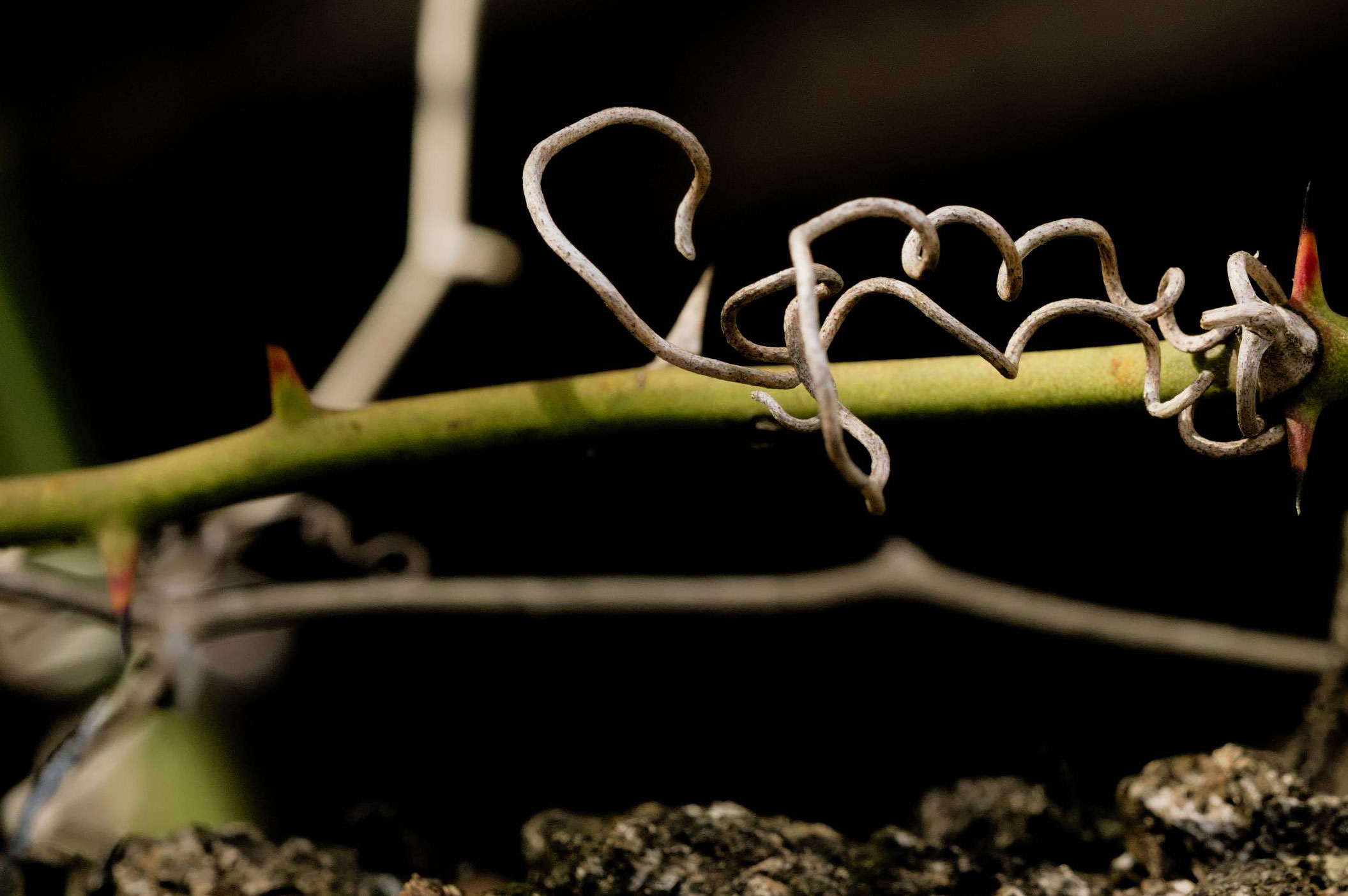
I have this photo of a vine that I've finally level-adjusted to a point where I'm mostly satisfied, but the crop is giving me trouble. I used the Rule of Thirds to set my crop area, and it seems about right to me when I'm looking at it at a closer zoom level, but when stepping back/zooming out the crop looks to wide, like I should tighten it up. I'm not sure how to go about determining that; how should I approach it?
2 Answers
I had a similar qestion a couple of years ago - How to choose the most appropriate composition?
You find yourself chasing in circles trying out different things, yet not being sure which is 'right'.
The trouble is, there is no 'right', there's only the one you finally choose.
In my particular case, the one I ended up with was an accident, the client was looking for a portrait & I'd sent a landscape - solved by turning the phone round.
Another thing to bear in mind is that no-one but you (or us, in this case) will ever know what you cropped out. So you get stuck in a dither of alternatives - because you can see all the alternatives. They will only ever see the finished result; so the only person that will ever even think about what's 'missing' or what else could have been done is … you (& us).
I had a go at some 'dangerous' alternatives. I'm not saying any of them are great, just different approaches. As I was doing it, I tried to give each a title that would explain, at least to me, what the idea of each was… just as something to hang onto as a thought process.
Negative Space
Just the Facts
All the Threes
From Another Angle
If anything, I like the first couple. The others get messy, especially the third, which, whilst trying hard to put every aspect of the image onto a rule-of-third line ends up looking like disorganised clutter once you take the grid lines away.
The last one was just an idea to shake things up a bit. Not sure it worked.
In the first two, I've painted out encroaching objects to keep the background cleaner.
After comments, I extended the paint-out idea. I get the feeling it's gone maybe a bit minimalist now, but I don't hate it…
Paint it Black
-
4\$\begingroup\$ IMHO the big problem with the picture is the distracting bright out-of-focus twig on the left, and your last crop is a good way to get rid of most of it. \$\endgroup\$– xenoidCommented Mar 12, 2021 at 9:54
-
2\$\begingroup\$ That last one satisfies my minimalist soul. My only bone with it is that the white tip of the thorn is a bit too close to the frame for comfort. \$\endgroup\$– xenoidCommented Mar 12, 2021 at 10:18
-
1\$\begingroup\$ @xenoid - you have to bear in mind I'm spending whole seconds on these edits ;) \$\endgroup\$– TetsujinCommented Mar 12, 2021 at 10:19
-
1\$\begingroup\$ @xenoid Going back, I wish I could have eliminated that branch, but it was drastically less prominent before I pulled the levels (all told, I'm running at probably a cumulative +3.5EV on the highlights). I'm torn between "figure out how to heal it out" and a very strong dislike for content modifications. \$\endgroup\$ Commented Mar 12, 2021 at 15:45
-
2\$\begingroup\$ @chrylis-cautiouslyoptimistic- Instead of completely painting it out, there is also the option to use a mask and selectively reduce the expose for the area of the branch. This is something I would consider as advanced exposure adjustment rather than content modification, so it might be a good compromise. \$\endgroup\$– luatorCommented Nov 11, 2022 at 9:20
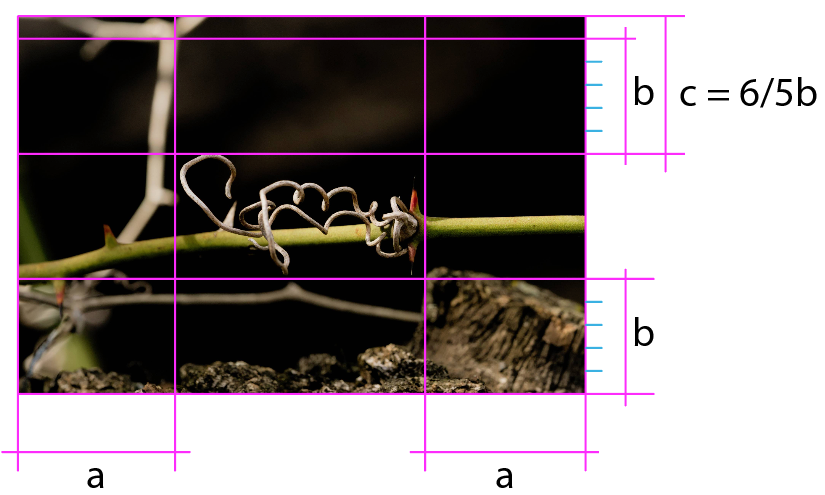
Once the main object of the photograph is defined, the crop should be made based on the blanks it leaves, the empty areas in the case of this image.
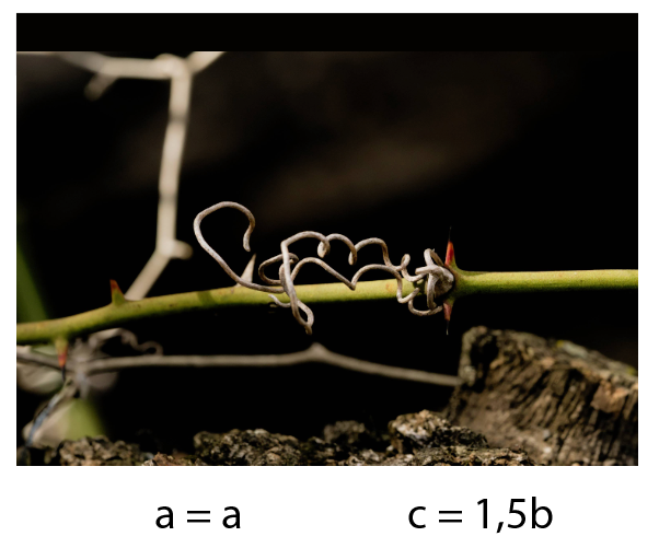
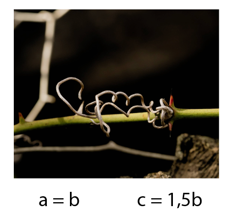
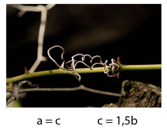
While the two outer margins show clear equality and equidistance, the difference between the upper and lower margins has a minimal difference that looks arbitrary or capricious, unbalancing the entire composition (c in the image below).
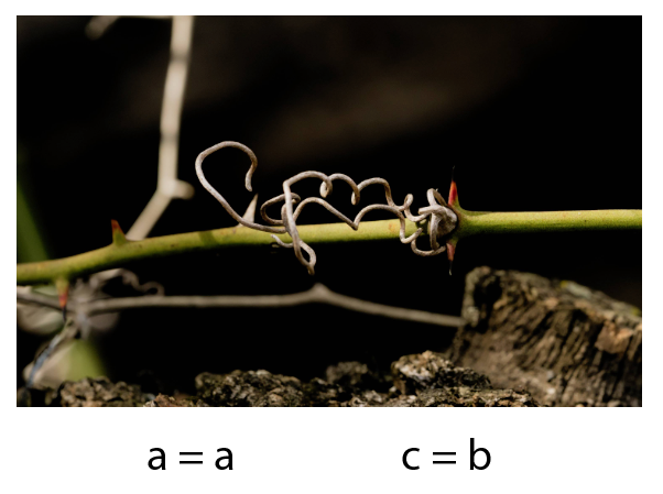
You should find a way to adjust both proportions, either equaling them or exaggerating their difference, but never by an insignificant minimum, but looking for proportional relationships: 1.2 or 1.3.
Here are some examples with relationship settings between blank areas:


