14
\$\begingroup\$

Atm I'm editing some images (Mainly photos of landscapes and food) for a social media campaign. My supervisor is confident that adding high saturation and contrast will lead to more attention in social media, while I am not convinced yet.

Is there any study or proof that high saturation and contrast in a photo will lead to more attention and make the image "shine out"?

\$\endgroup\$
10
  • 1
    \$\begingroup\$ No only in social media... \$\endgroup\$
    – xenoid
    Commented Jun 17, 2019 at 6:34
  • 14
    \$\begingroup\$ Do an A/B test to find out. \$\endgroup\$
    – xiota
    Commented Jun 17, 2019 at 7:02
  • 2
    \$\begingroup\$ This was considered a truth even before the digital era. Without Photoshop or other image processing software, it had to be solved on a chemical level and therefore colour negative films for the consumer marked are usually made high constrast and high saturation. \$\endgroup\$
    – jarnbjo
    Commented Jun 17, 2019 at 12:36
  • 15
    \$\begingroup\$ I pray to the gods that what is more appealing to social media never dictates what is good photography. \$\endgroup\$
    – Alaska Man
    Commented Jun 17, 2019 at 19:33
  • 7
    \$\begingroup\$ Kinda reminds me of the Loundness War. \$\endgroup\$ Commented Jun 18, 2019 at 7:16

3 Answers 3

22
\$\begingroup\$

I think your manager is right, and that this phenomenon is much more widespread than just photos for social media, or even photography in general.

Take a look in supermarkets, and take in the flashy bright colours and stark contrasts brands use to attract your attention. If they get you to look at their product, chances of you buying it shoot up dramatically. That's how it works for social media; get people to look at your content, and they might just get more engaged with your product.

The same counts for the colourful application icons on your smartphone, and especially the notification marks for these apps that attract your attention and engage you with their their product.


Sources for further reading

  • Morton J. Why color matters. COLORCOM. Available from: http://www.colorcom.com/research/why-color-matters. 2010.
  • Labrecque LI, Milne GR. Exciting red and competent blue: the importance of color in marketing. Journal of the Academy of Marketing Science. 2012 Sep 1;40(5):711-27.
  • Asadollahi A, Givee M. The role of graphic design in packaging and sales of product in Iran. Contemporary Marketing Review. 2011;1(5):30-4.
\$\endgroup\$
0
12
\$\begingroup\$

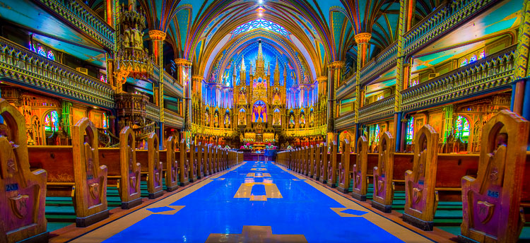
Up to a point, yes. As this answers explains very well.

On the other hand, there is a point at which one enters the area of "too much of a good thing!".

https://www.digitalphotomentor.com/photography/2016/09/processing-sins-over-saturation-750px-09.jpg

Here's the full article rom which the above image was linked: 7 Deadly Photo Editing Sins That Could Ruin Your Images.

\$\endgroup\$
8
  • 13
    \$\begingroup\$ While that image is ... horrible ..., it is going to make you notice it among a bunch of less garish images. \$\endgroup\$
    – user82065
    Commented Jun 17, 2019 at 14:11
  • 13
    \$\begingroup\$ it's beautiful - in terms of a certain aesthetic. If you were trying to blend gothic and cyberpunk together in a game, then it would make for good inspiration. As an accurate yet aestheticly pleasing photo though? no. \$\endgroup\$
    – Baldrickk
    Commented Jun 17, 2019 at 15:16
  • 1
    \$\begingroup\$ Ahhh my eyes! HDR is so overused these days (and generally, I'd say "improperly"), that image is driving me crazy! ...but, if your belief is that "any press is good press", I suppose even users talking about how "overdone company XYZ's photos are" means they're talking about your company... \$\endgroup\$
    – BruceWayne
    Commented Jun 17, 2019 at 16:25
  • 15
    \$\begingroup\$ On the other hand, that particular basilica was going for "god, the video game!" when it was built. Sure, it's pushed too hard, but it really is that colour. \$\endgroup\$
    – Tetsujin
    Commented Jun 17, 2019 at 17:55
  • 4
    \$\begingroup\$ @Tetsujin This version is much closer to what the eye sees at Montreal's Notre-Dame Basilica. \$\endgroup\$
    – Michael C
    Commented Jun 18, 2019 at 0:16
9
\$\begingroup\$

It doesn't straight answer your question but I'd say your supervisor is correct on this one.

MKBHD did a blind test comparison between smartphones and the result is exactly this theory. The flashiest and most saturated photos always were considered better, even being of lower quality.

It's the sad reality we live in.

\$\endgroup\$

Your Answer

By clicking “Post Your Answer”, you agree to our terms of service and acknowledge you have read our privacy policy.

Not the answer you're looking for? Browse other questions tagged or ask your own question.