4
\$\begingroup\$

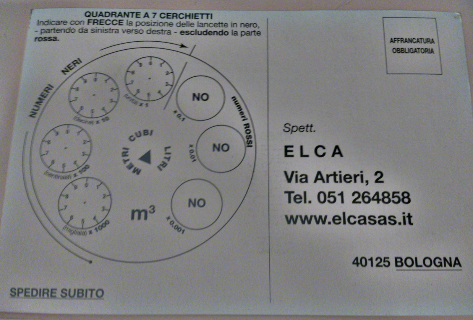
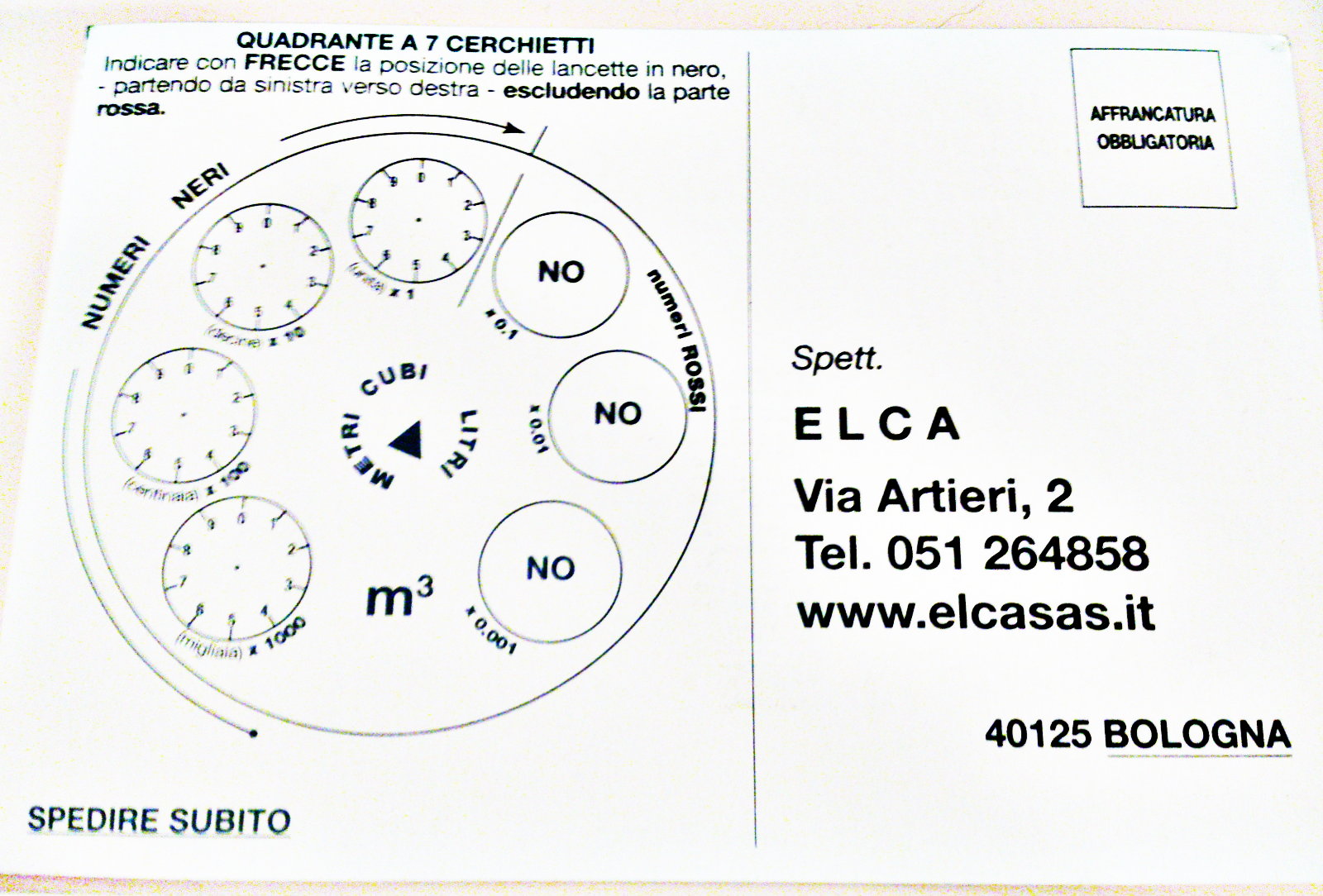
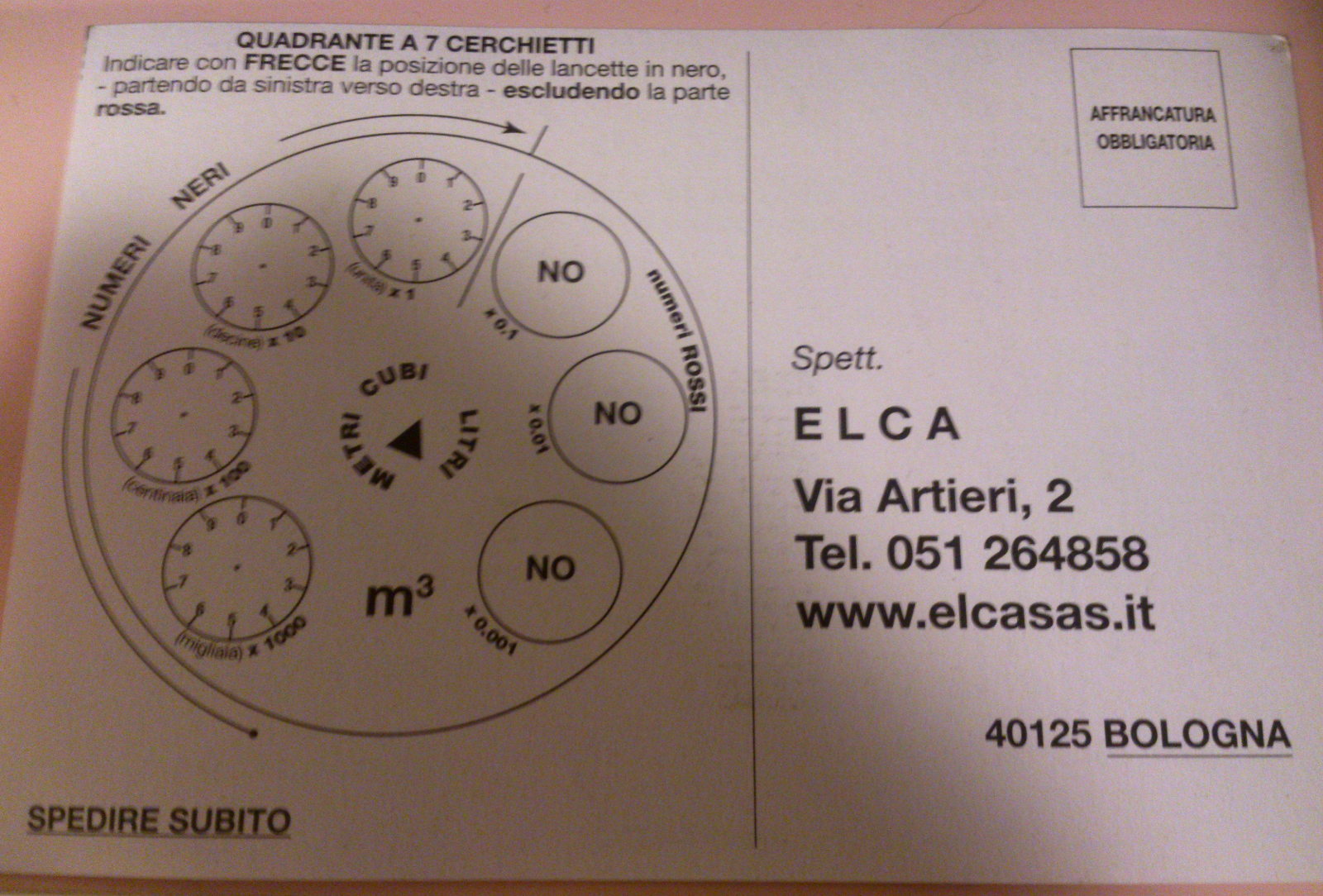
I have a photograph of a document with black text on white background.

The photo has a few problems:

  • The text is a bit blurry.
  • Overall there is noise even in the white areas.
  • The background appears not really white but a bit yellow-ish.
  • Most important: Some areas of the picture, even the areas that are supposed to be white, are darker than others.

I would like to clean this picture up. I am on Linux.

The "Colors > Auto > White balance" filter in GIMP is producing promising results. However, it does not equalize the background in different areas in the picture.

But if I select only a sub-area of the image, the "White balance" filter actually works better in this area.

So I imagine that gradually applying "White balance" in local areas of the picture would work really great.

I imagine that the "White balance" filter is implemented like this:

  1. Collect color statistics of the entire picture.
  2. Build a color conversion matrix, and apply it globally.

So what I'd like instead:

  1. Collect local color statistics for every area of e.g. 100*100 px.
  2. Build local color conversion matrices.
  3. Build continuous function of conversion matrices per pixel.
  4. Apply locally per pixel.

Do you know anything like this that exists either in GIMP or as an independent piece of software e.g. for the Linux command line?

\$\endgroup\$
8
  • 2
    \$\begingroup\$ Would simply desaturating the image not work for you? \$\endgroup\$ Commented Nov 23, 2016 at 2:17
  • \$\begingroup\$ Or increasing exposure until all but the black print is blown out? \$\endgroup\$
    – Michael C
    Commented Nov 23, 2016 at 2:41
  • \$\begingroup\$ @MichaelClark I photographed the document with my mobile cam, handheld. It does not have a control for exposure. Also lighting is not optimal. And I don't like flash because it creates reflections and uneven lighting. \$\endgroup\$
    – donquixote
    Commented Nov 23, 2016 at 15:59
  • \$\begingroup\$ @junkyardsparkle Desaturate just turns the image to greyscale. The main problem I cannot easily fix is the variation of the background. \$\endgroup\$
    – donquixote
    Commented Nov 23, 2016 at 16:00
  • \$\begingroup\$ I fixed the bullet list in the question. The main problem which this question is about is that the white level of the background is not evenly distributed. \$\endgroup\$
    – donquixote
    Commented Nov 23, 2016 at 16:02

4 Answers 4

10
\$\begingroup\$

I assume you have a gradient in overall brightness due to unevben lighting. If that's the case, what you could do is to duplicate the layer with the image and apply the best correction to each part of the image on a different layer: curves for contrast, color balance or desaturate for white balancing.

Then, using layer masks you can paint each region with smooth gradients, in order to blend them together. Desaturation can be used as last step to even a bit the remaining differences.

An alternative approach could be to duplicate the layer (i took a picture with my hand shading half of the card, to reproduce the issue):

Blur it until the text disappears:

enter image description here

And then subtract the resulting layer from the original one select the blending mode as "Grain extract", in order to reverse the unevenness of the lighting:

enter image description here

The lowpass filtering that you achieve by blurring is only effective if changes in lighting are much smoother than the details of text, and it works best with sparser text as it disappears with blurring. Note that in this case, the bold text causes a halo when blurred, which gets inverted when doing the blending. You can try with a larger radius, or try masking it before blurring the duplicate layer.

Also, note that this operation also fixes the white balance as it inverts the color curves.

As a final touch I applied the 'Curves' setting to increase contrast.

enter image description here

It may not be perfect but I'm actually surprised by how that one came out.

\$\endgroup\$
7
  • \$\begingroup\$ I suspect your 2nd approach wouldn't work unless the text was very sparse. But the first seems like a good idea \$\endgroup\$
    – Chris H
    Commented Nov 24, 2016 at 6:54
  • \$\begingroup\$ @ChrisH I tried it and, actually, I believe it can be effective. I agree with you that denser text may be a problem, but not so much if you blur enough. Very bold and sparse text may actually be worse. \$\endgroup\$
    – clabacchio
    Commented Nov 24, 2016 at 21:11
  • \$\begingroup\$ Very nice. That's the sort of thing I was thinking of as sparse compared to something like a letter. \$\endgroup\$
    – Chris H
    Commented Nov 24, 2016 at 21:52
  • 1
    \$\begingroup\$ @donquixote of course the result can be improved, it took me 10 minutes to get there and I'm no expert. If you want more quality, I think using a clone tool on the layer to be blurred could help, as would a better blending. But the principle is there, and it could be done in batch \$\endgroup\$
    – clabacchio
    Commented Nov 24, 2016 at 22:30
  • 1
    \$\begingroup\$ I thjink the circles on the left got overexposed on the last step, they look almost OK in the previous image. Gotta try again \$\endgroup\$
    – clabacchio
    Commented Nov 24, 2016 at 22:32
1
\$\begingroup\$

You are likely to have some success doing levels in the channels that are darker (if the image looks yellow, lighten the blue channel etc.) You can do this globally. This is likely to be in addition to (before) levels on the *value" channel. In the value channel, you can move the input black and white points closer together, then probably increase the gamma to lighten the paper that's affected by the blur from the print.

While desaturating might help it will leave you with a grey background rather than white if applied before you lift the background levels - it will be useful once the background looks white. Unsharp mask with a fairly low value but large radius can lift areas of white around the text, while a small radius can overcome some of the blur.

I don't recommend threshold unless you absolutely have to provide black-and-white, as greyscale has an anti-aliasing effect.

Once your background is white (rgb 255,255,255) well away from the text, local spot removal might be necessary.

\$\endgroup\$
7
  • \$\begingroup\$ While I know I have examples to back this up, I don't have the intermediate steps saved. \$\endgroup\$
    – Chris H
    Commented Nov 23, 2016 at 7:48
  • 1
    \$\begingroup\$ There's a compromise approach to threshold: posterise to a small odd number (I usually experiment with 3 to 15 and end up picking 3 or 5). It largely gives the cleanness of threshold with a bit of anti-aliasing. \$\endgroup\$ Commented Nov 23, 2016 at 14:35
  • \$\begingroup\$ @PeterTaylor I'll have to try that some time and see how it compares to my steep levels approach. \$\endgroup\$
    – Chris H
    Commented Nov 23, 2016 at 15:52
  • \$\begingroup\$ @ChrisH Thanks for the answer. But it does not really address the main problem, that the background is unevenly lighted. \$\endgroup\$
    – donquixote
    Commented Nov 23, 2016 at 19:57
  • 1
    \$\begingroup\$ @donquixote IME (and I've done this quite a bit) it does address that issue. Though I don't think it's a great answer to your question, I think it's a decent answer to your problem. Could you post a (redacted if necessary) image? \$\endgroup\$
    – Chris H
    Commented Nov 23, 2016 at 20:04
1
\$\begingroup\$

...blending mode as "Grain extract"

"Division" mode also produces nice effects for documents (more contrastful)

\$\endgroup\$
2
  • 2
    \$\begingroup\$ Hey Laskus, welcome to the site. Can you provide any more detail about how to use "Division" mode and what it does? This may be promising information for what the OP is trying to do, but it's of limited value without some explanation of how to use it. \$\endgroup\$
    – AJ Henderson
    Commented Aug 29, 2018 at 13:49
  • \$\begingroup\$ I just tried this; the "Divide" layer blend mode has a more immediate effect than "Grain Extract"; the result is similar to jumping straight to the last step in @clabacchio's answer. However, from playing around I sometimes get cleaner-looking text from the Grain Extract / curves method, so it probably depends on the input image. Anyhow, the steps for this are: duplicate the base layer, blur, set blend mode to "Divide". As for what exactly it does, see docs.gimp.org/en/gimp-concepts-layer-modes.html . \$\endgroup\$
    – Felix
    Commented Oct 24, 2018 at 2:14
0
\$\begingroup\$

Here is an idea without concrete implementation instructions. If someone can flesh this out in a new answer, go ahead!

First you make a copy of the image, e.g. in a new layer - depends on the tool you use.

In this copy, you first do a bit of smoothing with a small radius. This means, every pixel becomes a weighted average of its local surrounding.

Then you apply a median, or a "lower median", with a radius larger than the average character. This means, for every pixel (and every color channel):

  • Collect all pixels in the vicinity, e.g. 100 = 10x10 pixels.
  • Sort them by brightness.
  • Use the 50th brightest color value, as the new color value for the central pixel. Or the 10th darkest color value, for "lower median".

This gives you an estimate of the background. However, it will likely contain "steps" in the colors due to how medians work. Maybe there is something even smarter than these medians.

Optionally, use some smoothing (large radius) to eliminate these steps.

Now subtract this layer from the original image.

Optionally, use "white balance" on the result (if you are working with GIMP).

I don't know which tool I should pick if I wanted to implement all this. So far I used PHP, but I am not convinced that this is the best solution at all.

\$\endgroup\$

Your Answer

By clicking “Post Your Answer”, you agree to our terms of service and acknowledge you have read our privacy policy.

Not the answer you're looking for? Browse other questions tagged or ask your own question.