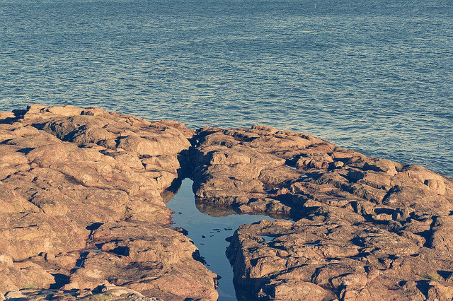
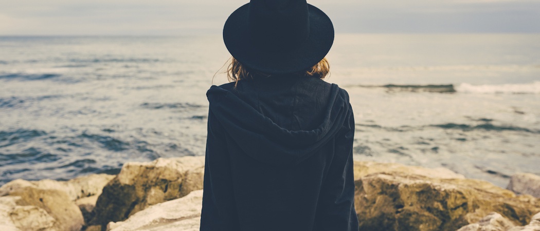
Quick summary: raise the black point and add an orange cast to the highlights and a blue cast to the shadows, and there you go.
Details:
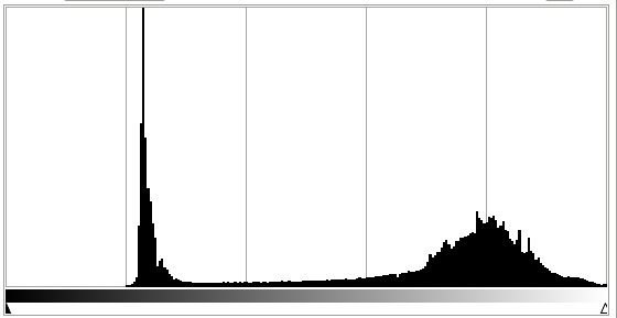
First, like most "vintage" or "film-like" post-processing, the black level has been raised. That means that nothing is pure black; everything is a shade of gray. In this case, this is quite extreme; see this histogram:

note that there's nothing in the image in the lower 20% of values. Generally, the in-camera tone curves of cameras aren't this extreme. It could be caused by veiling glare — excess light bouncing around inside the lens providing a diffuse increase in brightness — but most likely it was just done as a post-processing effect.
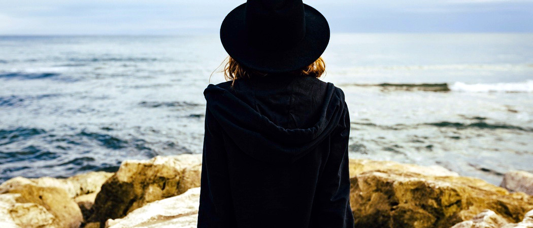
Second, the image has a orange/blue split tone applied. There is a strong orange cast in the brighter parts — the blue channel has been decreased significantly, and green to a lesser degree. And, there is an inverse *blue cast in the shadows**. Your perception of the result was "midnight blueish", but to me the orange cast is quite dominant. (The brain is a funny thing, and since your vision system is designed to compensate for color casts, it's hard to identify them without a lot of careful practice.)
This could be due to messing with white balance in the field, but most likely it is also due to post-processing. This is also typical for "vintage" looks, because it simulates the effect of degradation of color prints, where different dyes age differently.
Both of these are very typical for "old film look" effects, although you'll see different particular color casts. See
for further examples.
It's also instructive to take this into any editing program and hit the "automatic levels adjustment" button (or "auto fix", or whatever). This will stretch the histogram so the blacks are black again, and even out color channels, so you'll get:

which is probably reasonably close to the image as shot. It's not going to be exact, since the color and black level shifts are inherently a loss of information and can't be completely reversed. It's probably more contrasty than the original and will be missing some nuance of color, but this should be in the ballpark.
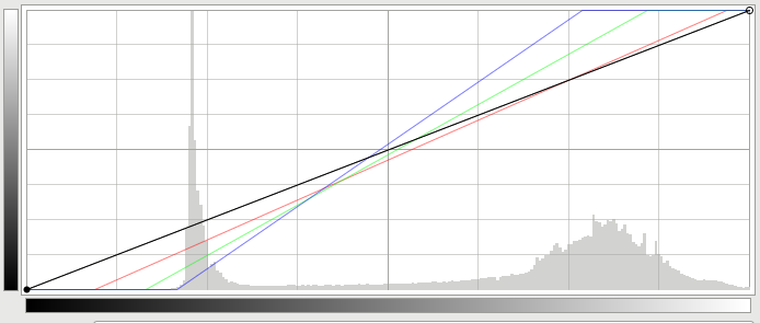
Here's a view of the Curves tool for the automatic correction above:

Here, you can see in order to reverse the effect, the blue channel is raised significantly in the brighter parts of the image, and the green channel raised about half that much. That's the same as adding a blue cast to the whole thing — and that blue is the inverse of orange. And you can see the inverse over on th left, in the darker parts. (The channels are also compressed, increasing contrast to undo the black level change. If you play with this by hand, you can correct the color cast without increasing contrast, if you like.)
Or, for another visualization: for each of the tones in the black-to-white gradient here (with dark tones at the left and right tones at the right), the corresponding color has been added from the blue-to-orange gradient below:

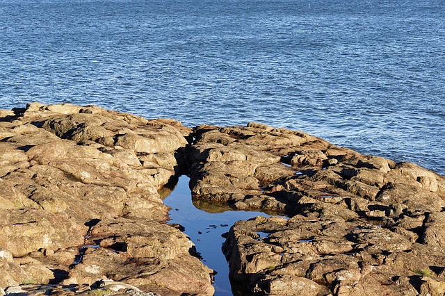
I constructed this by taking the adjustment between auto-levels above, inverting it, and applying it to the bottom half of the black-to-white gradient. You could do the same to an actual photograph, though; here's the same technique applied to a different image:
Before:

After:

Note that there's also possibly a third thing going on. This image is saved with the Adobe RGB color profile. If your web browser and system aren't properly recognizing that and displaying appropriately, colors will be shifted and even more muted than intended. If these two images look identical:


(where the first is the original and in the second I've left the pixels the same but dropped the information which says to render with Adobe RGB), you're seeing that as well, and you should fix your system — but that's a whole different topic.


