I realize that an image histogram is a graphical display of an images tonal distribution (i.e. horizontal darks to lights, vertical pixel distribution), but how does one really use it and why? I mean, can't you determine everything you need just by looking at the image?
-
5\$\begingroup\$ Be aware that the histogram can be misleading, since it shows date from the processed JPEG, not the raw image. There are ways to minimize this; perhaps someone can write an answer explaining how. \$\endgroup\$– ReidCommented Jul 16, 2010 at 3:38
-
1\$\begingroup\$ UniWB is a technique to make the most out of your in-camera histogram: photo.stackexchange.com/questions/664/…. @jrista - feel free to update your answer according to this info if you think it's relevant. \$\endgroup\$– KarelCommented Aug 10, 2010 at 8:40
-
\$\begingroup\$ FYI The histogram added by Magic Lantern as an overlay to Canon DSLRs is derived from RAW data, not JPEG, as is the data displayed by its other overlays. \$\endgroup\$– UndistractionCommented Nov 21, 2015 at 11:25
7 Answers
While there may not be a "right" answer to this question, there are "correct" answers. A histogram is a powerful tool, and when you understand how to use it effectively, it can greatly help your photography.
As you mentioned, a histogram is a representation of tonal range and distribution in a photo. The basic mechanics are as such:
- A histogram represents tonal range from left to right, with blacks and shades to the left, progressing through midtones in the middle, to highlights on the right.
- The "volume" of any given tone is represented by the height of the vertical line that represents that tone.
- A vertical line at the very left end is indicative of the volume of total black tones
- A vertical line at the very right end is indicative of the volume of total highlight tones
- A vertical line in the very center is indicative of the volume of 18% gray tones
- The tones for an image are taken from the intensity of each pixel (chroma, or hue, is ignored, and only brightness/lightness/luminosity is measured)
- The total number of tones in an image is dependent upon the bit depth of the image
- An 8-bpp (24-bit) image has a total of 256 distinct tones
- A 12-bpp (36-bit) RAW image has a total of 4,096 distinct tones
- A 14-bpp (42-bit) RAW image has a total of 16,384 distinct tones
- A 16-bpp (48-bit) RAW image has a total of 65,536 distinct tones
- A 32-bpp (96-bit) HDR image is effectively able to represent infinite tonal range
- There is no technical limit to the height of a histogram.
- Unless you have a very low-bit image, a single histogram is generally incapable of representing every single individual tone in an image, so each vertical line tends to represent a small range of similar tones.
- A color histogram can represent a much greater range of information than a pure tonal histogram in the same space.
(As a real (float) number, the values of a 32 bpp HDR image range from 1.0 x 10^-37 through 1.0 x 10^38. In more real-world numbers, tonal range from black, through very dim starlight (0.00001), through indoor lighting (1-10), through the sunlit outdoors (1,000,000), to the brightness of the sun itself (100,000,000) and well beyond. All those values can be represented in a single HDR image.)
Given these facts about a histogram, there is a wide variety of information you can gleen from one:
Contrast
Contrast is the measure of difference between the brightest tones and the darkest tones. The more range a histogram covers between its left and right edges, the greater the contrast of an image:
Low contrast:

High contrast:

Key & Exposure
Key is the rough measure of brightness in an image, with high-key being brighter, and low-key being darker.
If the histogram is bunched up in the highlights, you have a high-key image:

If the histogram is bunched up in the shades and shadows, you have a low-key image:

Obviously, if the histogram is evenly distributes, you get a balanced exposure:

(A histogram riding up the right-hand side of the histogram probably indicates overexposure – clipped highlights. A histogram riding up the left-hand side of the histogram probably indicates underexposure – blocked shadows.)
White Balance
When using a colored histogram, the convergence of red, green, and blue peaks is an indication of white balance. In particular, the offset of major blue peaks can be a strong indicator of the warmth or coolness of a photo:
- Blue peaks shifted towards the right indicate a cooler tone image

- Blue peaks shifted towards the left indicate a warmer tone image

- Blue peaks within close proximity to red and yellow peaks indicates a slightly warm image
In a properly white balanced image, blue is usually a little right of red and yellow peaks.
Tonal Range
The balance and height of peaks in a histogram is an indication of tonal range and tonal balance. Parts of the histogram that are very low (valleys) indicate very low volume for those tones. Parts of the histogram that are very high (peaks) indicate very high volume for those tones.
Color Volume
A basic colored histogram will often show gray, red, blue, and green. A more advanced colored histogram may also show yellow, magenta, cyan.
Colored peaks are an indication of the volume of those given primary colors, the horizontal position of a colored peak is an indication of the tone of colors of that particular primary or primaries.
Gray indicates a balance of primary colors at those tones. Off-primary color peaks (or partial height lines), such as yellow, magenta, and cyan, indicate a blend of two primary colors at those tones.
EDIT
As mentioned by Jordan H., there is a trick called "expose to the right" (or ETTR) that can be useful to get you the optimal RAW data. When shooting a scene, particularly those that have a broad range of contrast that may be on the border of, or possibly slightly beyond, the 5-6 stop dynamic range of a digital camera, capturing enough tonal range in the shadows can be difficult.
This is due to the the limitations of most current digital sensors, and how they are more sensitive to highlights than shadows. "Exposing to the Right", which is a technique where you slightly overexpose your shots by 1/3 to 1/2 of a stop (which, in turn, shifts your histogram to the right...toward highlights), can help mitigate these limitations.
Exposing to the right can also help alleviate noise problems in the shadier parts of your images. It should be noted that exposing to the right requires that you use RAW format, as only with raw are you saving enough information to correct your overexposure during post-processing to bring your image back into normal range. The benefit of this technique is that it allows you to capture detail that would otherwise be lost, without the need to resort to ND grad filters or other more extreme measures.
This guideline is just that, a guideline. With newer camera sensors, dynamic range is improving, and capturing a greater range of contrast in a scene with a single shot is easier. However, even as digital sensor dynamic range improves, there will always be times when we need to shoot "on the edge" or what is possible, and tricks like shooting to the right will always be useful.
-
\$\begingroup\$ I'd add "shoot to the right", but that's probably closer to a religious debate than factual answer. \$\endgroup\$ Commented Jul 16, 2010 at 4:29
-
\$\begingroup\$ @Jordan: Thats a good point, and it actually has a technical base that justifies it. I'll update my answer. \$\endgroup\$– jristaCommented Jul 16, 2010 at 4:33
-
1\$\begingroup\$ @NickBedford: I agree with your premise, and the theory is correct. However a simple fact is often disregarded by people who argue over ETTR: Its entirely possible that you cannot go less sensitive when your are at ISO 200, or ISO 800 or even ISO 6400, due to shutter speed and aperture constraints. If you need a certain shutter speed, and dropping down from ISO 800 to ISO 400 means you can't achieve that required shutter speed...then ETTR at ISO 800 is entirely valid, theoretically and in practice. \$\endgroup\$– jristaCommented Feb 22, 2012 at 2:53
-
1
-
3\$\begingroup\$ I finally added some sample histograms. Hope they help. \$\endgroup\$– jristaCommented Apr 2, 2013 at 15:40
In the old fashioned darkroom we had a tool called the densitometer. It measured the density (how much light is blocked when you shine a light through) of the negative or slide. It was a bulky and expensive device, and of course it required the film to be developed so it wasn't very practical for use in the field. But we could use it in testing to determine optimum exposure and development techniques for personal use.
Film photographers are primarily concerned with a lack of density. Too much density can conceivably be burned through (apply a greater intensity and/or duration of light to a local area) to recover detail in printing. A lack of density (shadows with negs, highlights with slides) cannot be corrected for, as it means the detail/information isn't there to recover.
Digital photographers have to be concerned at both ends. When the tonal range goes beyond the edges of the histogram scale it means there is nothing in those areas except white or black. You can lighten or darken, but you are only making solid gray tones with no detail recovery possible. I use the histogram display like a field densitometer. It shows me if I've got areas of my photo where details will not be recoverable no matter what Photoshop tricks I know. Because I use ETTR (expose to the right) I don't expect my files to come out of the camera looking like the finished photo any more than I expected my negs to look like my finished photos. The histogram helps me assess the exposure even if what's on the LCD doesn't look quite right.
As was mentioned in the comments, the histogram display is created from a jpeg processed according to the in-camera software parameters even if you are shooting raw. Raw is like exposed but undeveloped film. There is a potential image there, but we can't see it until it is processed. The raw data needs to be processed for a histogram to be generated. I keep my cameras set to the most neutral in-camera processing parameters available in order to get a more accurate histogram. It's still not the same as the histogram I'll see in Adobe Camera Raw when I open the files there. The standard default in-camera processing, among other "Picture Styles" or whatever your brand calls them, is often higher contrast and higher saturation. Both of these can cause a histogram from an in-camera jpeg to display the histogram falling off the highlights side (right side), when that is not the case with the actual raw data, and the potential image if processed with other software or techniques. Only practice and experience will teach you how to interpret the histogram for your processing techniques, and how much of the blinkies you can ignore.
-
\$\begingroup\$ I really like the practical and historical aspects of your post. I especially like and agree with the point that when shooting RAW you have to understand just how close your real image will be to what the camera's preview histogram will be, that takes some time and can vary depending on the scene. \$\endgroup\$ Commented Feb 22, 2012 at 17:27
I'm not a technical photographer and never made much use of the histograms that I've been seeing for the last 5 or 6 years, until this summer. I went to Israel with family this summer, and as the goal of the group was to see a lot of sites, not to be in various places with ideal photographic lighting, I took a lot of photos in midday sun. To make matters harder, many of the historic sites in Israel consist of ruins built of light colored stone. Light colored stone, midday sun: you get the picture (or not, as the case may be).
It took a lot of post-processing to get the pictures to look like anything I was willing to show anyone, and as I played with the various contrast and light settings in Picassa, I noticed that by the time I got the photo to where I wanted it, I had made certain changes to the histogram: I had spread it out from being bunched up to the right to spread out that curve over the full range, and then the scenery looked pretty good. Alternatively, when I was shooting people in the context of the white rocks, the way to get those shots to come out was to take the bump on the left side and spread that out over the entire area (over-exposing the background, but getting good contrast on the faces). Over the course of processing about 1000 photos, I began to understand the histogram and how to use it as a tool, even in less extreme situations.
I know I'm not as technically proficient as many of you, but this is how I, as an amateur, came to grips with the histogram.
-
3\$\begingroup\$ +1 For experimentation and exploration. Despite the technicalities that drive a histogram, there is a fundamental instinctual sense that a photographer should have when reviewing their histogram. Understanding what your goals are and how the histogram reflects those goals is something you just have to learn by experimentation and exploration. \$\endgroup\$– jristaCommented Aug 3, 2010 at 22:16
To add to jrista's excellent answer, an histogram is god-send in bright situations where your LCD is very hard to read (eg: at noon in a field of snow, for example).
-
\$\begingroup\$ It is also very useful in the opposite condition: if you have been shooting for a long time i low light, then your eyes are accustomed to low light and get into hiper-sensitive mode. The pictures in the LCD will appear too bright to the sensitive eye, but the histogram will tell you closer to actual truth whether your exposure is correct. It also saves you if someone fiddled with your LCD's brightness setting. \$\endgroup\$– JahazielCommented Oct 21, 2014 at 21:50
The basic thing I use it for is telling at a quick glance if there is enough light. If the histogram is all on the left, it is too dark and at best you will need to do some post-processing tweaks to get a usable photo. If it is all to the right, it will probably be washed out.
Note that you can recover somewhat from both of these in post-processing, but you will almost certainly have lost some detail.
When you look at a picture, it can be hard to tell exactly how well the shadows and highlights fill up the range, especially if you are looking at the picture in the display of the camera. The histogram gives you an exact measure for how the image is exposed.
A histogram is useful in two general areas:
- When taking a photograph, one can use it to judge exposure and dynamic range.
- When evaluating a processed photo, one can use it to help deduce some information about common post-processing techniques.
First, quick background: a histogram is a special kind of bar graph where, for a set of data, similar values are lumped together into "bins". Each bin gets a column in the graph, and the height of that graph represents the number of distinct samples in that bin. Outside of photography, it's often used for graphing the occurrence of something by the age range of the people that something happens to.
An "image histogram" should probably be called a tonal histogram, or an image tone histogram, because of all the possible ways to group aspects of a photo, that's what we generally mean with this term: a histogram where the bins represent different levels of brightness. Conveniently, the act of digitizing from the analog world to a JPEG 8-bit image is "binning" — the infinite, continuous range from dark to light gets split up into 256 digital values. So, usually, image histograms just show that.
When Taking Pictures
This turns out to be a really useful quick way of judging exposure — if the histogram has many values crowded up against the left (lower) side, you are probably underexposing (to the point of not recording the data that would be off the chart) and if the values are crowded up against the right, you're probably overexposing (and the same deal about not recording all the information — we call this case "blown out").
It's also useful for judging contrast — that is, overall range from darks to brights, not to be confused with microcontrast. If the histogram stretches from one edge to the other, you have high contrast (and probably have a scene which has high dynamic range). If the histogram is clustered up together and doesn't reach either edge, you have a low-contrast (and have captured the scene's entire dynamic range).
When Evaluating Existing Images
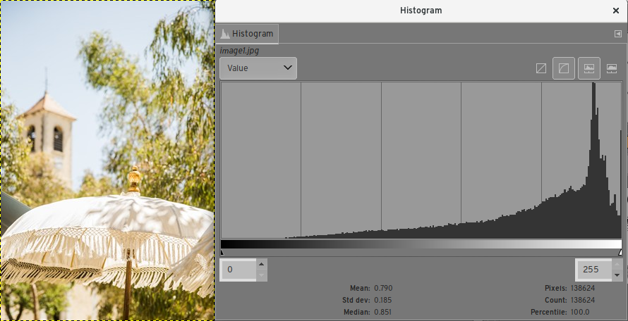
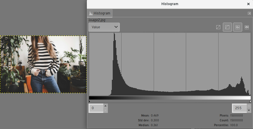
An image tone histogram is also super useful in reverse-engineering post-processing. See these examples from this question and this question:
In both cases, we can see that there's not much in the extreme blacks, but in the first case it seems that the image was intentionally brightly-exposed (or processed in a way that mimics that), while in the second it's clear that the black point (the darkest black in the image) was intentionally raised (common to the "retro photo look") and that the dark tones were crushed down so there's a lot of very dark hues (which gives a contrasty magazine-print appearance).
For more on image (tone) histograms and their relationship to image appearance, see: How does histogram shape affect the aesthetics of a picture?.
About Color
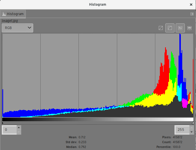
There's a variant of this that's also common in photography: the RGB histogram. This does the same thing, but displays each channel separately — either as three separate charts side by side, or overlapping in one kinda confusing and hard to read graph:
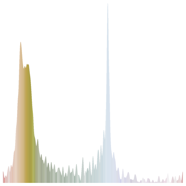
Because these channels are an artifact of how digital images are recorded and stored and not particularly well-related to human perception of color, this is useful as a technical tool to make sure you aren't blowing out a specific channel. (See this great example: Pictures of a dark violet flower appear light blue. Is this a lens or a technique problem?). It isn't particularly useful for thinking about the actual colors in a composition, and for that reason although you'll sometimes see this called a "color histogram", I think it's better to reserve that for histograms which bin color in a different way. See How do I interpret individual colors on RGB histogram? for some discussion of that, including a hue histogram, which buckets colors by that dimension rather than value. For the sample images above, those look like:
This isn't useful at all for exposure, but can be helpful in thinking about color and composition. See Are color and tones in this seascape fine? for some of that in practice, along with some other ways to visualize tone and color in a photograph.


