4
\$\begingroup\$

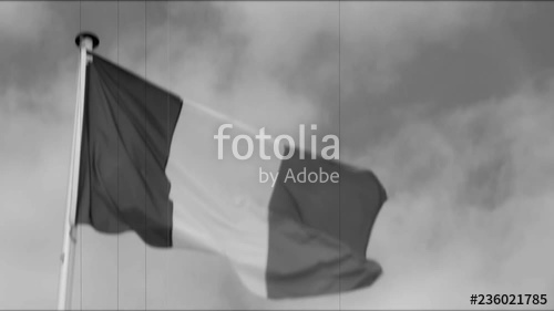
A co-worker of mine was trying to identify a film clip of a ticker-tape parade, and was thinking it was a parade from WWII in Italy (celebrating V-E Day), because the clip showed a tri-color flag with a lighter hue on the hoist (leading) edge. However, further searching showed that it was the parade in New York celebrating Lindburgh's crossing of the Atlantic, which would make the flag French, and the hoist side color blue.

Other pictures from that day and general time period confirm that the blue hoist side definitely photographs lighter in the B&W film of the day: enter image description here

However, more modern digital pictures, desaturated from full-color to B&W, show the blue field at least as dark as the red, which was our expectation: enter image description here enter image description here

The question for the gallery is, why? Our theories so far:

  • Lighter blue used in older French flags
  • Light transmitting through the cloth more readily than through red making blue field brighter depending on illumination angle
  • Rayleigh scattering of daylight increasing ambient blue light illuminating the blue field
  • Digital desaturation to a "perfect" compensated luminance value doesn't match imperfect chemical film response to red/blue light

Are any of these in the ballpark?

\$\endgroup\$
3
  • \$\begingroup\$ The middle flag is front side lit and material that's reflecting, the top is back lit and porous material. The bottom looks back lit too, high back. I think you need a pic of similar sized flags with similar lighting. \$\endgroup\$
    – moot
    Commented Nov 1, 2019 at 16:27
  • 2
    \$\begingroup\$ It's worth noting that the modern digital B&W images you posted are unlikely to just be desaturated - processing a colour image into a good black and white one can be quite a technologically involved process. If you develop a RAW file into black and white in Lightroom, for example, you have a set of faders for how exposed you want each hue to be in the final image, so the person producing the image can freely choose which stripe should be the lighter one. \$\endgroup\$
    – N. Virgo
    Commented Nov 2, 2019 at 11:58
  • 1
    \$\begingroup\$ Would it be surprising if they didn't differ?? \$\endgroup\$
    – TaW
    Commented Nov 3, 2019 at 16:22

4 Answers 4

9
\$\begingroup\$

Just to expand on Matt's answer a bit.

Most B&W films used during the first half of the 20th century were not panchromatic. They were much more sensitive to the energy in blue light than the energy in red light.

Even if a panchromatic film were used, if a blue filter were placed in front of the camera's lens, it would reduce the amount of red light allowed to pass through the filter by a far greater ratio than the amount of blue light allowed to pass.

If you have a raw image file of a french flag, open it in your preferred raw conversion application and apply color filters to a B&W rendering. You'll be amazed by the difference between applying a red filter and a blue (or green) filter.

\$\endgroup\$
2
  • \$\begingroup\$ Ilford's just announced a new 35mm ortho film :) \$\endgroup\$ Commented Nov 2, 2019 at 23:36
  • \$\begingroup\$ @rackandboneman What's that got to do with a photo taken roughly one century ago? \$\endgroup\$
    – Michael C
    Commented Nov 3, 2019 at 8:07
6
\$\begingroup\$

Photo films and digital sensors do not record colors exactly as seen by our eye / brain vision system.

Initially, photo films were only sensitive to the violet and blue region of the visual spectrum. Translated, films blackened when exposed to violet and blue. They did not blacken when exposed to any other colors. The resulting black & white prints depicted violet and blue as very light shades of gray. Other colors were depicted far too dark. Ladies lips and cheeks with rouge imaged clear on the film and black or near black on the black & white print made from these films. They were called “blind” or “blue sensitive” materials.

Film images often were impaired by a halo like blur that surrounded bright gleaming objects like jewelry or highlight sparkles. These were called “halation” caused by strong light complexly negotiating the film, hitting the back pressure plate behind the film and then reflecting back into the film from the rear.

Professor Hermann Vogel of Berlin Technical attempted to mitigate. He reasoned that halation cause was also blue-violet and could be halted by installing a yellow (blue blocking filter) within the film.

He tried many approaches; in one attempt he dyed the film emulsion yellow. This worked like a charm, halation eliminated. To his surprise this, this emulsion retained the violet – blue sensitivity plus it gained green sensitivity.

This film was named orthochromatic (producing image that better corresponded to nature). With no sensitivity to red light, it could be handled under red safelight. This material retained popularity until just after the WWII.

Vogel’s graduate students experimented with other dyes and eventually discovered dye formulas that extended film sensitivity into the red region. These films revived Greek prefix pan meaning all since they are sensitive to red, green, and blue, the three light primary colors.

Photographs taken blind, orthochromatic, and panchromatic films image colors differently. Additionally it was common practice to mount colored optical filters before the lens to alter the way colors were rendered. Most common was a medium yellow filter initially called a K2. This filter sported a touch of green and was in vogue during this era. Used in combination with pan film, it greatly improved monochromatic rendering. It also darken blue sky allowing clouds to stand out. It would naturally darken blue flag field.

Who knows what film was actually used and what filter, if any was mounted.

\$\endgroup\$
2
  • \$\begingroup\$ The addition of a coloured light-absorbing layer of gelatine on the back of film during manufacture provided a non-halation/anti-halation coating to accomplish this handy function. \$\endgroup\$
    – Stan
    Commented Nov 1, 2019 at 17:58
  • \$\begingroup\$ @ Stan - True however the dye additives in the emulsion allow the silver salts to gain sensitivity to colors other than UV - Violet - blue etc. \$\endgroup\$ Commented Nov 1, 2019 at 18:10
5
\$\begingroup\$

Are any of these in the ballpark?

The last one: "imperfect chemical film response". Most black and white processes are not "panchromatic". That is, it does not respond the same way across the whole color spectrum. Ever see darkroom with a red "safe light"? That's what's going on here.

\$\endgroup\$
1
  • 1
    \$\begingroup\$ In case you have never seen such a darkroom... \$\endgroup\$
    – muru
    Commented Nov 3, 2019 at 3:34
0
\$\begingroup\$

Compare apples with grapes.

As a comparison, note that the US Red, White, & Blue also has very similar colours as the French Tricolore so direct comparison of the relative print tones can be made.

It would be a mistake to compare different photographs to come to some conclusion as the situation regarding each different image can't be verified.

Relative colour rendition, however, will be constant in each photograph regardless of it being orthochromatic or panchromatic. If the reds show lighter luminosity than blue, generally all of the reds in the same photograph will be proportionately lighter.

On the US flag does the red show lighter/darker than the blue? In the same photograph, does the French flag show the red show lighter/darker than the blue?

\$\endgroup\$
2
  • \$\begingroup\$ The "blue" in U.S. flags is a dark, almost black, navy. \$\endgroup\$
    – Michael C
    Commented Nov 1, 2019 at 19:20
  • 1
    \$\begingroup\$ @MichaelC According to multiple sources, more than 20 countries use the same three colours in their flag, including the United States, France, the United Kingdom, and Australia. The blue is "flag blue" RGB 000.035.149, Pantone Reflex Blue. More specs at en.wikipedia.org/wiki/Flag_of_France \$\endgroup\$
    – Stan
    Commented Nov 3, 2019 at 0:11

Your Answer

By clicking “Post Your Answer”, you agree to our terms of service and acknowledge you have read our privacy policy.

Not the answer you're looking for? Browse other questions tagged or ask your own question.